


Last edited by a moderator:
Alien: Covenant (Blu-ray SteelBook) (FilmArena Collection #85) [Czech Republic]
- Thread starter luke98
- Start date
You are using an out of date browser. It may not display this or other websites correctly.
You should upgrade or use an alternative browser.
You should upgrade or use an alternative browser.


I guess you all are joking or just love FA a bit too much when you say that you like this steelbook and its obvious lack of originality more than manta's one
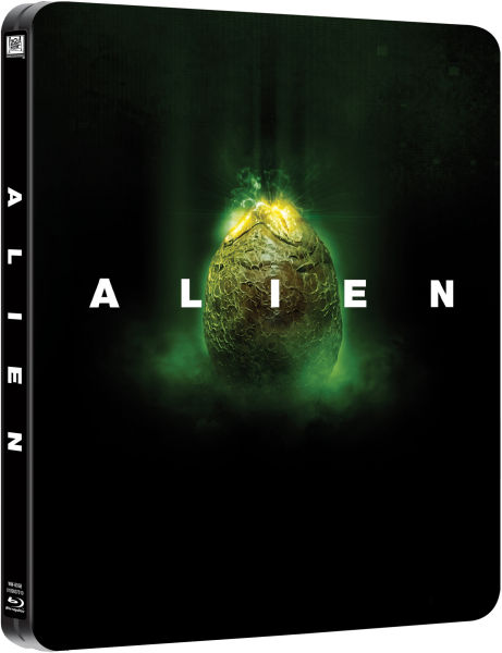

In fact, I think that FA's output is generally some of the weakest in the business, and Manta's output is usually at the very top of the heap. But in this case, FA's steelbook at least features competent design. Doesn't matter how original something is if the overall design is sh!t.

They're trolling us mate
I guess anyone who disagrees with you is a troll
.In fact, I think that FA's output is generally some of the weakest in the business, and Manta's output is usually at the very top of the heap. But in this case, FA's steelbook at least features competent design. Doesn't matter how original something is if the overall design is sh!t.
I see your point, but for me, front artwork in Manta`s is far superior with more punch
Guess everyone has its own taste !

In fact, I think that FA's output is generally some of the weakest in the business, and Manta's output is usually at the very top of the heap. But in this case, FA's steelbook at least features competent design. Doesn't matter how original something is if the overall design is sh!t.
I can see yours and @Noodles point 100% but I'm personally bored of the egg
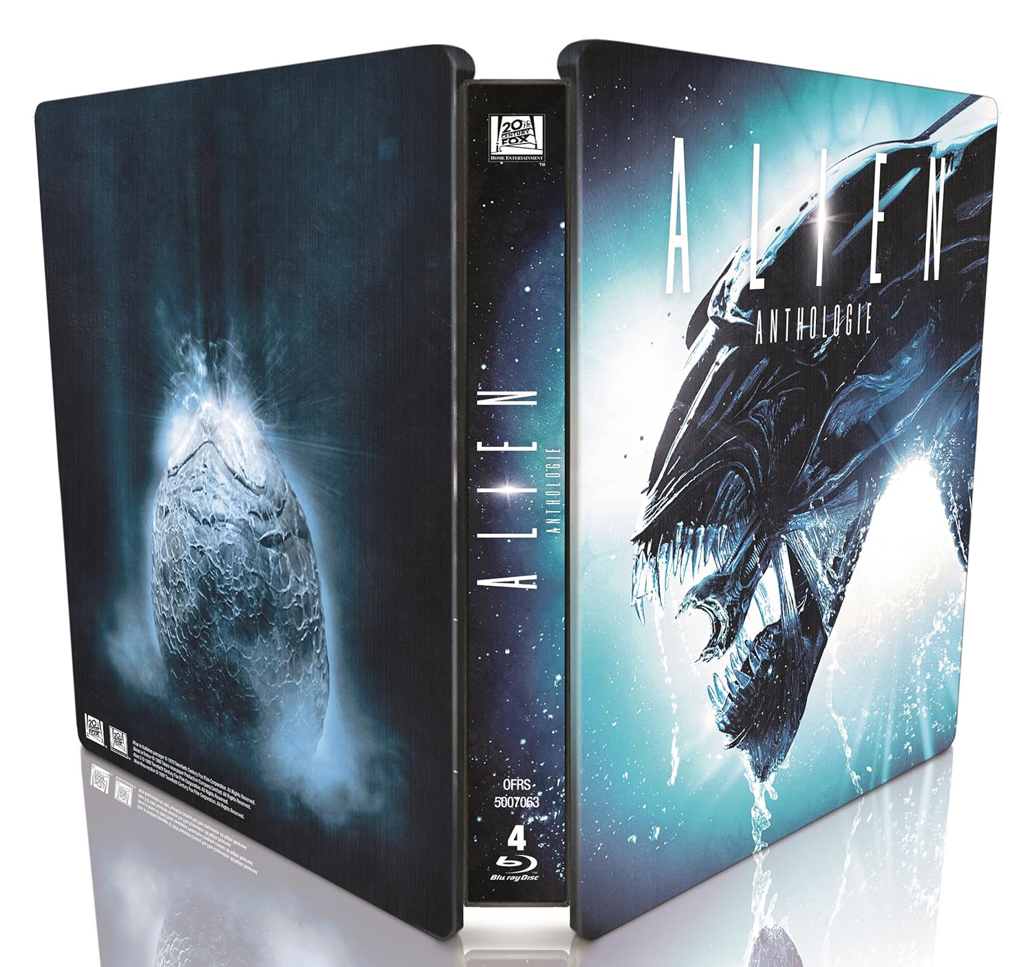
I love the murial art on Manta and I really like that poster on the back. They both compliment each other IMO and work well, I don't think a steel has to have a wrap around art all the time although sometimes cool (like the 3 illustrated ghostbusters steels). Where the tone is quite dark on both I think they gel well. Like novas new guardians
I guess anyone who disagrees with you is a troll
Lol only noodles
I only troll where Marvel is involved.Lol only noodles

Lol only noodles

I can see yours and @Noodles point 100% but I'm personally bored of the egg
I love the murial art on Manta and I really like that poster on the back. They both compliment each other IMO and work well, I don't think a steel has to have a wrap around art all the time although sometimes cool (like the 3 illustrated ghostbusters steels). Where the tone is quite dark on both I think they gel well. Like novas new guardians
Yeah, I totally get being tired of the egg, there's no denying it's been used dozens of times over the years. And I agree that the front cover of Manta's steel is excellent, I love that art--but I don't agree about the back complementing the front. It's not like it clashes horribly with it, it's just not quite right--the color doesn't really match, the composition and style of it don't really complement the front, and I frankly don't think it's an interesting image to begin with.
But the steel art was actually only half the reason I passed on Manta this time. I thought the decision to make the slip with one continuous image from front to back (lenti A, I think?) a single-sided lenti was a bonehead decision. It should either be a non-lenti full slip or a lenti all the way around. Since that was the only slip art I liked, I passed altogether due to that and the back of the steel.
Last edited:
Yes they did.Just a question, did both Manta and FA announced a collection of WEA of the Alien Series?
Yeah, I totally get being tired of the egg, there's no denying it's been used dozens of times over the years. And I agree that the front cover of Manta's steel is excellent, I love that art--but I don't agree about the back complementing the front. It's not like it clashes horribly with it, it's just not quite right--the color doesn't really match, the composition and style of it don't really complement the front, and I frankly don't think it's an interesting image to begin with.
But the steel art was actually only half the reason I passed on Manta this time. I thought the decision to make the slip with one continuous image from front to back (lenti A, I think?) a single-sided lenti was a bonehead decision. It should either be a non-lenti full slip or a lenti all the way around. Since that was the only slip art I liked, I passed altogether due to that and the back of the steel.
THats fair enough
Yeah it's lenti slip A that does that. Again love that front image (for once an editon where all art used from steel to lenti is exactly what I wanted) and the lenti will hopefully be awesome but there's nothing on the back except a bit of xeno tail so that's kinda annoying and plain. Probably why they chose holofoil for the finish to make us all "shiney shiney pretty" and trick us into forgetting there's nothing there lol
Totally love Manta Slip A engaging front, but in fear of holofoil nightmare,,, looks cool as is

HQ already posted but beauty shots are up @Actarus
Just saw those beauty
 Thanks for the headz up mate
 whats the difference between "slipcover 3d" E3 and slipcover "slipcover 3d lenticular" E2?
This never happened before to me with FA, I honestly don´t know which slipcover is better  absolutely awesome choices
absolutely awesome choices Similar threads
- Replies
- 46
- Views
- 7K
- Replies
- 9
- Views
- 2K
- Replies
- 54
- Views
- 11K
- Replies
- 20
- Views
- 4K