Last edited by a moderator:
Arrival (Blu-ray SteelBook) (Zavvi Exclusive) [UK]
- Thread starter bigfub
- Start date
You are using an out of date browser. It may not display this or other websites correctly.
You should upgrade or use an alternative browser.
You should upgrade or use an alternative browser.


Yeah, the film is basically all about the symbols/language, so the UK steel makes more sense in that respect... although, I saw the artwork for both steels before I'd actually seen the film and yet preferred the UK art even back then.I think the UK artwork is more attractive to those who have seen the movie and understand the meaning of the symbols while the EU artwork is more appealing to those who haven't seen it. The symbols alone really confused me until I saw the movie. The EU artwork has a little more context with the people in the pictures. That's just my feeling, I could be wrong.

Hmm the black symbols definitely look/feel glossier than the rest to me.I thought this was full gloss?
Basically I didn't like the other version but now seeing pics of this I prefer the other but then that's ruined by a bad finsh and I agree about the back but the front looks better to me now. Catch 22s all around
I'm just bitter because the film was amazing and neither really justify it for me. It deserves much better
I can agree with you there mate... neither steelbook does the film justice to be fair. I'd love to see either Plain or Manta have a go at doing something special for this one!


^ or you can think again
• PA - have their art designed for the steel by artists
• manta with possible fight club
• mondo
• pop art
• Other non poster designed steels and fan art (American psycho, whiplash, better call Saul, ghostbusters - all 3, possible Logan etc)
That's just some examples.
many other retailers have had the same
PA could smash this with the style of art and design they use for their steels and slips plus with sicario on the horizon and the same director it could happen (in 2 years )
)
• PA - have their art designed for the steel by artists
• manta with possible fight club
• mondo
• pop art
• Other non poster designed steels and fan art (American psycho, whiplash, better call Saul, ghostbusters - all 3, possible Logan etc)
That's just some examples.
many other retailers have had the same
PA could smash this with the style of art and design they use for their steels and slips plus with sicario on the horizon and the same director it could happen (in 2 years
)
Last edited:
The steelbook is a lazy disaster IMO.. And would have looked so much better in full gloss white and not this no effort bare bones silver.. For the price asking...???

Much prefer the french version although we still need a better version, me thinks..
For the price asking...??? Much prefer the french version although we still need a better version, me thinks..
Not going to convince anyone that hates it that this is a very decent steelbook but a few more pics of the exterior - sourced from another forum - won't do any harm . . .
With a soupcon of imagination this steelbook is transformed by its colouring into a section of glass wall from the film on which the logograms appear with the swirls of smoke behind it perfectly represented by the darker grey mottling.
Clever effect and most satisfying.


With a soupcon of imagination this steelbook is transformed by its colouring into a section of glass wall from the film on which the logograms appear with the swirls of smoke behind it perfectly represented by the darker grey mottling.
Clever effect and most satisfying.
Not going to convince anyone that hates it that this is a very decent steelbook but a few more pics of the exterior - sourced from another forum - won't do any harm . . .
With a soupcon of imagination this steelbook is transformed by its colouring into a section of glass wall from the film on which the logograms appear with the swirls of smoke behind it perfectly represented by the darker grey mottling.
Clever effect and most satisfying.
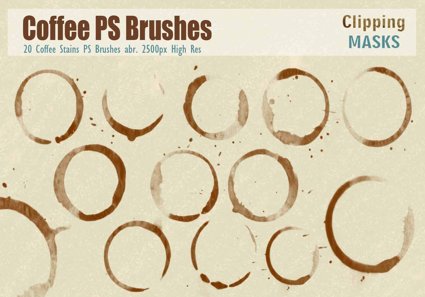
In the movie the images look almost smoke like, on the steel it just looks like a coffee mug stain. No "soupcon of imagination" is changing that.
^ You're not totally wrong . . . but they obviously did the best they could with the materials available and the fact that the logograms look a bit like coffee cup ring stains is not accidental (as you will see if you can be bothered to read the comments from the makers of the film) but all of that has zero significance to my appreciation of the steelbook or of the artwork.
You can make fun of the logograms - and consequently of the concept of the film itself - all you like but people are buying these signs of communication on T-shirts, wall clocks etc. and even having them as tattoos so IMO that speaks for itself:-
You can make fun of the logograms - and consequently of the concept of the film itself - all you like but people are buying these signs of communication on T-shirts, wall clocks etc. and even having them as tattoos so IMO that speaks for itself:-
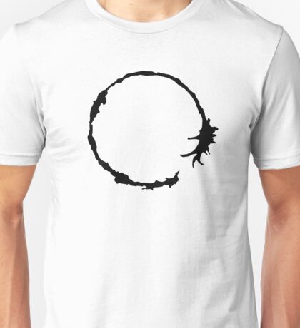


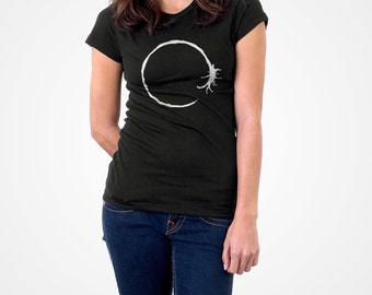

A lot of those products you showed only prove the point: the logograms look really good on a white background. ")
I'm glad there are people who like this steelbook, but I would have a much easier time believing someone put a lot of thought into the design if the symbol was debossed, or if there was any indication that the design was regarded as something more special than a bare-minimum silver steelbook. (And I like to think I have several soupçons of imagination.)
Subjectivity and differing opinions, and all that. Thanks for the nice, level-headed conversation about it!
If the steelbook is to best represent the film the logograms looks as they should on the steelbook and IMO would look silly on a white background - stands to reason after watching or looking at images from the film!
Of course the logograms looks better on white clothing, plastics and porcelain as white makes for more dramatic contrast. . . but for a steelbook of the film with artwork representative of the film it's a big "no" from me.
A bare metal steelbook with shading is clearly the closest the designers were able to get to the effect seen in the film and if people don't get that there's little point on my part in commenting further on the matter.
BTW, thanking you for your unsubtle "level-headed" dig.
P.S. Nothing wrong with bare metal steelbooks and there are more than a few stunning U.K. bare metal steels out there if you'd care to look . . . if you don't know which ones just ask.
--------------------------------------------------------------------------------------------------------------------------------------------------------------------
My design for this steelbook would have gone the extra mile (LOL) and would have been as unique as the film itself . . . although probably wildly impractical and uneconomical to produce . . .
Steelbook would have the same mottled bare metal background but with the following differences:-
- No printed logogram on the steelbook itself
- Framing border with recessed central panel in which would be invisibly fixed the thinnest sheet of tempered slightly opaque glass with the logogram printed on the underside of the glass - as in sandwiched between the glass and the steelbook.(to best reflect the glass of the all-important communication wall).
Last edited:
The film shows more logograms printed on white paper than on the window. ")
I think you misread my comment. I didn't mean a dig at all. I simply meant it's been a good conversation between people with different opinions (which sometimes is not the norm on Internet forums). Sorry for the miscommunication!
I think you misread my comment. I didn't mean a dig at all. I simply meant it's been a good conversation between people with different opinions (which sometimes is not the norm on Internet forums). Sorry for the miscommunication!
At the end of the day this still remains a bare metal steelbook which doesn't warrant the £22.99 price tag. Was the decision to make it bare metal an effort to represent a particular element of the movie or enhance the symbols in some way? I think not. Its a cheap steelbook with a premium price tag and thats all there is to it, in my opinion...............
This cannot be sold out ! Must be some sort of Marketing plot from Zavvi thinking we'll want some if we think it sold out 

Similar threads
- Replies
- 19
- Views
- 2K
- Replies
- 83
- Views
- 9K
- Replies
- 6
- Views
- 848
- Replies
- 28
- Views
- 3K