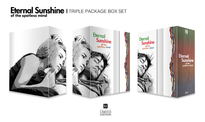
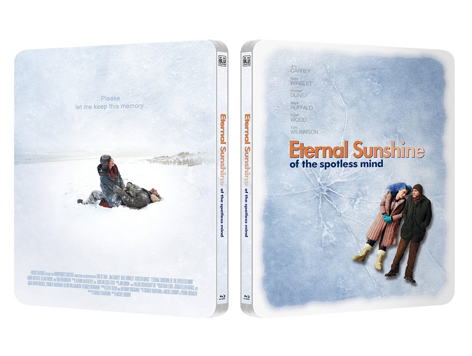
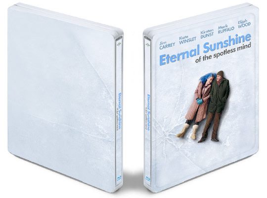
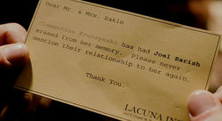
Eternal Sunshine of the Spotless Mind (Blu-ray SteelBook) (Kimchidvd Exclusive #19) [Korea]

Choi Chungkwon

Premium Supporter
Jan 28, 2013
1,726
South Korea
Release date: February 13th, 2015
Pre-Order: January 8th 2015. 10:00 AM (Korean Time)
Purchase links & Prices:
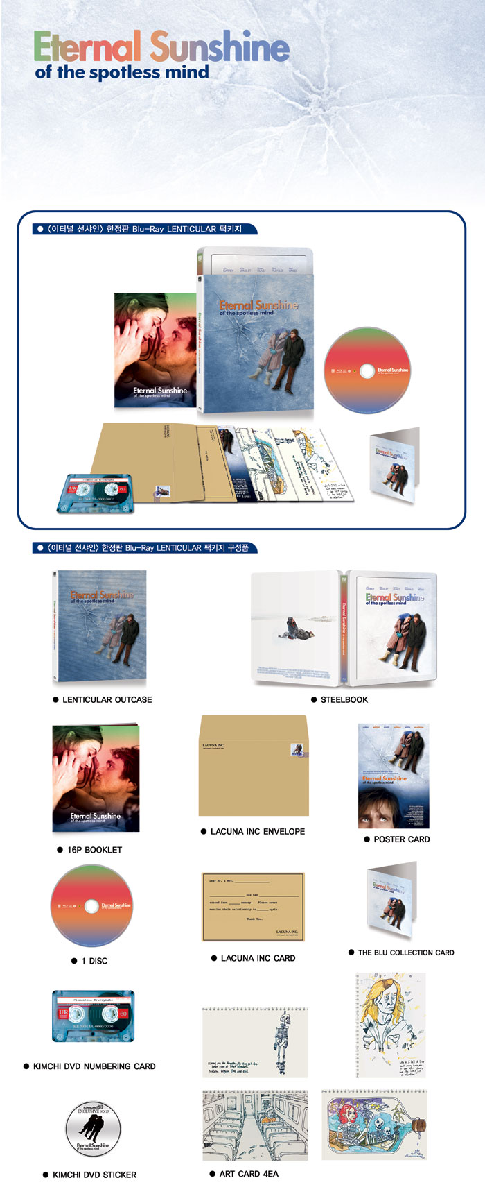
Lenticular $36.99
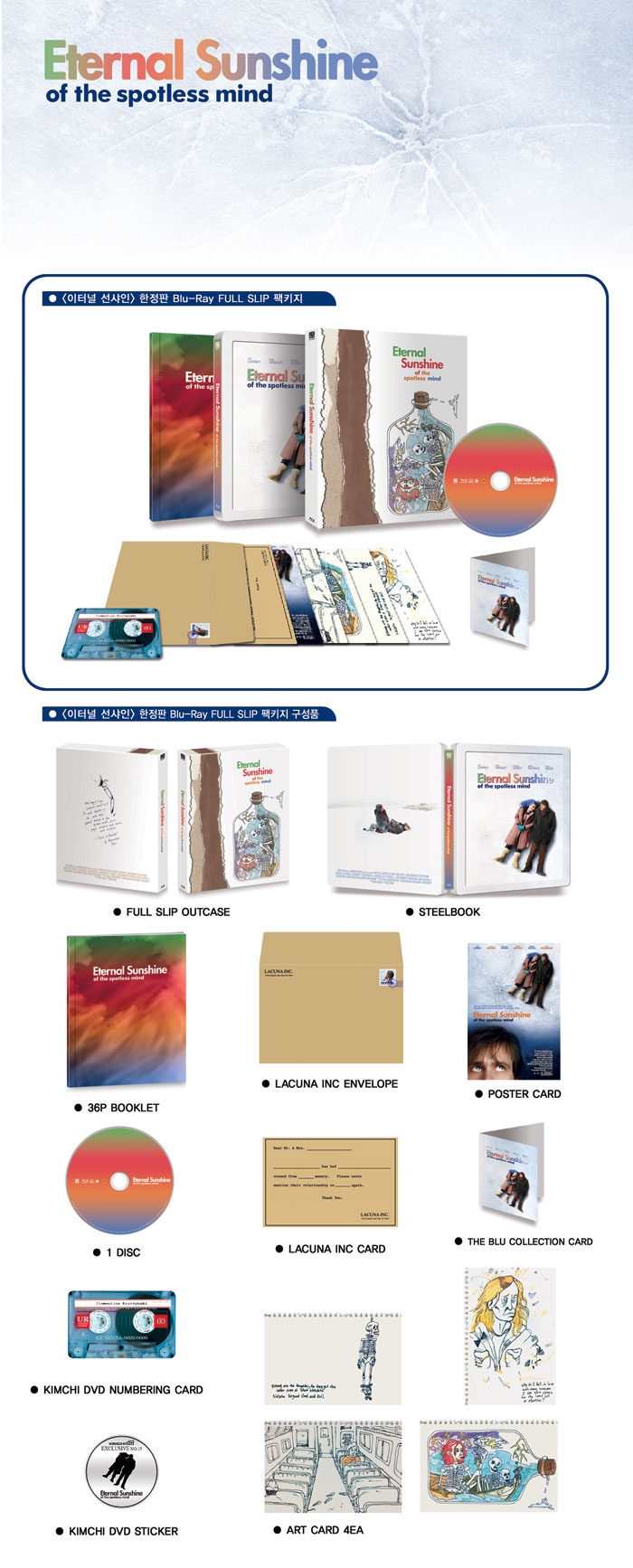
Full Slip $36.99 (sold out)
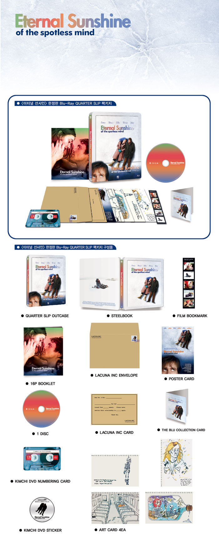
1/4 Slip $34.99
Triple Pack $110.99 (sold out)
1.jpg

2.jpg

Packaging:
14199333979892777.gif

1419934370496316.jpg
14199342544962061.jpg
1419934482975641.jpg
ESOTSM.jpg

Artwork candidate
Type A
A.jpg

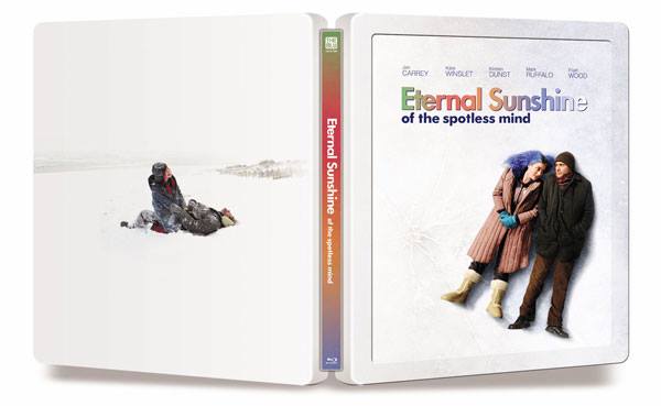
Type B (Kaw's artwork)
B.jpg
 
Last edited by a moderator:
I've never seen this film, so I have to research it more. The reviews are phenomenal, so im actually really looking forward to watching this to see what all the praise is about.

This would make a great Blind Buy for me, so excited!!!!!

Right on Kimchi!!!!!'
 
Last edited:
Haven't seen the film but the reviews are really good. However, I don't like either of the two designs but just from a design point of view. Whether these capture the tone of the film accurately I can't say
 
I like both but Kaw's artwork pips it with the continuity of the artwork on the back...only downside is the blue title - I would prefer orange. I've never seen a blue title for this film and the orange is not only striking but reminds me of her name (Clementine)
 
  • Like
Reactions: kaw and lolwut
First of all, after reading some comments here, I have to applaud Kimchi for their release choices. One great movie after another. They will always have my $upport with this kind of release.

As for the artwork choices, I'd go with type B.
Would love to have a type C option, though.
 
  • Like
Reactions: kaw
Thanks Buddy! I was quite pumped when i was told they might use it. Hope they do.
But seems like a lot of people like "A" for some reason... I personally feel like A is way too messy (I know i'm slightly biased). Ive always been a fan of more clean steelbooks with good artwork.

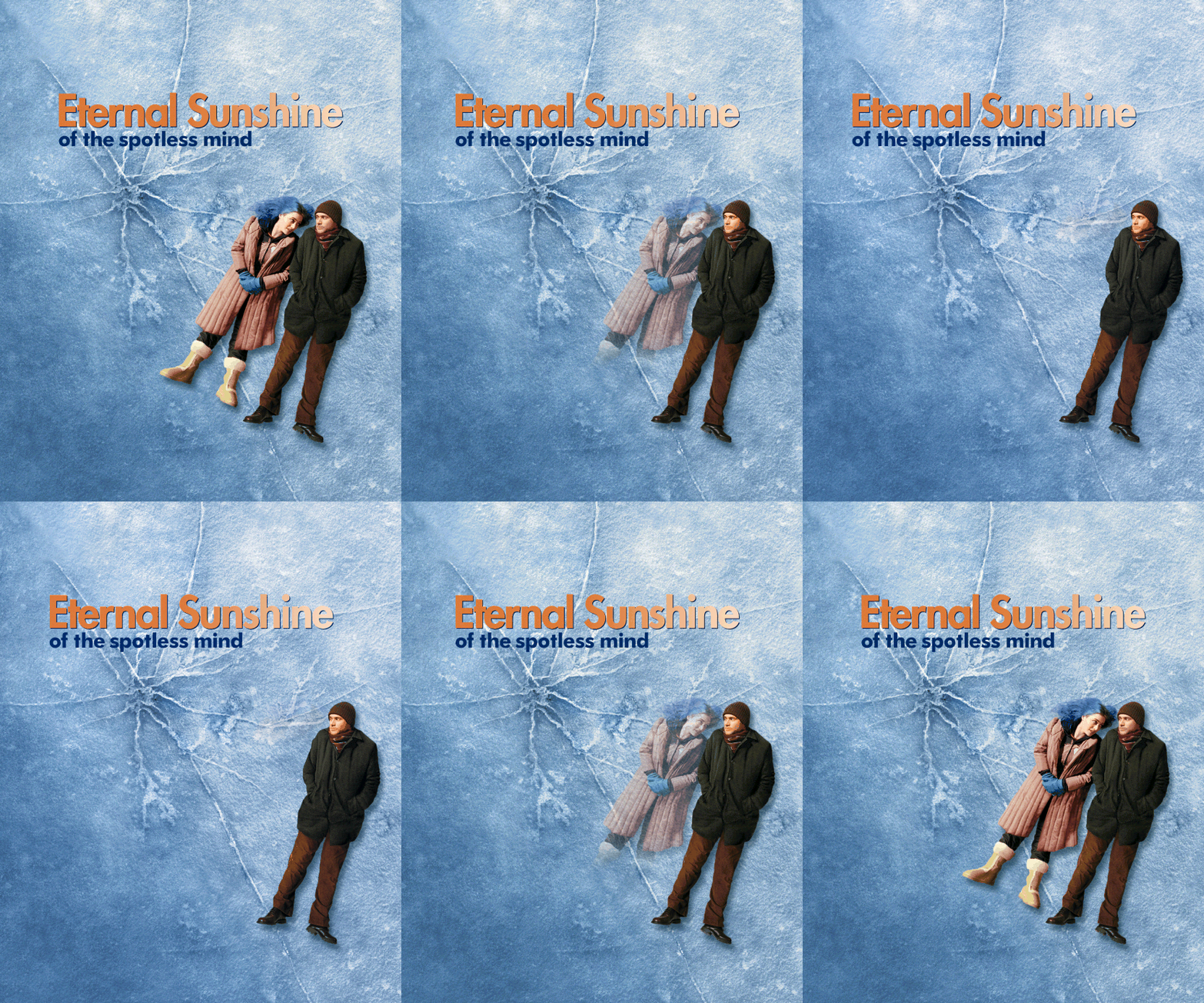
For people wondering why I didn't put any back art on it, it was on purpose. I tried many things with my concept, but in the end I wanted it to represent the film and have it clear of clutter. Kind of like if this was just a single memory in Joel's mind about to be erased. I also wanted the steelbook to look a bit like block of ice. When i added any back images it took away from that. Of coarse this is my personal preference and everyone has different tastes and I'm cool with that. Just thought people should know why I made it look how it is.

I do think yours is slightly better than A, but why not go with the blue ice?
 
  • Like
Reactions: kaw
Type B wins this one, I like the cleaner look. Nicely done @kaw :thumbs:

Just one little thing, get rid of what looks like a frame on the front, would look better IMO.
 
  • Like
Reactions: kaw