Last edited by a moderator:
My Neighbour Totoro (Blu-ray SteelBook) [UK]
- Thread starter digitalbabe
- Start date
You are using an out of date browser. It may not display this or other websites correctly.
You should upgrade or use an alternative browser.
You should upgrade or use an alternative browser.

Nice, finally ghibli movies on steelbook!
Hopefully will be a tad lower on amazon, but as the ghibli movies on standard blu ray are upwards of £13 these are a fair price already.
Hopefully will be a tad lower on amazon, but as the ghibli movies on standard blu ray are upwards of £13 these are a fair price already.
Suhweet  , BIG fan of Studio Ghibli flicks and have all DVD & BD LEs out there so this will be a nice welcome addition to my Ghibli Collection, let's hope for a kick ass art and more Gibli titles from the UK, all numbered now please
, BIG fan of Studio Ghibli flicks and have all DVD & BD LEs out there so this will be a nice welcome addition to my Ghibli Collection, let's hope for a kick ass art and more Gibli titles from the UK, all numbered now please 
Available to pre-order at Amazon, priced at £17.90:
http://www.amazon.co.uk/Neighbour-Totoro-Steelbook-Blu-ray-DVD/dp/B00FGRP6R4

http://www.amazon.co.uk/Neighbour-Totoro-Steelbook-Blu-ray-DVD/dp/B00FGRP6R4
Last edited by a moderator:

Sainsbury's in at £19.99 and I would just like to point out that the thread title is spelt incorrectly. It should be 'My Neighbour Totoro' 
http://www.sainsburysentertainment.co.uk/en/Films-TV/Blu-ray/Elevation-Sales/My-Neighbour-Totoro-Steelbook/product.html?product=E11292976
http://www.sainsburysentertainment.co.uk/en/Films-TV/Blu-ray/Elevation-Sales/My-Neighbour-Totoro-Steelbook/product.html?product=E11292976
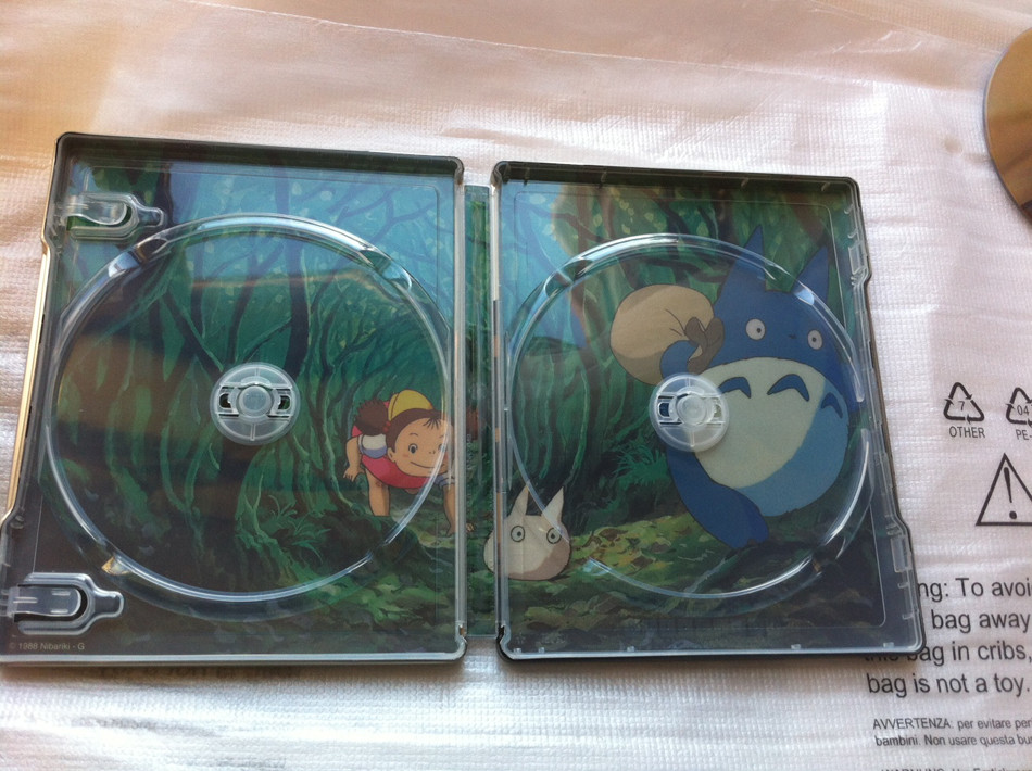
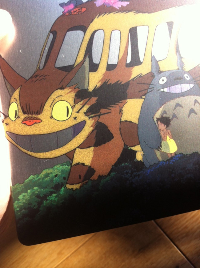
Actual pics thanks to mattyl149 at the other forum:


Last edited by a moderator:

They are not perfect, but so much better than a lot of the dross that gets released.
Nice spine art
Blu + DVD
Lovely inner art
No ratings logos
Excellent movies
I hoped they would have been glossy and came with a booklet of some sort, but alas they do not. These are exceptional films, so it's a no brainer from my perspective.
I can't wait for the next lot to be announced.
Nice spine art
Blu + DVD
Lovely inner art
No ratings logos
Excellent movies
I hoped they would have been glossy and came with a booklet of some sort, but alas they do not. These are exceptional films, so it's a no brainer from my perspective.
I can't wait for the next lot to be announced.
I agree with the above comments. Lovely inside artwork but the outside is soooo dull. This wave could/should have been breathtaking but it is plain and uninspired.
A let down.
Sent from my iPhone using Tapatalk
Disagree. If they had used white, they'd look like that godawful 'premium' collection. If they had been different block colours, they'd look like kids DVD covers.
The silver acts as a unifying template or base colour that encourages you to collect them. The circular image on the front and type on the front and spine is similar on all of them too which also enhances the consistency across the set. The spine and text colours and the back and inside artwork are obviously unique to each film which is a nice touch. Personally I did have Nausicaä on pre-order and was going to get Totoro too, but the only thing I have to complain about at the moment is the price. If they fall below £15-ish each then I'll consider buying them no problem, but £20 (or indeed £18) is a bit steep for a catalogue title, even if Nausicaä hadn't been Dual Format in the past.
I just think, they look cheap! No embossing, debossing. They just look a little flat. Just my opinion!
Sent from my iPhone using Tapatalk
You can see the really weird spotty paint job here. Not great.


Similar threads
- Replies
- 6
- Views
- 827
- Replies
- 22
- Views
- 2K
- Replies
- 0
- Views
- 761
- Replies
- 6
- Views
- 694