Spider-Man: Homecoming (4K+3D+2D Blu-ray SteelBook) [HMV Exclusive] [UK]

Shane Dale

Premium Supporter
Mar 23, 2015
763
Bristol uk
Release date: November 20, 2017
Purchase link: HMV
Price: £24.99
Group buy: click here to join
Notes: 4K Ultra HD, 3D Blu-ray, 2D Blu-ray, Bonus Blu-ray Disc and Comic

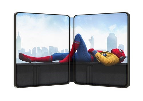
02-484043.jpg

03-484043.jpg
01-484043.jpg
 
Last edited by a moderator:
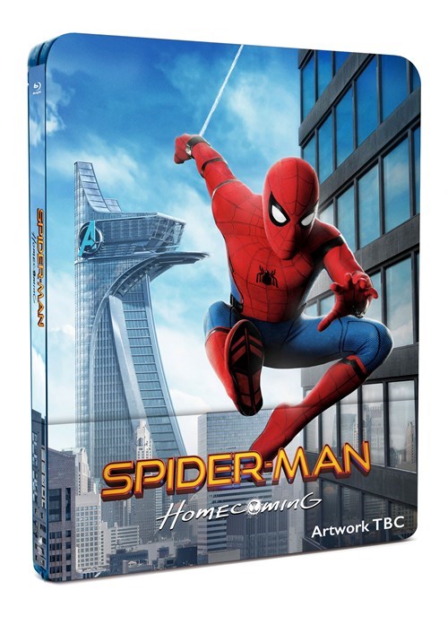
I like the artwork, but i dont get how spidey is that high up in the artwork when there is no sky scrapper to be found.

I look at it two ways

He either used iron man and webbed off of him or like in the original McGuire spidey when he sling shots him self using 2 webs
 
  • Thanks
Reactions: thewoe
Maybe stick in a order with Amazon France as a fail safe

I've done that and if HMVs turns out to be the current art they have listed then I'll cancel and keep the Amazon France order

I still like the HMV art but I'm preferring the illustrated art and FACs art better so they will be the 2 I go for
Thanks, just ordered the French one. I'll definitely keep my HMV order to future proof with the 4k disc and decide between Amazon France and Zavvi once all the artworks are finalised.
 
  • Thanks
Reactions: Flloydo
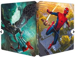
Why is Vultures wing overlapping onto the front art on the WWA when nothing else is? It's actually 2 separate images altogether. Looks ridiculous IMO.

View attachment 322729
An obvious contrast on each panel of light and dark. The wing is a piece of subtle cohesion that merges the two together. The art doesn't strive away from being anti-realistic (with the floating heads), it works well as a united piece with multiple elements.

Looks great in my opinion.
 
Last edited:
  • Thanks
Reactions: Noodles and Flloydo
An obvious contrast on each panel of light and dark. The wing is a piece of subtle cohesion that merges the two together. Looks great in my opinion.

The art doesn't strive away from being anti-realistic (with the floating heads), it works well as a united piece with multiple elements.

I really like that too.

Makes sense not cutting of the wing and instead changing the style to fit the front art for the small section it takes up

Very creative IMO
 
  • Thanks
Reactions: matthewtheunicorn
I really like that too.

Makes sense not cutting of the wing and instead changing the style to fit the front art for the small section it takes up

Very creative IMO
Yeah I think without it, it's vulnerable to the stark juxtaposition found in other recent reveals which not many are enjoying. The small detail of the wing demands it to be looked at as a whole.

And to its credit, it's not just the wing that does this. If the spine was solid colour, it'd look much worse but the image blurs right at the spine. Gorgeous composition. Really well thought out design.
 
  • Thanks
Reactions: Flloydo
Yeah I think without it, it's vulnerable to the stark juxtaposition found in other recent reveals which not many are enjoying. The small detail of the wing demands it to be looked at as a hole.

And to its credit, it's not just the wing that does this. If the spine was solid colour, it'd look much worse but the image blurs right at the spine. Gorgeous composition. Really well thought out design.

Completely agree and I even thought the same about the spine. And how it's the lighter background image from the front is used so the title shows up better

Imagine if we had a whole mcu set with this style of art from this guy.

Would love it but at the same time we don't need more steels lol
 
  • Thanks
Reactions: matthewtheunicorn
Completely agree and I even thought the same about the spine. And how it's the lighter background image from the front is used so the title shows up better

Imagine if we had a whole mcu set with this style of art from this guy.

Would love it but at the same time we don't need more steels lol
He's done a lot of artwork for the MCU. Rate that idea highly:thumbs:If only it was like that since the beginning haha

I found the full piece online. I can say, it becomes really apparent the change of coposition that went into creating the steelbook and I appreciate that it wasn't just a coincidence. And secondly, I'm so grateful we don't have a cluttered conglomerate of side characters on the steelbook.
19731859_1475460765848734_2672637132048419676_n.jpg
 
  • Thanks
Reactions: Flloydo
He's done a lot of artwork for the MCU. Rate that idea highly:thumbs:If only it was like that since the beginning haha

I found the full piece online. I can say, it becomes really apparent the change of coposition that went into creating the steelbook and I appreciate that it wasn't just a coincidence. And secondly, I'm so grateful we don't have a cluttered conglomerate of side characters on the steelbook.
19731859_1475460765848734_2672637132048419676_n.jpg

I love his age of ultron battle pic

Unreal

Yeah if it was like that from the start then great. It's like when zavvi released their lenti wave why only the 2 caps and antman with the illustrated art? Why not the whole batch. Would of been much better than the arts they chosen especially their age of ultron, guardians, Thor 2 etc

Yeah I see the full piece the other day possibly posted in the US thread. I agree but you have to admit that pic of Ned is f*cking hilarious. Should be on a art card in the steel. Just the image of him lol
 
  • Thanks
Reactions: matthewtheunicorn
Looks like I'll be keeping HMVs and France's then

I'll pick up the FAC somehow some way a little later down the line. Just their steel will do me (no slips)