The Interview (Blu-ray SteelBook) [UK]
- Thread starter bigwednesday0
- Start date
You are using an out of date browser. It may not display this or other websites correctly.
You should upgrade or use an alternative browser.
You should upgrade or use an alternative browser.
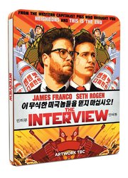
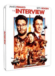
You can vote for the artwork on the Facebook page of the film -2 options: https://www.facebook.com/SkylarkTonight/posts/1591897257693466
D
Deleted member 14299
Number 2 just seems to be boring and generic- boring font, uninteresting images; At least the first option makes use of the promotional poster artwork for the steelbook!
Incidentally, anyone else seen this movie? Caught it last Week and it was probably just as I expected it to be- Not hilarious but some funny jokes in there (the Stalin joke relating to the tank for example..)
James Franco's character is beyond irritating though, and think ultimately that's what killed it for me- He can't really do over-the-top, in your face style humour (he almost came across as a Stifler style character- Over sexed and stupid. Unfortunately, while Stifler is a great comedy character, Franco's 'Skylark' character falls flat ...) Thankfully, his character was toned down in the second half of the film.
All in all, was average to good at best, but will happily skip this on release...
I loves James and Seth there hilarious especially in Pineapple express too bad the sequel might be cancelledNumber 2 just seems to be boring and generic- boring font, uninteresting images; At least the first option makes use of the promotional poster artwork for the steelbook!
Incidentally, anyone else seen this movie? Caught it last Week and it was probably just as I expected it to be- Not hilarious but some funny jokes in there (the Stalin joke relating to the tank for example..)
James Franco's character is beyond irritating though, and think ultimately that's what killed it for me- He can't really do over-the-top, in your face style humour (he almost came across as a Stifler style character- Over sexed and stupid. Unfortunately, while Stifler is a great comedy character, Franco's 'Skylark' character falls flat ...) Thankfully, his character was toned down in the second half of the film.
All in all, was average to good at best, but will happily skip this on release...

Price: £18.25
@Amazon UK http://www.amazon.co.uk/dp/B00TDQNN7O/?tag=hidefnin-21
@Amazon UK http://www.amazon.co.uk/dp/B00TDQNN7O/?tag=hidefnin-21
Ahh man just seen the poll. I actually like both but only if option 2 was white. 1 is the best but in this case I like both and I would be happy with either. Which is a first for me
Looks like I'll have to vote via my mums Facebook lol how sad is that. My mates will just slap me if I ask them
I'll be using my dads for the same reason!
I loves James and Seth there hilarious especially in Pineapple express too bad the sequel might be cancelled
They already made it in "This is the End" lol
Lol oh yes Blood RedThey already made it in "This is the End" lol
Similar threads
- Replies
- 8
- Views
- 867
- Replies
- 16
- Views
- 2K
- Replies
- 22
- Views
- 2K
- Replies
- 0
- Views
- 413
- Replies
- 6
- Views
- 790


