Last edited by a moderator:
Thor: Ragnarok (4K and 3D Blu-ray SteelBooks) (Zavvi Exclusive) [UK]
- Thread starter luke98
- Start date
-
- Tags
- 4k steelbook
You are using an out of date browser. It may not display this or other websites correctly.
You should upgrade or use an alternative browser.
You should upgrade or use an alternative browser.
Fans should have a voice in the design of a monthly (or one off) premium from a particualr retailer... or at least the masses on such a forum to have the ability to put forward our own design that we have all voted on from a selection of concepts and then that can be created. Obviously it would have to be further approved and the legalitites out of the way. There is logic and reasoning behind it. We are the ones who buy these things and have a HUGE opinion on the artwork before and after. If we all collectively, or as a majority, easily prefer a particular concept above others then we will 100% be happy with that product knowing what we were getting and can't certainly ***** about it because we picked it. @Noodles concept I would buy in an instant if Blufans came along and said "yep, we are going to make those". Bam! Done and dusted... bring on next months.
The only way we voice and they hear is "voting with our dear WALLETS" 

There's so much cool/colourful artwork available for this movie, so I just had to do a premium edition concept.
View attachment 344342
HOLY. SH*T.
Yeah...nothing is even going to come close to being this good. This is incredible!
when Warner release a Steelbook, then their are no extra costs, because they own them.Because fans don't pay for their creations to be produced...Every layer of complexity adds to the overall cost
when Warner release a Steelbook, then their are no extra costs, because they own them.
I'm talking about the production costs of a Steelbook..Eg. Add embossing, add gloss, add colour one, add colour two etc
There's so much cool/colourful artwork available for this movie, so I just had to do a premium edition concept.
View attachment 344342

Main hero on front
Main villain on back
YES, YES and YES
This and the contents included is what we should be getting for Steelbook premium releases...ones which aren't just limited to Blufans...HINT HINT @zavvi
I would pay so much money for this.
Confirmed visual for France - same as for the US - but with the thumbnails instead of the title on the spine - and undoubtedly what we'll be getting in the UK . . . with spine title, of course:-
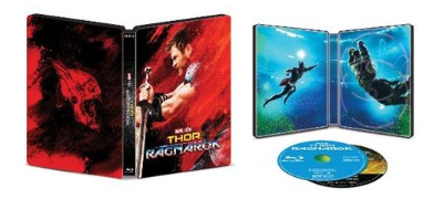
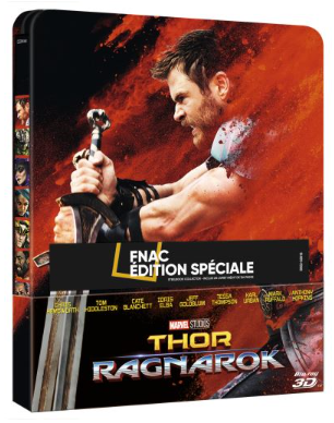
Classic original poster design depicting just the main character (as on the other THOR steelbooks) seems perfectly reasonable to me . . . a design - one of eight - inspired by legendary Marvel Comics artist Jack Kirby incorporating the famous "Kirby Krackle" (or power globs) effect . . . in the comics more usually black but here red, orange, blue etc. :-
"Kirby Krackle" December, 1966 --------------------------------- "Kirby Krackle" influence December, 2017
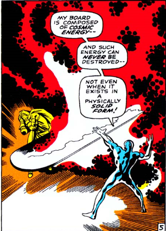

"Kirby Krackle" -
Done deal, maybe, but the back / inside art in the OP not doing anything for me . . . shame they couldn't have used 3 of the remaining 7 similar style posters.
For example: Idris Elbe as Heimdall on the back ---------------------------------------- Insides with Tessa Thompson as Valkyrie and Jeff Goldblum as The Grandmaster
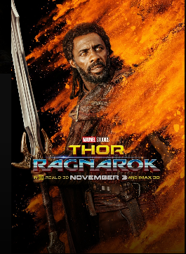
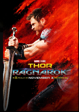 5
5
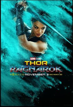
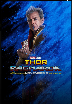
The non-gimmicky artwork should please more folks than it puts off . . . which is a plus.
Traditional image of only Thor on the front of a THOR steelbook seems perfect to me for the WWA edition . . . and fits in well with previous THOR steelbooks:-


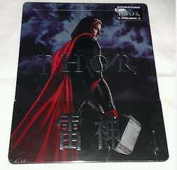 ......

Just my 10 ¢
Classic original poster design depicting just the main character (as on the other THOR steelbooks) seems perfectly reasonable to me . . . a design - one of eight - inspired by legendary Marvel Comics artist Jack Kirby incorporating the famous "Kirby Krackle" (or power globs) effect . . . in the comics more usually black but here red, orange, blue etc. :-
"Kirby Krackle" December, 1966 --------------------------------- "Kirby Krackle" influence December, 2017
"Kirby Krackle" -
"In the 60’s Jack Kirby began to draw clusters of round black dots to depict enormous but not necessarily directed energy, often of a cosmic nature. This simple graphic technique was so effective that it has been picked up by other comic book artists and can still be found in comics of today. The device has been given the name Kirby Krackle. It is an annoying cute name but one that has become so entrenched that it has come to be accepted.
But what are the origins of Kirby Krackle? Some comic book scholars have pointed to a panel from Fantastic Four #46 (January 1966) where the Inhuman Triton is depicted in water surrounded by bubbles and black shapes that look surprisingly like Kirby Krackle. Nothing to suggest energy or anything cosmic but visually similar enough that perhaps it formed the basis for an imaginative leap by Kirby. Old grainy photographs of Quasars (astronomical objects discovered in 1963) have also been suggested to be the inspiration for Kirby Krackle. Because at the time inkers were encourage to embellish the pencils some have even suggested that it was the inker Joe Sinnott that actually created Kirby Krackle!"
(Jack Kirby Museum)
Done deal, maybe, but the back / inside art in the OP not doing anything for me . . . shame they couldn't have used 3 of the remaining 7 similar style posters.
For example: Idris Elbe as Heimdall on the back ---------------------------------------- Insides with Tessa Thompson as Valkyrie and Jeff Goldblum as The Grandmaster
The non-gimmicky artwork should please more folks than it puts off . . . which is a plus.
Traditional image of only Thor on the front of a THOR steelbook seems perfect to me for the WWA edition . . . and fits in well with previous THOR steelbooks:-


Just my 10 ¢
Last edited:
I too like that it's only Thor on the front for the UK steels. We know premiums will bring their own take. I also like the shift in design much like the shift in the movie's personality.
The new film is bringing a lot of colour and humour to it, and as much as some don't like that, I think it was a great welcome to the Thor series. Even the design of the new title is
a big change. I'm really liking the new design and the red it expresses is a splash of colour in place of the previous red cape as well as the weapon. It's a warm shift in the theme.
Spine titles were confirmed a year ago for Disney UK steelbooks.Hopefully we get the title on the front too like the States side one!! Really like the design for this which complements the other 2 quite well.
Spine titles were confirmed a year ago for Disney UK steelbooks.
I meant the front title. Not just the spine.
This artwork looks like it's a 'Highlander' or some other Knight movie. It doesn't represent Thor's characteristics that much.
Urgh so that Best Buy place holder was correct all along? Why can't that happen when it's actually good artwork? 
Really don't like the design and certainly not in fitting with Marvels other recent WWA releases (walkmans, SSD's, books etc etc), I'm sure a broken hammer with some debossing like the Civil War could have looked alright...
Ah well Blufans was always going to be king anyway

Really don't like the design and certainly not in fitting with Marvels other recent WWA releases (walkmans, SSD's, books etc etc), I'm sure a broken hammer with some debossing like the Civil War could have looked alright...
Ah well Blufans was always going to be king anyway
No 3D disc in the USA? This might be the way to go for the basic Thor: Ragnarok steelbook if you aren't interested in Blufans, etc....
Similar threads
- Replies
- 80
- Views
- 8K
- Replies
- 6
- Views
- 778
- Replies
- 6
- Views
- 663
- Replies
- 4
- Views
- 773
- Replies
- 29
- Views
- 3K


