These line of steelbooks are WHACK!
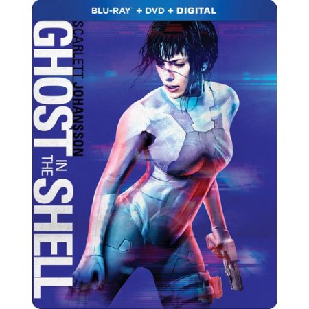
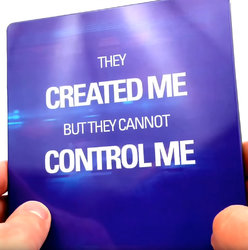
There is no creativity with many steelbooks these days and this clearly shows that the designers are garbage at making a steel with any kind of creative ART WORK! This cover is just Scarlet J. On the front and words on the back which please tell me how is that creative ART? This kind of cover belongs on the standard plastic editions, but not a steel.
Steels are meant to have Art that stands out vividly as well as creatively and by just slapping the main character on the front of the steel with a Quote on the back is not creative at all. That is flat out Lazy on the designers part..... All current Steelbook designers that create these World wide Editions should be FIRED because they have a lazy mind and don't deserve to create steels.
Steelbook ART is not intended to be simple and if you want simple art then put it on the plastic cases, not steels.
Steelbook Art was better 10 years ago then the ones today... The only good steels mostly are the ones that these specialty shops sell, but places like Best Buy have no creativity with their steelbooks and are most the time LAME!
Really, Best Buy Thor Ragnarok gets an ugly almost all red Steelbook when places like BlueFans compliments Thors Vibrant themed colors and makes a way more appealing artistic steel rather then The Bland one Tone Red.
The art chosen for these steels can be a million times better and I'm sure the studio would approve better art versus these lame simple covers need to go away. Even though I enjoy Scarlett J movies, I would never support this crappy steel... This already came out with a way better steel then this and to
re-release this movie with an ugly Steelbook Line is horrible..
Aren't we as humans always suppose to improve from the past. So what happened here? This steel is definitely not an improvement from the first Ghost in the Shell steel which blows this one out of the galaxy.
How do people like this simple crap for a STEEL? A steel is meant to show off nice art and please tell me how just having the main character on a plain background is creative art or art at all? Of course she looks sexy, but this simple cover is meant for the simple plastic case and for a premium steel this simplicity needs to go away.
If the movie name is wrtten on the spine there is no need to write the Title that big on the Front ... The title on the front is ok to have on steels, but it should be small and not distract away from the Art work.. This steel has more words on it then it does Art. SMH
This is the crap products we get when people only care about money and have no passion to be more creative! Thanks, but no thanks. I'll pass on this Steelbook line. SMH


 Luckily my copy was undamaged.
  Come on Amazon get with the program and quit slacking off.