Last edited by a moderator:
Hellraiser Trilogy (Limited Edition with Bust) [France]
- Thread starter diogoffonseca
- Start date
You are using an out of date browser. It may not display this or other websites correctly.
You should upgrade or use an alternative browser.
You should upgrade or use an alternative browser.


Yeah, they have a 1/6th too for more...but the sculpt isn't like this one- this one is dead on!Now that is cool.
Like Neca, they do really good stuff for a good price.
Some of these are incredible. I only wish some of the blu ray sets would have a bit more detail like these do.Yeah, they have a 1/6th too for more...but the sculpt isn't like this one- this one is dead on!
Like Neca, they do really good stuff for a good price.
It would definitely look way better with the pins in it. I think that's why it looks kinda ordinary in those new pics.
I dunno. Just look at the title etching. It looks like it was done by a kid in shop class.
But - I will wait to see final pics.
Yeeaaahhh a bit.....but i still think the pins would make it look pretty cool.
I agree the promo looks a bit better in terms of the painting. Of the new images, the things I think look the worse compared to the promo are the black neck collar, and the base itself that the head is seated on. The promo base is very straight with clean lines, and the Collar of the promo looks exactly like pin heads and the paint looks like patent leather like the actual Pinhead collar. I agree with Elle that I believe it will look a lot better with the pins in place. The lettering on the promo is a little cleaner, but has exaggerated angles and is a bit wavy so the new lettering is ok to me.
Im sure they'll release more pics later when its up for pre order. So hopefully it'll look better then. The pins definitely make a big difference though. Its kinda plain without them.I agree the promo looks a bit better in terms of the painting. Of the new images, the things I think look the worse compared to the promo are the black neck collar, and the base itself that the head is seated on. The promo base is very straight with clean lines, and the Collar of the promo looks exactly like pin heads and the paint looks like patent leather like the actual Pinhead collar. I agree with Elle that I believe it will look a lot better with the pins in place. The lettering on the promo is a little cleaner, but has exaggerated angles and is a bit wavy so the new lettering is ok to me.
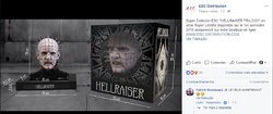
Ca y est!! ....... On l' a enfin reçue !!!! Elle est là ! .........je la tiens à bout de bras......

Alors? Elle vous plaît? On lance la production pour 500 exemplaires numérotés ou on attend 2018?


Alors? Elle vous plaît? On lance la production pour 500 exemplaires numérotés ou on attend 2018?
Last edited:


 That looks soooo bad
  i had high hopes for this


It does look kinda weird right......I think I might also, damn it why'd they mess it up so bad!! The teeth are bothering me so much like he has 2 sets of top teeth hmmmmmmmmmm

couldnt find it on their site
should make the official link available next year.
Similar threads
- Replies
- 4
- Views
- 764
- Replies
- 8
- Views
- 487
- Replies
- 3
- Views
- 784
- Replies
- 55
- Views
- 4K