I searched for a topic on this to no avail but I was wondering... What is your most hated artwork change from what was listed as possible to what was revealed? Mine personally is the Great Gatsby.
From this beauty.

To this ugly.

Pics are welcome so everyone what say ye? Whats your most hated artwork change?
P.S. This is my first thread creation... be gentle")
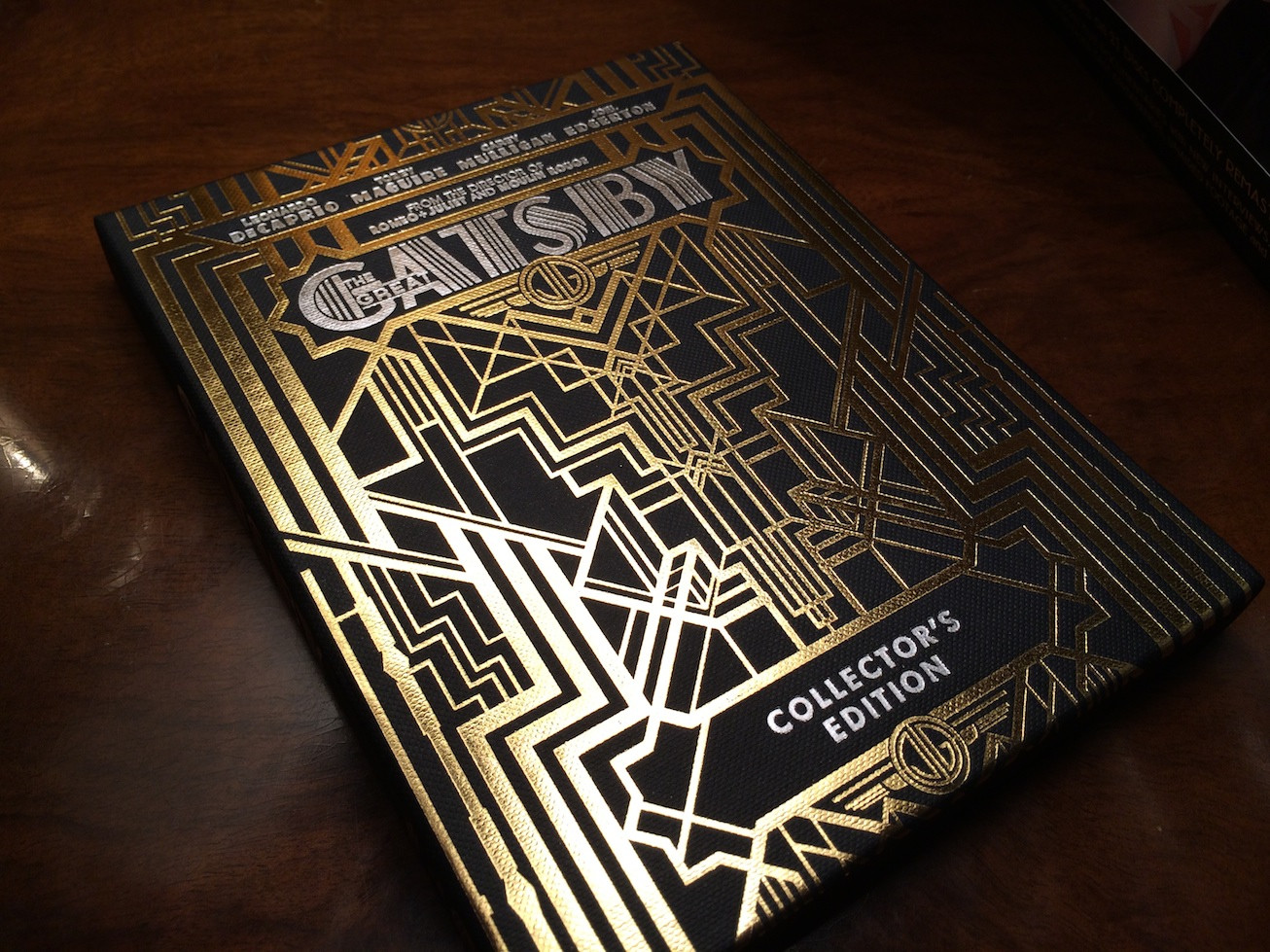
From this beauty.
To this ugly.
Pics are welcome so everyone what say ye? Whats your most hated artwork change?
P.S. This is my first thread creation... be gentle