The Shape of Water (4K and Blu-ray SteelBooks) (Manta Lab Exclusive No.18) [Hong Kong]

IRON MAN

E.D.I.T.H.
Super Moderator
Premium Supporter
Dec 28, 2012
39,387
Everywhere
Release date: October 29, 2018
Purchase links: One Click - Full Slip (4K + BD) - Double Lenti (BD) - Quarter Slip (BD - Exclusive to the One Click Edition) (Pre-order October 5 at 8 PM Hong Kong time) Check your local time HERE
Price: $48.99 (Full Slip) - $43.99 (Double Lenti) - $145.98 (One Click)
Group Buy: hosted by Aniv One Click - Full Slip (4K + 2D) - Double Lenti (2D)
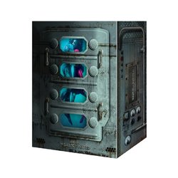
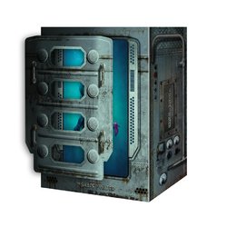
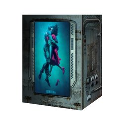
Notes: One Click has a detachable cover with "see-through" PET.
Print run is limited to 2700 numbered copies (Full Slip 1100 + Double Lenti 1100 + One Click 500 sets that include 500 Quarter Slips).

FS_c9a7d6b7-686f-4b86-943e-92f93f8ca427.jpgSOF_DLS_packshot-2.jpgSOF_QS_front.jpg

382224-650dae6d033cf1c26a4bcecfcba89ee7.jpg
382222-059aa5d283deafc59a8a3735200047d5.jpg
382223-b67b1ef2b64b6625fd2c22104c94b93c.jpg
382254-03b1bc12a470e982952a171706b91537.jpg

SOW_FS_F.jpgSOW_FS_bk.jpg
SOW_LTFS_F.jpgSOW_LTFS_bk.jpg
 
Last edited:
I also received my full slip today and have just got around to opening it... honestly, I'm a little disappointed with it. :dunno:

I know a lot of folks don't like holofoil anyway, but I usually don't mind it. However, in this case I find it to look really tacky... it reminds me of that cheap sparkly rainbow effect you get on kids birthday cards lol. The mock-up shows it being a classy gold, so that's obviously what I expected on the final product. The illustration itself looks great, but the holofoil takes away from it as it's really in your face.

As for the steelbook... it's pretty nice overall. I like that they kept it simple with just a debossed title, and I love the colours, especially the red on the front which really pops! But the back is quite dark IMO, although maybe it's one that really must be seen in proper daylight (it's currently nighttime here), so that's probably just my bad.

One thing that's confusing me though... what's with the little Manta "lenti" card? There's absolutely no lenticular effect or depth on this one. :confused:

I genuinely feel like a traitor posting this, because I'm usually a huge fan of Manta's work! Maybe I just expect too much from them nowadays lol. It's honestly the first time I've felt this disappointed with one of their releases though. :(
 
I also received my full slip today and have just got around to opening it... honestly, a little disappointed with it. :dunno:

I know a lot of folks don't like holofoil anyway, but I usually don't mind it. However, in this case I find it to look really tacky... it reminds me of that cheap rainbow effect you get on kids birthday cards lol. The mock-up shows it being a classy gold, so that's obviously what I expected on the final product. The illustration itself looks great, but the holofoil takes away from it as it's really in your face.

As for the steelbook... it's pretty nice overall. I like that they kept it simple with just a debossed title, and I love the colours, especially the red on the front which really pops! But the back is quite dark IMO, although maybe it's one that really must be seen in proper daylight (it's currently nighttime here), so that's probably just my bad.

One thing that's confusing me though... what's with the little Manta "lenti" card? There's absolutely no lenticular effect or depth on this one. :confused:

I genuinely feel like a traitor posting this, because I'm usually a huge fan of Manta's work! Maybe I just expect too much from them nowadays lol. It's honestly the first time I've felt this disappointed with one of their releases though. :(
I can't see it in the posted pics but I guess you're saying the FS is full holofoil but quite subdued. Or do you mean the gold is gold with a holofoil effect?
 
I can't see it in the posted pics but I guess you're saying the FS is full holofoil but quite subdued. Or do you mean the gold is gold with a holofoil effect?
The latter (just the gold areas/text), but it's not even really the holofoil we're used to... the best I can describe it is "multicoloured sparkles" lol.

Kinda like this I guess...

063296-PAPEL-HOLOGRAFICO-FOLIA-31014-40CMX1M-PLATA_5276_1.jpeg
 
  • Like
Reactions: DMD4k
I see, thank you. Shame it's not pure gold, somewhat like TheOn used on Pan's. Rainbow gold lol
Yep, that's what I expected/wanted. I can see what they were going for, but they really should've just stuck with a simple gold foil IMO.
 
  • Thanks
Reactions: DMD4k
Full slip looks boring to me personally. It's just too much text over (what is essentially) the already used WWA steelbook artwork.

I'm not sure white suits the tone of the film either....
I love that illustration, and since I don't have the WWA steel, I just had to have an edition with that art! I thought the gold on white looked really classy in the mock-up, but it didn't even end up being gold in the end, so I honestly regret choosing the full slip now... I'd say the lenti is the winner in this round.
 
  • Thanks
Reactions: BluSteel2012
Yep, that's what I expected/wanted. I can see what they were going for, but they really should've just stuck with a simple gold foil IMO.
I haven't received mine so I can't judge just yet, but it's a fair comment. Gold without this effect would have worked just as well if not better. Manta do love their holofoil!! I'm just glad they use it quite well, at least I tend to like it.
 
  • Like
Reactions: Noodles
Thought I'd try and show it off in one of my infamous crappy videos, and then decided I may as well just show everything whilst I'm at it...


P.S. I just chose a random track for the music, so you might want to mute it. ;)

I thought at the very last second you were about to chuck that Lenti card out the picture. As if to dismiss it in disgust :rofl:
 
  • Haha
Reactions: milky and Noodles
Thought I'd try and show it off in one of my infamous crappy videos, and then decided I may as well just show everything whilst I'm at it...


P.S. I just chose a random track for the music, so you might want to mute it. ;)

wow, the holofoil is super unnecessary and almost ruins it
 
  • Thanks
Reactions: Noodles
I thought at the very last second you were about to chuck that Lenti card out the picture. As if to dismiss it in disgust :rofl:
Haha I actually started tilting it forgetting that there's no effect to be seen, then suddenly remembered, so just dropped it in disappointment. :p

wow, the holofoil is super unnecessary and almost ruins it
Yup, it has actually ruined it IMO. I mean, look how nice the gold foil looks on the envelope... what could've been!
 
  • Haha
Reactions: Mickle_89
I also received my full slip today and have just got around to opening it... honestly, I'm a little disappointed with it. :dunno:

I know a lot of folks don't like holofoil anyway, but I usually don't mind it. However, in this case I find it to look really tacky... it reminds me of that cheap sparkly rainbow effect you get on kids birthday cards lol. The mock-up shows it being a classy gold, so that's obviously what I expected on the final product. The illustration itself looks great, but the holofoil takes away from it as it's really in your face.

As for the steelbook... it's pretty nice overall. I like that they kept it simple with just a debossed title, and I love the colours, especially the red on the front which really pops! But the back is quite dark IMO, although maybe it's one that really must be seen in proper daylight (it's currently nighttime here), so that's probably just my bad.

One thing that's confusing me though... what's with the little Manta "lenti" card? There's absolutely no lenticular effect or depth on this one. :confused:

I genuinely feel like a traitor posting this, because I'm usually a huge fan of Manta's work! Maybe I just expect too much from them nowadays lol. It's honestly the first time I've felt this disappointed with one of their releases though. :(
@Noodles , it's just like having what you think is an ugly baby. Hopefully you'll grow to love it.
 
  • Haha
Reactions: Noodles