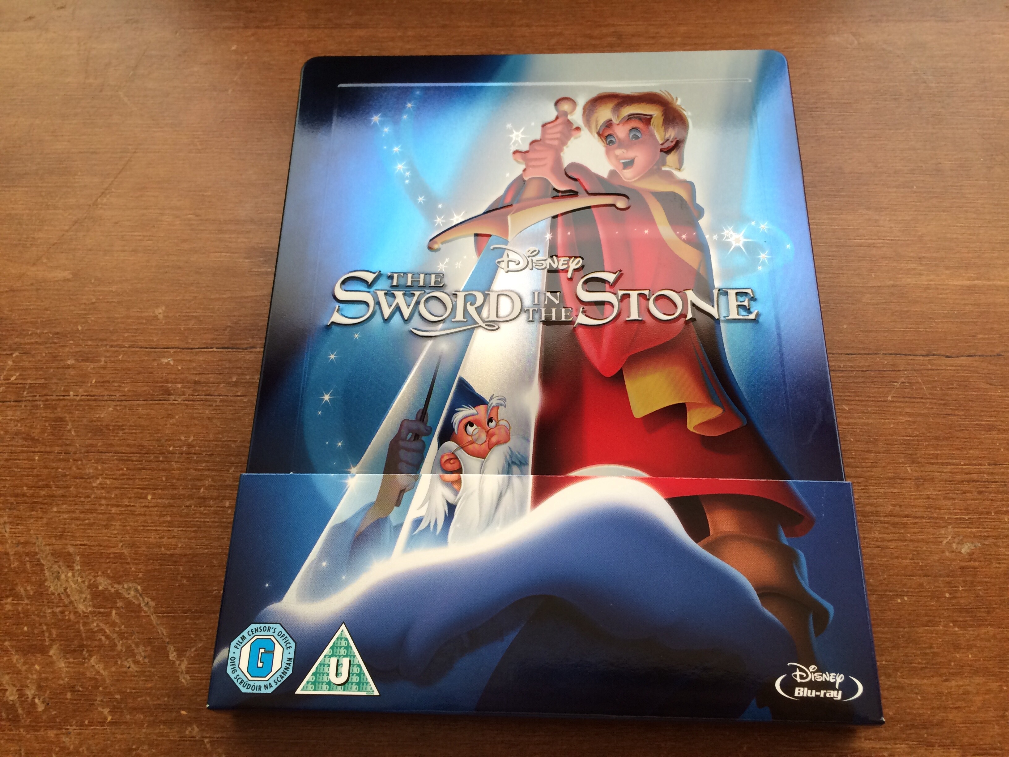
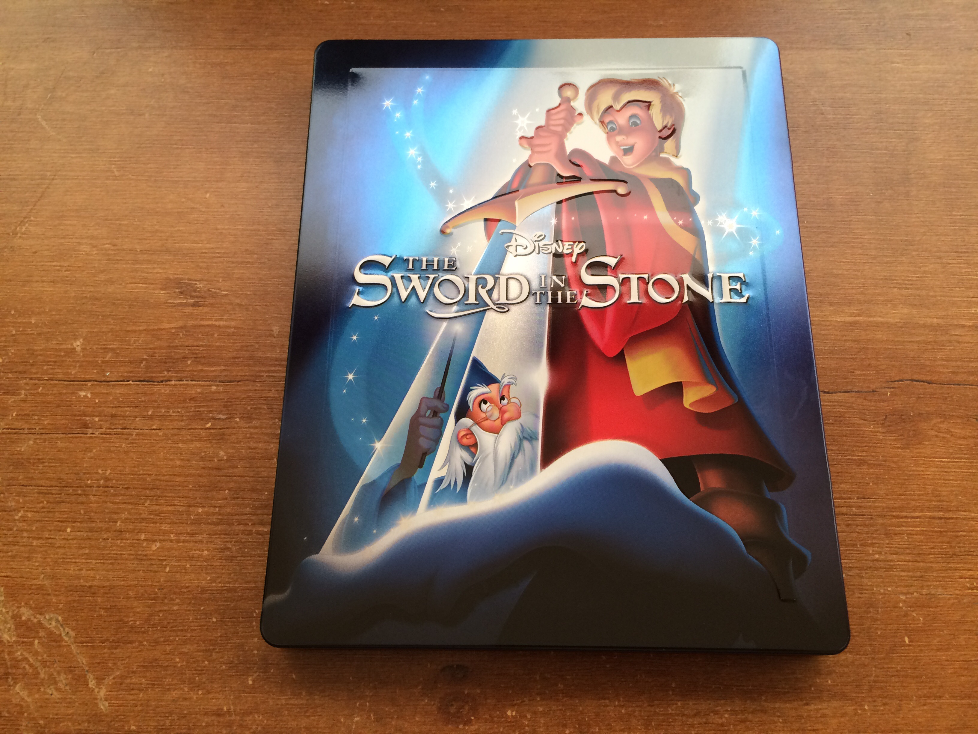
I agree overall its a fantastic series of steelbooks and if your a Disney fan great to have in your collection even if you already have the slipcase versions already
For anyone starting out collecting Disney on Blu-ray its a fantastic way to get a nice collection together
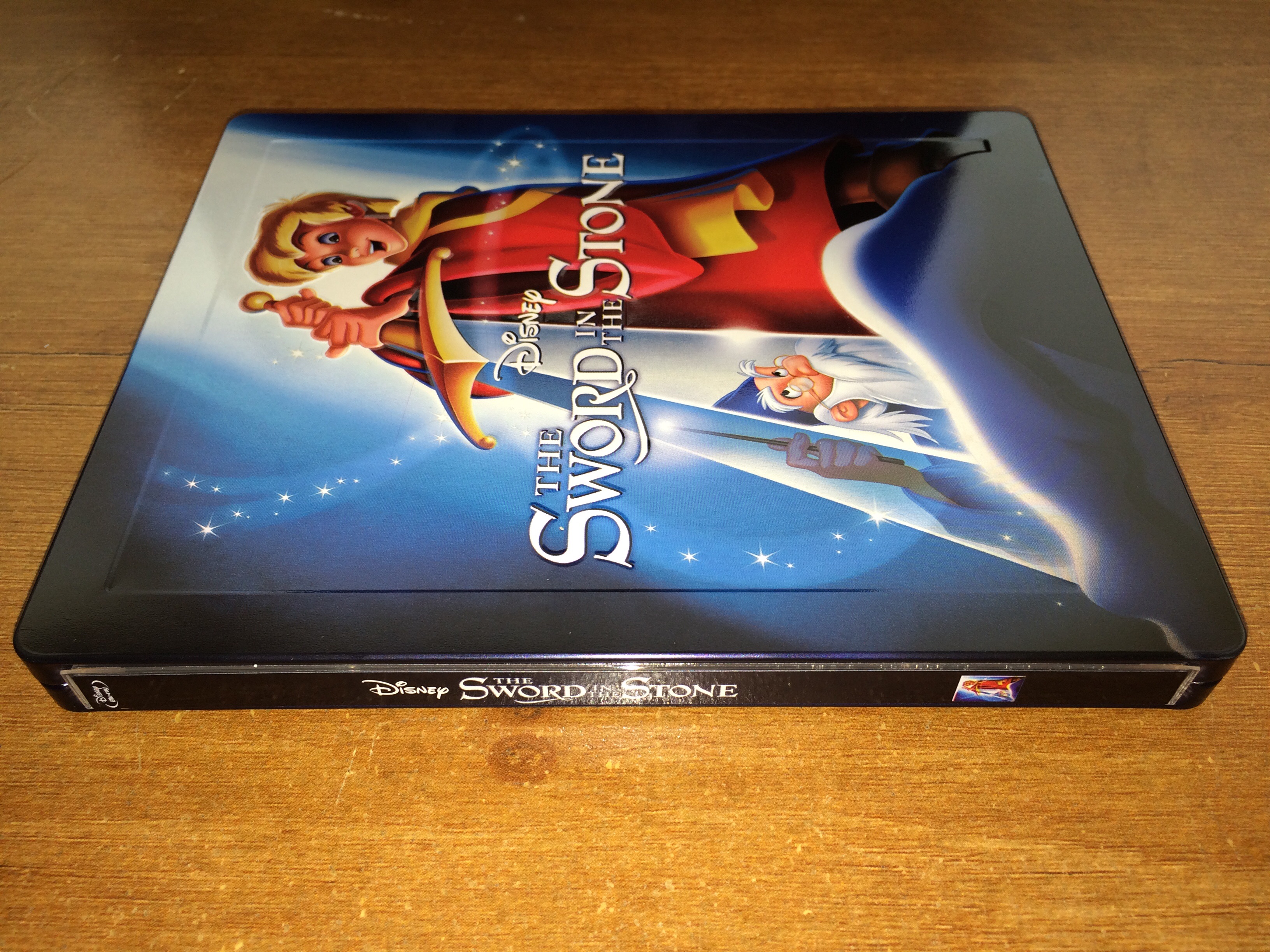
There a few ones that could have been better especially after we started getting the ones with a gloss finish and embossing done very well
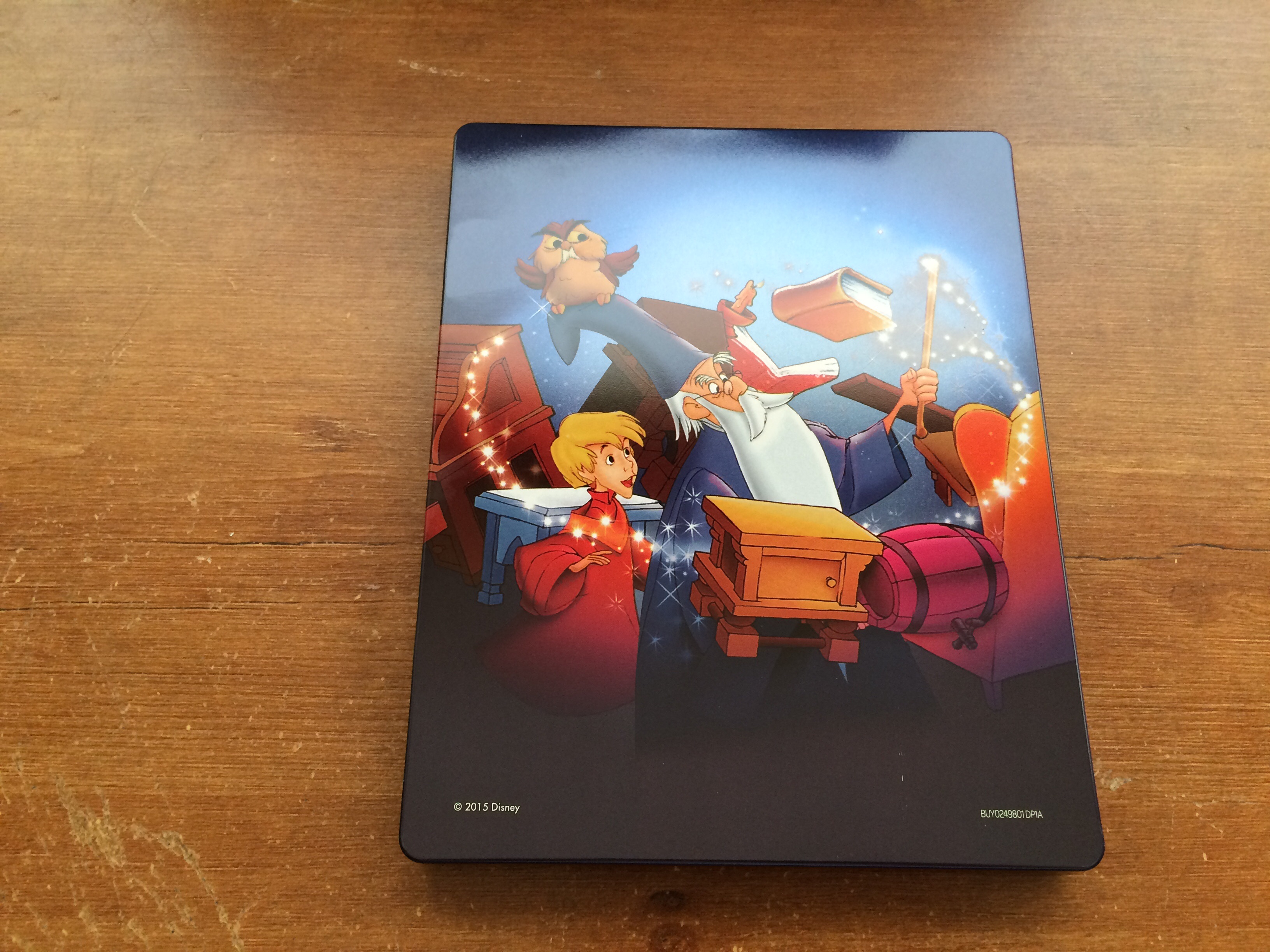
The only weak one really was Fantasia with terrible finish and bad back artwork if that had of been a gloss finish and better back artwork it would have looked fantastic
Planes just ignore that one

it don't count IMO
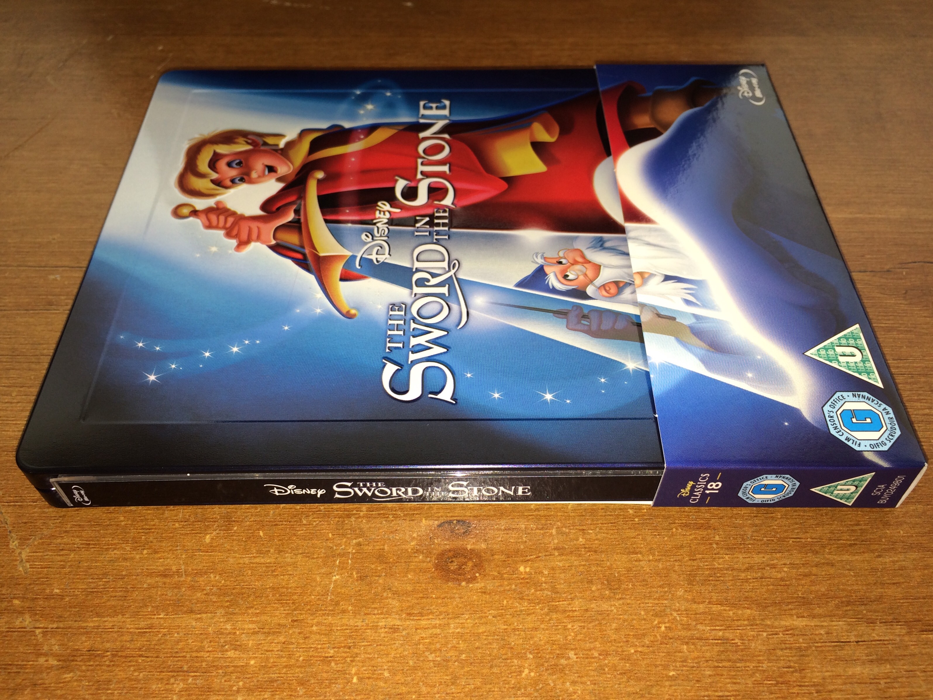
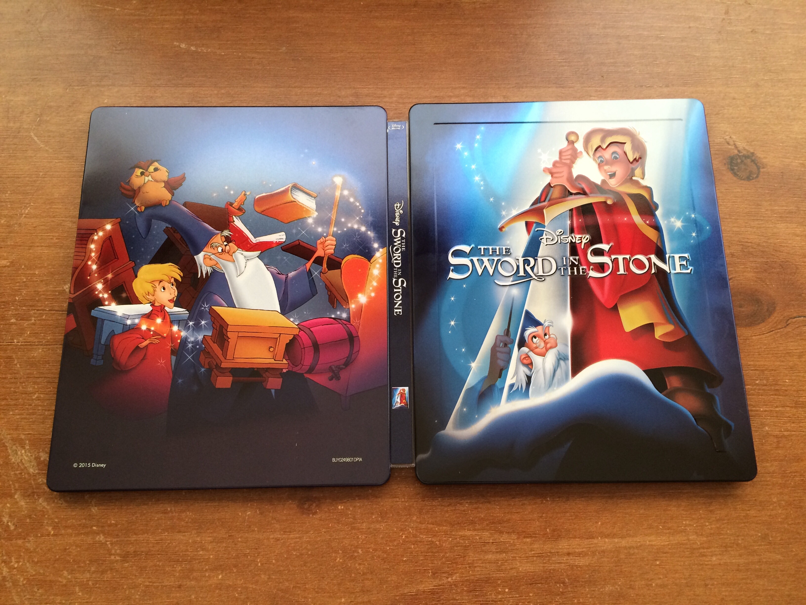
The earlier ones with plain Jcards would have been nicer if they used the same style later Jcards as they way they blend into the artwork looks great
Even some of the matte finish ones are still good and look great but would have most likely been even more amazing if they had of been a gloss finish and the later style Jcards
Mary Poppins I like the way that was done as in hand looks great and is one of my favourite Disney films and its also by the way was Walt Disney most hands on Disney film in making sure it getting released and the one he wanted the most to happen as it was his daughters favourite children's book
If your a Disney Fan its a fantastic way to have a brilliant collection


 otherwise it's great


 How on earth did I forget that masterpiece !