A Clockwork Orange (Blu-ray SteelBook) (Zavvi Exclusive) [United Kingdom]

apsmith21

Operations Director
Staff Member
Aug 6, 2010
29,096
USA
Release Date: 10 February 2014
Purchase link: purchase here
Price: £14.99
Notes: 4k qty confirmed.

clockwork_front.jpg
 

Attachments

  • clockwork_spread.jpg
    clockwork_spread.jpg
    31.6 KB · Views: 281
  • thumb.jpg
    thumb.jpg
    19.9 KB · Views: 327
Last edited by a moderator:
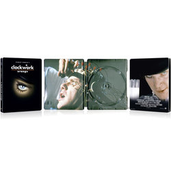
A pass for me with that artwork. Like I've said before, if they are going to stick with that design for the Kubrck releases, they should at least drop the titles and resize the artwork. These images are designes as icons, and should be able to stand on their own without a big title explaining it. Imo that's the only reason to choose that artwork - so you don't need a title, but keep it minimal and clean.

That said, would prefer a redesign with better artwork + title (in its original font)
 
I don't get it. Here is a film that was violent, confronting, and withdrawn from screening by Kubrick himself due to the controversies over copycat killings. It wasn't released again for nearly 3 decades. And here we have a steelbook that seems to strive for banality. Everyone up the production line needs a kicking, preferably with "singing in the rain" playing loud.
 
Last edited:
I can see what's going on here. I think we can pretty much assume the rest of the Kubrick set are coming as well. However, I do feel that they are taking somewhat f a lazy approach towards these releases, recycling the minimal artwork previously offered for the Dvd releases - You'd think that they could have made a bit of effort and come up with different artwork worthy of a SteelBook! A bit of a waste if you ask me...
 
I can see what's going on here. I think we can pretty much assume the rest of the Kubrick set are coming as well. However, I do feel that they are taking somewhat f a lazy approach towards these releases, recycling the minimal artwork previously offered for the Dvd releases - You'd think that they could have made a bit of effort and come up with different artwork worthy of a SteelBook! A bit of a waste if you ask me...

+1 I'll be passing on all...I can't believe for such Kubrick classics that the artwork is so "Photoshop" and naff EEK! Seems an Intern had a go as a 1 week project :(
 
I think I'll stick with my digibook, 2 discs and better art


+1 I'll be passing on all...I can't believe for such Kubrick classics that the artwork is so "Photoshop" and naff EEK! Seems an Intern had a go as a 1 week project :(

There's no way that took a week to do, more like a couple of hours with a long coffee break thrown in.
 
  • Like
Reactions: lolwut and dfoles
Hell, I did my FMJ mockup in like 10 minutes, and I would've been done sooner but I was remoting into someone's computer at work and doing IT stuff.
 
The front is just too busy and there's not nearly enough empty black space. They should make the eye image smaller and, since the designer's shift keys seem to be broken, they may as well lose the title. :rolleyes:
 
  • Like
Reactions: dfoles
It's actually quite striking but I do agree that there is other imagery that is possibly a better fit for this film.

I can pass on this despite it being my favourite film, already have the Kubrick boxset.
 
Definitely should've kept the font from the original movie poster IF they had to put the title at all. I'm with the other ninjas who prefer no title at all. I don't mind the eye, because it's one of the icons that represent the movie so well, but again...No title, bigger eye would've been PERFECT! I am a fan of the black background for the Kubrick series though. However, I would prefer it to be matte versus glossy.