Last edited by a moderator:
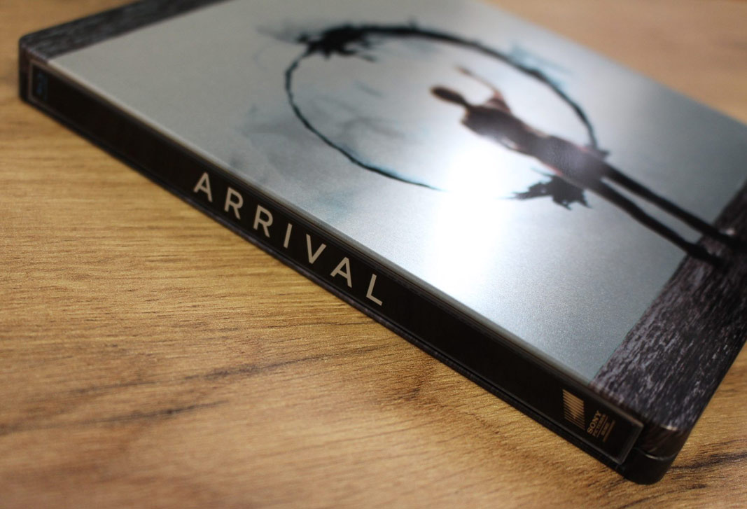
Arrival (Blu-ray SteelBook) (Zavvi Exclusive) [UK]
- Thread starter bigfub
- Start date
You are using an out of date browser. It may not display this or other websites correctly.
You should upgrade or use an alternative browser.
You should upgrade or use an alternative browser.


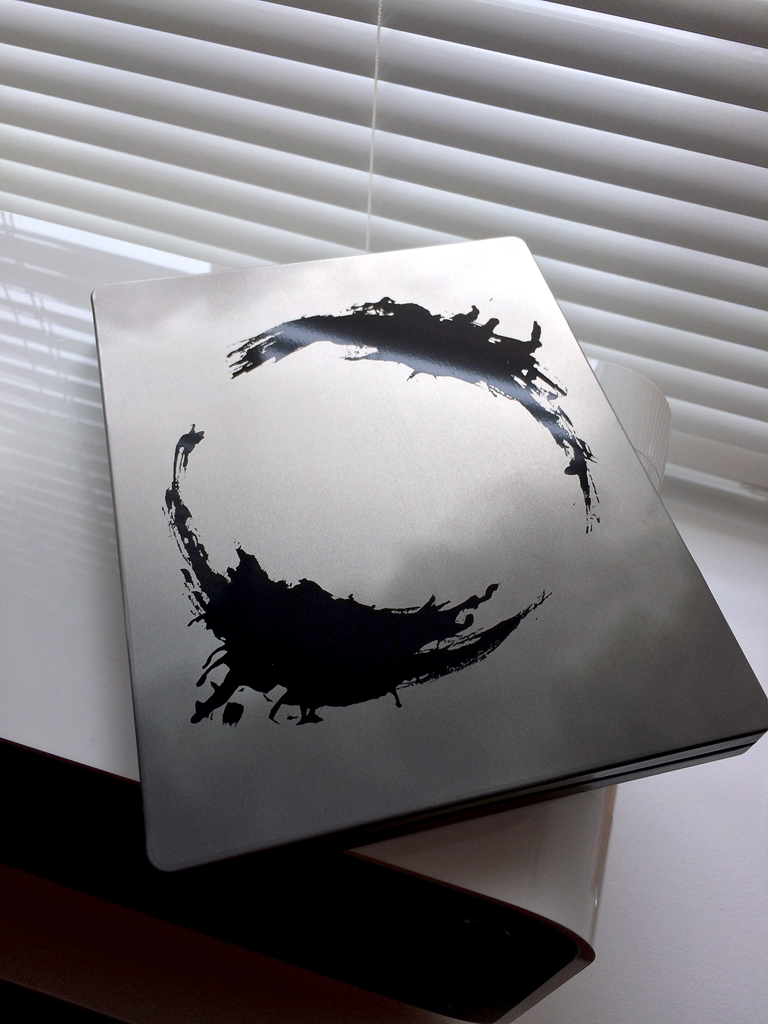
Looks poor, too offset the metallic finish they should have embossed the circular shape, to give it at least a bit more of a premium feel. Charging £23 for that is quite frankly a p**s take.

^ Yes, it is expensive but no more than other new films in steelbooks I could mention.
Yes, the artwork is not to everyone's tastes - as in too simple - but it does perfectly represent the guts of the film . . . in other words, communication with/from the Heptapods.
Yes, the colour is not to everyone's taste but again perfectly represents the smoky background behind glass wall also seen on the other version of this steelbook.
IMO good thing to have a choice and anybody not digging this one can opt for t'other which is probably cheaper anyway")
A quick comparison:-
U.K. from Eone (the kings of wraparound artwork)


Other territories (from Sony):-

Yes, the artwork is not to everyone's tastes - as in too simple - but it does perfectly represent the guts of the film . . . in other words, communication with/from the Heptapods.
Yes, the colour is not to everyone's taste but again perfectly represents the smoky background behind glass wall also seen on the other version of this steelbook.
IMO good thing to have a choice and anybody not digging this one can opt for t'other which is probably cheaper anyway
A quick comparison:-
U.K. from Eone (the kings of wraparound artwork)
Other territories (from Sony):-

Last edited:
Oh this does look so bad!!
Why do the great films get shite steels and shite films get great steels (majority of the time)
I'm actually starting to prefer the other version. Front looks much better but the back messes my eyes up. Lol
Is that one gloss?
Does make me laugh when people look for the oddest reasons behind a silver steel
If this was supposed to represent the guts of the film and be like the ships alien window then the mock up would not of been white.
Hahaha don't make me laugh people. The "designers" (can't believe I called them that) of this monstrosity are laughing at you

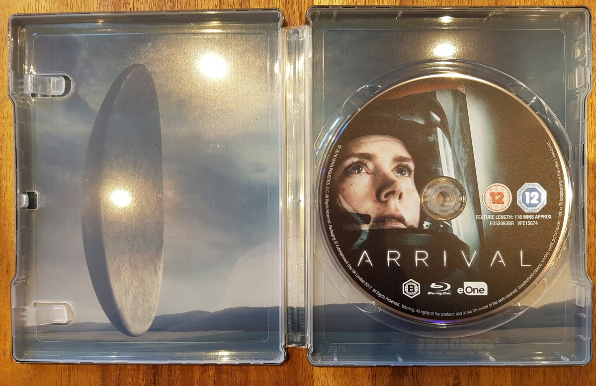
Isn't the window on the front of the WWA steel also silver/bare metal? So if you bash one steelbook for that reason, then you're basically bashing them both. I'd also be pretty annoyed if I hadn't already seen the film and got the WWA steel, since it gives away what the aliens look like... I found it to be a nice surprise when I first watched the film.
Why didn't they use the UK inside for the EU steelbook? That's the perfect steelbook for this movie

The concept looks shite. What's difficult to grasp about that?In a nutshell - as the film is all about COMMUNICATION you have symbols of communication as steelbook artwork.
Not understanding what's so difficult to grasp about that concept.
In your considered opinion . . . and as you obviously haven't bought it then your opinion is worth jack.The concept looks shite. What's difficult to grasp about that?
You don't have to hold dog poop in your hand to know it's crapIn your considered opinion . . . and as you obviously haven't bought it then your opinion is worth jack.
Looks better in hand than in pics is all I can say.
-------------------------------------------------------------------------------------------------------------------------------------------------------------------------------
Only way this could have given the impression of more bang for your buck is for the Heptapod B symbol on the front for "EARTH" to have been embossed with a framing border - as on the mock-up posted earlier - which would of course have meant shrinking the symbol to fit within the frame (if it was designed correctly).
De-bossing the logogram would have enabled it to remain the same size as existing.
Last edited:

Yes, inside artwork is sweet and perfect for the inside, not for the outside and could even make for a decent but boring slipcover.Why didn't they use the UK inside for the EU steelbook? That's the perfect steelbook for this movie
Isn't the window on the front of the WWA steel also silver/bare metal? So if you bash one steelbook for that reason, then you're basically bashing them both. I'd also be pretty annoyed if I hadn't already seen the film and got the WWA steel, since it gives away what the aliens look like... I found it to be a nice surprise when I first watched the film.
Originally this looked good with the white background
Although the other has silver/ bare metal you are also getting a fuller picture. The execution on this is bad. It's like they cut corners
Saying that the other version is ruined by its finish
There's still a difference in bashing because this is full bare metal with faint smog and the other has a smaller portion of bare metal but with some other imagery and colour
originally the mock up looked so much better for this and looked more like the print outs of the symbols. Just worked better on white IMO like ex machina did. Look how people treated that; this could of been the same.
Personally I think the execution works a lot better here than on the WWA steel... they're just two random images with no real consistency from front to back, whereas this one clearly had some thought put in to it as it wraps around to imitate the alien window. Granted they could have pulled it off better by making it white like we'd all hoped, but I still find the design really effective overall. It's definitely one that has to be seen in hand to be fully apreciated though IMO. And at least this has spot-glossing too, which is always a winner in my book!Originally this looked good with the white background
Although the other has silver/ bare metal you are also getting a fuller picture. The execution on this is bad. It's like they cut corners
Saying that the other version is ruined by its finish
There's still a difference in bashing because this is full bare metal with faint smog and the other has a smaller portion of bare metal but with some other imagery and colour
originally the mock up looked so much better for this and looked more like the print outs of the symbols. Just worked better on white IMO like ex machina did. Look how people treated that; this could of been the same.

Personally I think the execution works a lot better here than on the WWA steel... they're just two random images with no real consistency from front to back, whereas this one clearly had some thought put in to it as it wraps around to imitate the alien window. Granted they could have pulled it off better by making it white like we'd all hoped, but I still find the design really effective overall. It's definitely one that has to be seen in hand to be fully apreciated though IMO. And at least this has spot-glossing too, which is always a winner in my book!
I think the UK artwork is more attractive to those who have seen the movie and understand the meaning of the symbols while the EU artwork is more appealing to those who haven't seen it. The symbols alone really confused me until I saw the movie. The EU artwork has a little more context with the people in the pictures. That's just my feeling, I could be wrong.
Personally I think the execution works a lot better here than on the WWA steel... they're just two random images with no real consistency from front to back, whereas this one clearly had some thought put in to it as it wraps around to imitate the alien window. Granted they could have pulled it off better by making it white like we'd all hoped, but I still find the design really effective overall. It's definitely one that has to be seen in hand to be fully apreciated though IMO. And at least this has spot-glossing too, which is always a winner in my book!
I thought this was full gloss?
Basically I didn't like the other version but now seeing pics of this I prefer the other but then that's ruined by a bad finsh and I agree about the back but the front looks better to me now. Catch 22s all around
I'm just bitter because the film was amazing and neither really justify it for me. It deserves much better
I think the UK artwork is more attractive to those who have seen the movie and understand the meaning of the symbols while the EU artwork is more appealing to those who haven't seen it. The symbols alone really confused me until I saw the movie. The EU artwork has a little more context with the people in the pictures. That's just my feeling, I could be wrong.
I've seen the movie, loved the movie, one of my best of 2016 and the U.K. Artwork makes sense to me (with the style they went for) but that is not attractive to me
If it stayed white then it would of been more attractive to me
I'll still pick one of them up at some point because I loved the film but only at a price drop now. Unless a better wea premium comes along
Similar threads
- Replies
- 2
- Views
- 371
- Replies
- 1
- Views
- 235
- Replies
- 0
- Views
- 339
- Replies
- 3
- Views
- 473