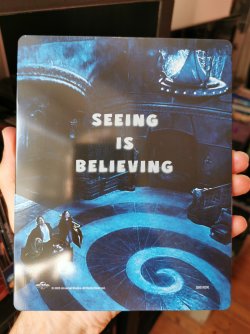
You obviously haven't held a Steelbook with successful metallic effects in your hands yet. The point of a Steelbook is the metallic effects; the white base is not a sign of high quality and should be used very selectively.
Blue looks fantastic with metallic effects. Take a look at the Battleship Steelbook, which is a perfect example of the use of white base. Or, as a more recent example, last year's Atomic Blonde Steelbook, which is truly beautiful.
The ghosts and highlights of the clouds should have been primed in white, because bare metal looks terrible in shades of white.
2.jpeg")