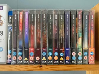
While the lack of consistency is annoying (replacement spines are available), I think the Whittaker logo works well on steelbooks.
I wouldn't have used it personally. I'd have used screen appropriate logos for the steelbooks, even the classic ones. Troughton's font on his, Eccleston/Tennant lozenge on theirs etc. Whittaker's logo on hers.
With 'The Collection', I'd have been torn between screen accurate logos, Hartnell, Baker, McCoy etc. or using the generally accepted Pertwee/McGann one from the front of the DVDs (not the one from the UK spines).
By-and-large, I prefer original fonts (or accepted fonts) when possible.
For Psycho, for example, I accept the cracked font on part 1, even though it didn't appear onscreen until '83 with Psycho II. It was used on original Psycho posters though.
The UK releases of Knight Rider have some new design. I believe the German Blu-ray set will use the original.
You get the point.