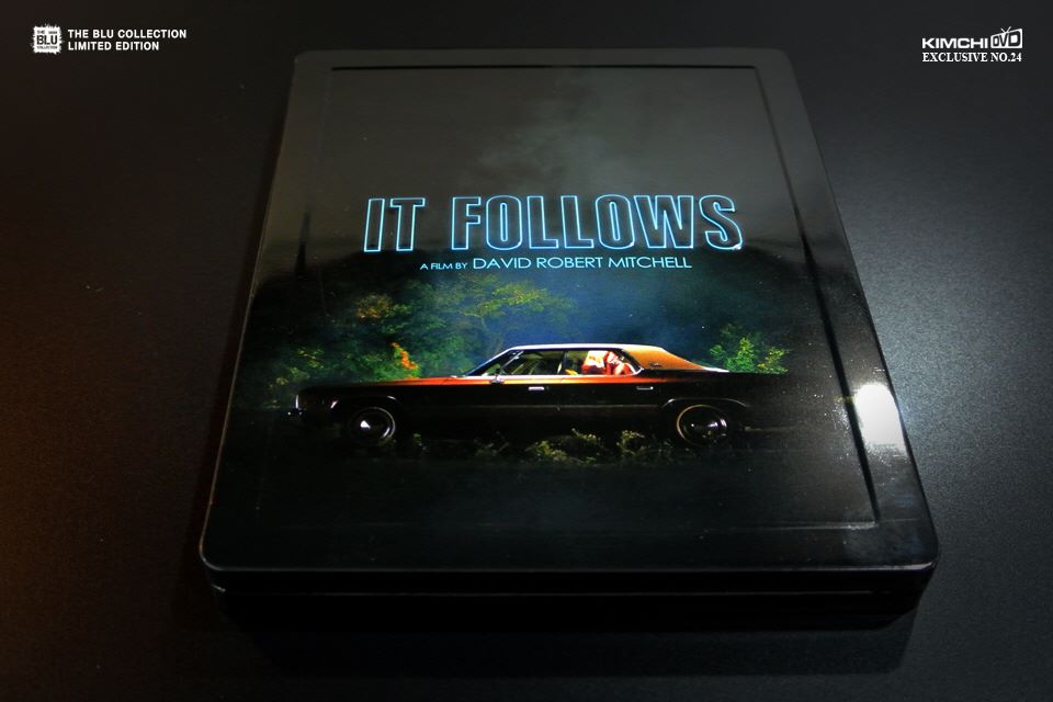
Release date: May 25, 2016
Purchase link: Full Slip (400 copies) OOS - Lenti Type A (700 copies) - Lenti Type B (1000 copies) - One Click (300 copies, matching numbers) OOS - Pre-order May 4 at 2 PM (Korea time) - Check your local timing HERE
Price: $34.99 (Lenti or Full Slip) - $104 (One Click)
Group buy: hosted by Kaka1888
Full Slip | Lenticular Type A | Lenticular Type B


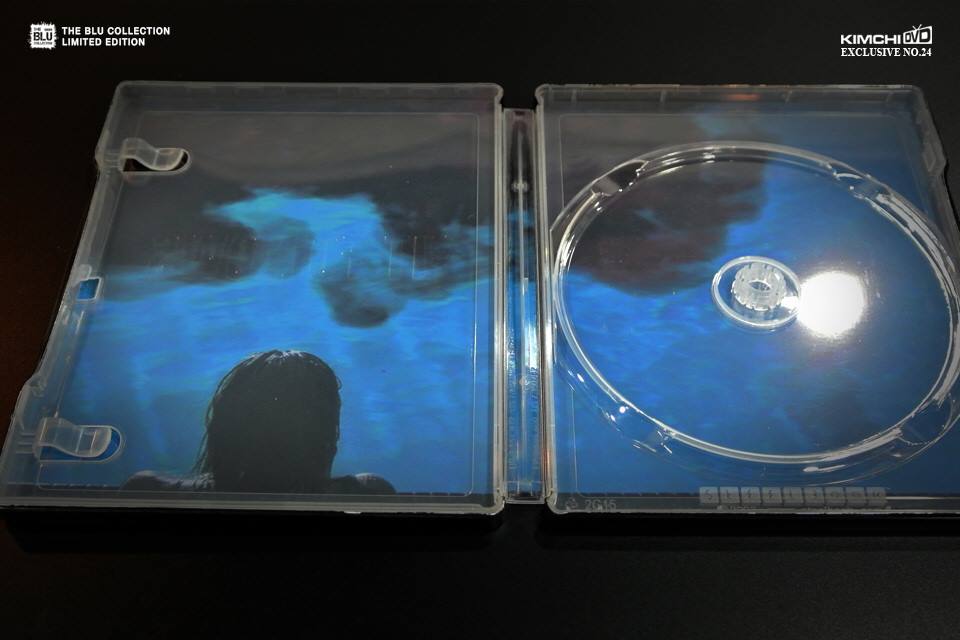
.png")

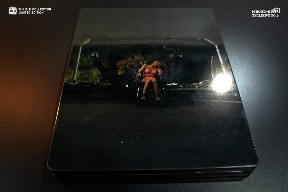
Purchase link: Full Slip (400 copies) OOS - Lenti Type A (700 copies) - Lenti Type B (1000 copies) - One Click (300 copies, matching numbers) OOS - Pre-order May 4 at 2 PM (Korea time) - Check your local timing HERE
Price: $34.99 (Lenti or Full Slip) - $104 (One Click)
Group buy: hosted by Kaka1888
Full Slip | Lenticular Type A | Lenticular Type B
Last edited by a moderator:


 )!
)!


 (I have one in my room