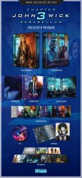
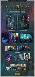
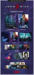
John Wick: Chapter 3 - Parabellum (Blu-ray SteelBook) (Novamedia Exclusive #25) [Korea]

BluSteel2012

Premium Supporter
Jan 4, 2012
23,673
Ireland
Release date: November 15, 2019
Purchase links: Box Set - Full Slip A - Full Slip B - Lenticular - Quarter Slip (Pre-order October 18, 10 PM Korea time) - Check your local timings HERE
Price: $124.99 (Box Set) - $37.99 (Full Slip A or Full Slip B or Lenticular) - $36.99 (Quarter Slip)
Group buys: hosted by Aniv Box Set - Full Slip A - Full Slip B - Lenticular - Quarter Slip
Notes: One click Box Set: $ 124.99 (As same numbered) (500 set) (Includes Full Slip A + Full Slip B + Lenticular O-Ring slip) - Box Set Gift: 48p PHOTO Book, Original Poster - Full Slip A: 800 copies - Full Slip B: 500 copies - Lenticular: 800 copies - Quarter Slip: 400 copies + Extra copies
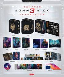
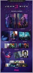
71316826_1945776548859441_2986148838009470976_o.jpg71289731_1945776672192762_8561156305367072768_o.jpg72051210_1945776652192764_3331848006885441536_o.jpg71348719_1945776565526106_7018580657404116992_o.jpg71528133_1945776538859442_6106026632445689856_o.jpg
 
Last edited by a moderator:
You like the change, which is of course absolutely alright. But why is it that weird for you that some other people prefer continuity? Especially when there is actually an existing official artwork which does match "perfectly" and not only "similar".
Take a look at the Game of Thrones Amazon.de exclusive editions. All seasons have dark splines but season four, which is yellow. You have no idea what a **** storm it triggered. It just doesn't look right on the shelf. Many even got the regular slip edition instead just to match the others.

But hey, is it a first world problem? Yes it is :LOL:
 
You are right - there is an existing image that would've matched up (even if it is a reused John Wick 2 image) but have you seen how 'busy' that image actually is? There is a good chance it would've been a blurry mess which maybe is another reason they didn't opt for it
 
  • Like
Reactions: hatredhorror
You are right - there is an existing image that would've matched up (even if it is a reused John Wick 2 image) but have you seen how 'busy' that image actually is? There is a good chance it would've been a blurry mess which maybe is another reason they didn't opt for it

I know what you mean. Maybe you are right, and it's too busy. Or maybe the pattern works perfectly in a lenti because it's deeper in the background. Who knows...
But I remember from a earlier post here that the reason they didn't opt for it was because "it's not an IMAX artwork" or something like that, which I couldn't really understand.
 
I agree. The lenticular is similar enough to be passable with the other two. As I've said previously.. It's not like they completely changed it up by having say the orange and purple poster artwork for the lenticular.

As I've also said.. There is no guarantee the next film and potentially any subsequent John Wick movies would even have an official artwork with him aiming down a barrel of a gun in which case the continuity could be derailed sooner or later anyway.
You like the change, which is of course absolutely alright. But why is it that weird for you that some other people prefer continuity? Especially when there is actually an existing official artwork which does match "perfectly" and not only "similar".
Take a look at the Game of Thrones Amazon.de exclusive editions. All seasons have dark splines but season four, which is yellow. You have no idea what a **** storm it triggered. It just doesn't look right on the shelf. Many even got the regular slip edition instead just to match the others.

But hey, is it a first world problem? Yes it is :LOL:
Do I love the lenti here - heck yes
Do I wish they kept the 'barrel of a gun' artwork for continuity - absolutely
Am I pissed about the change - no, just a tad disappointed whilst also loving what we are going to get - am on the fence as both will please me.


As for changing things up, I figured thats what the Fullslips are for. I mean the first movie didnt even have artwork as such, it was text(and bloody beautiful at that).

But @Covcraig is right - we might not even get any official artwork to match the 'staring down the barrel' style but as we did for Parabellum, it would have been nice to continue the trend for the lenti's at least as it is going to be a tad jarring having the first two match so perfectly and the next ones, not so much(they will match in a way and the colour scheme is persistant at least)
 
  • Like
Reactions: yy0925 and Covcraig
That art just don’t translate correctly on a lenti. Rain looks good and that’s it. Should of used that art on a full slip with nice finishes. Would of been all over it
 
  • Like
Reactions: K.i.T and DMD4k