Don't think the artwork is that bad, but agree the back is better than the front. I have this and the German mediabook on order, absolutely loved this movie at the cinema!
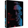
Even with gloss I can't see this looking that good. The front artwork just doesn't work for me. It didn't help that there were a lot of amazing artworks with vibrant neon colours. I think this is a let down in comparison to what I was expecting.
How the hell did that get chosen over so many good ones. I mean the front looks horrible with the picture, it really doesn't work with that effect over it
I think he should go over it again....whoever picked it.
Wow. It seems that the Director does not understand the steelbook market.
Rule #1: If there is a plethora of amazing entries from which to choose (and there was), then it would be a smart idea to pick one of the amazing entries.
Just what I wanted I steelbook with fickin flowers all over it.
This could have been an absolute belter up there with Drive but we get this wtf.
Really wanted this to go with Drive and Place Beyond the Pines, I keep clicking on Zavvi's website trying to convince myself I like it, but end up closing the page shaking my head.
Can't see this selling out any time soon if it come down in price I may pick it up then.
^ Lol sorry to laugh redlemon but your opening gambit was too funny .
Come on though you gotta admit the back is kind of unique looking - you don't see that sort of art everyday on a steelbook, and I like the way he incorporated the dragon into it. I'm kind of intrigued to see actual pictures of it :movie:
I actually really like the artwork... but then I never saw any of the other entries. Glad I enjoyed the film too, because I'm sure I'd be tempted to get it even if I didn't.


 .
. 
 I'll pass on this one