Doctor Who - Series 4 (Blu-ray SteelBook) [UK]
- Thread starter Strangerbyday
- Start date
You are using an out of date browser. It may not display this or other websites correctly.
You should upgrade or use an alternative browser.
You should upgrade or use an alternative browser.


Just pre-ordered this on Zoom with the 10% off code to make it £21.59. Glad they have kept the trend with this series at least.
Ordered!
And I don't know if anything can be done about the logo this time, especially without Chibnall having a hissy fit.
And I don't know if anything can be done about the logo this time, especially without Chibnall having a hissy fit.
Interestingly, Season 3 actually came out after the new Whitaker logo rebranding and the word from BBC worldwide was that on-going releases (like the S1-4 steelbook wave) would not be affected by the Whitaker rebranding.
On Twitter the designer has said she didn't do the spine, that was the BBC.
Purchased from zavvi as amazon wouldn’t let me buy it Once I get the season 4 steelbook that’s my collection of new Who complete Zero interest in anything after season 4 Now if they could only give us the classic Who in steelbook form with the correct Logopolis

Got my order in at Amazon. I'm hoping they release the Tennant specials in November/December & that'll close out the Tennant years.
I've got to wait around 10 days until I can pick up my copy (I don't get parcels delivered to my address - well not if I want them to still be there when I get home...)
So can someone very kind pop up some piccies for me to keep me going?
So can someone very kind pop up some piccies for me to keep me going?
happy days. ") your wish is my command, @Evil Genius.
your wish is my command, @Evil Genius. 
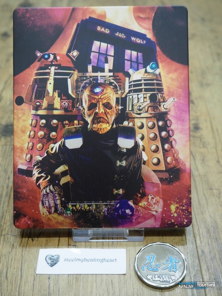
first gripe out the way. why use the new logo for the new season and new doctor on a Tennant series. baffling decision, leads to the great juxtaposition of a different logo on the series on screen than on the packaging. nice one, guys. anyway, what's this release like? unsealed front and back shots, with the j-card details:
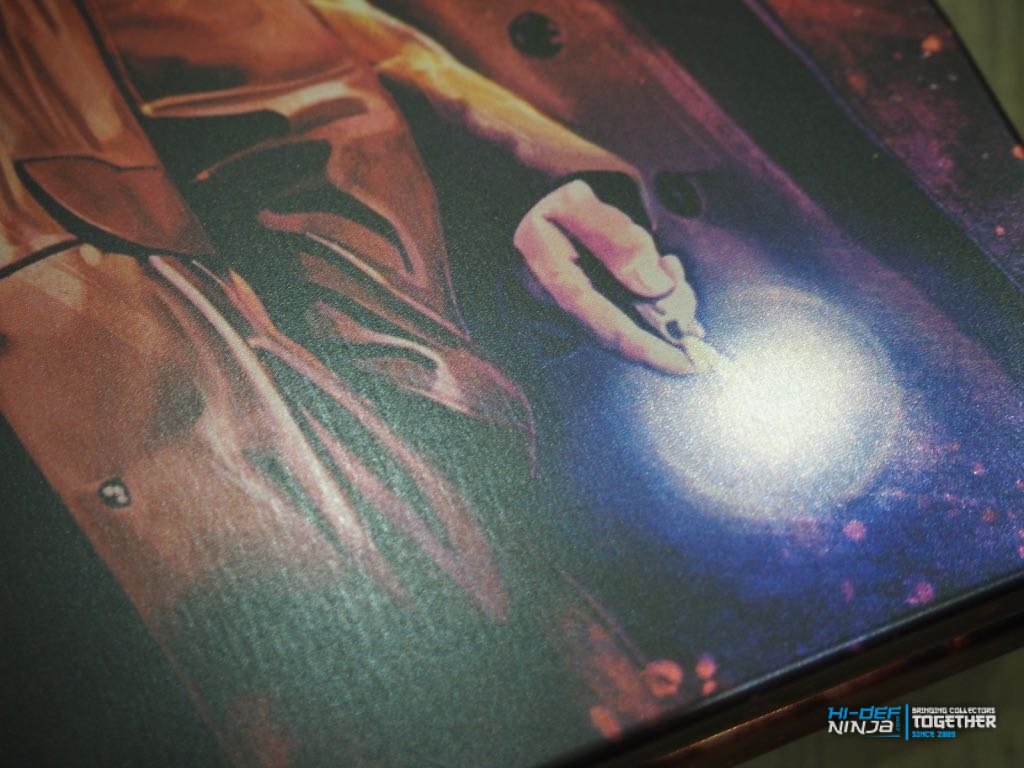
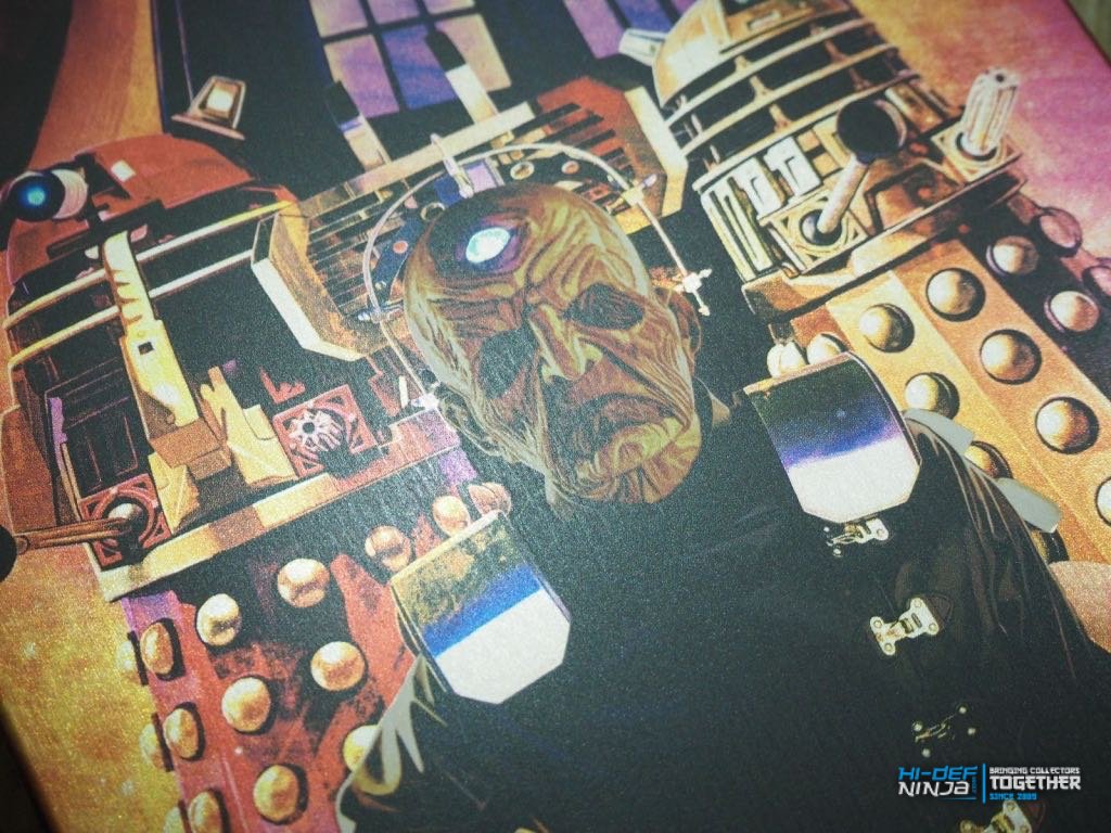
after initally being pretty happy, a closer look at the front and back artwork and we get to my second gripe. it's a streaky matt finish with some occasional light spot glossing, most notable on Davros. actually, the back is better, for me. plus on the front, Tate just looks to be smirking at my inability to delete the accidental double media post i made. 
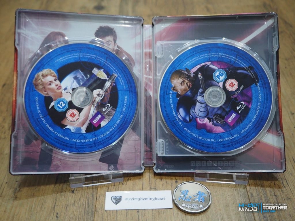
the discs are easily stacked and easily prised free, plus they have not made the mistake they made on the Season 10 release where every disc had the same artwork (which was super lazy). the inside art itself is a slightly odd, stagey shot, but works well enough for an inner:
i'm glad they are keeping the title-less artistic steebook artworks, in that they are keeping with the initial releases, but still wish they had kept to the more painterly style of the Season 9 (still missing from my collection, likely for ever  ) and 10 releases. that said, i don't mind these ones, or this artist. but that logo...
a must for completionists (here, sir!), but only really an average release.
your wish is my command, @Evil Genius. 
first gripe out the way. why use the new logo for the new season and new doctor on a Tennant series. baffling decision, leads to the great juxtaposition of a different logo on the series on screen than on the packaging. nice one, guys.
anyway, what's this release like? unsealed front and back shots, with the j-card details:
 plus on the front, Tate just looks to be smirking at my inability to delete the accidental double media post i made.

 ) and 10 releases. that said, i don't mind these ones, or this artist. but that logo...
a must for completionists (here, sir!), but only really an average release.
happy days.
first gripe out the way. why use the new logo for the new season and new doctor on a Tennant series. baffling decision, leads to the great juxtaposition of a different logo on the series on screen than on the packaging. nice one, guys.
after initally being pretty happy, a closer look at the front and back artwork and we get to my second gripe. it's a streaky matt finish with some occasional light spot glossing, most notable on Davros. actually, the back is better, for me.
the discs are easily stacked and easily prised free, plus they have not made the mistake they made on the Season 10 release where every disc had the same artwork (which was super lazy). the inside art itself is a slightly odd, stagey shot, but works well enough for an inner:
i'm glad they are keeping the title-less artistic steebook artworks, in that they are keeping with the initial releases, but still wish they had kept to the more painterly style of the Season 9 (still missing from my collection, likely for ever
a must for completionists (here, sir!), but only really an average release.
Sadly the BBC applied the new logo not the designer. They've also changed designer every couple of releases so we're lucky to get the slight consistency we have with these six or so releases.
My biggest gripe...the spine is different than the first three seasons they have already released.
I’m happy to get it I only wanted the 1st four seasons Zero interest in the rest so I’m one happy camper
Similar threads
- Replies
- 31
- Views
- 2K
- Replies
- 4
- Views
- 835
- Replies
- 12
- Views
- 1K
- Replies
- 14
- Views
- 2K