Last edited by a moderator:
Kubo and The Two Strings (Blu-ray SteelBook) [Italy]
- Thread starter bradipolpo
- Start date
You are using an out of date browser. It may not display this or other websites correctly.
You should upgrade or use an alternative browser.
You should upgrade or use an alternative browser.


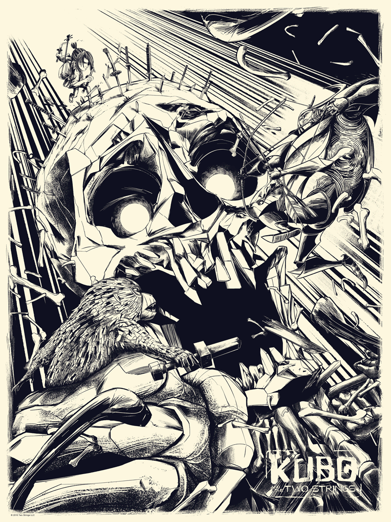
I really want a steel for this, but I'm not sure about that artwork... it looks like some really rough/unfinished concept art.
Woah! Been waiting for a steel for this but really didn’t think one would happen. Hopefully will include the 3D disc too.
Actually, looking at it more, I do like this artwork. Nice balance with the circles on front and back, good thematic hints of storm turning to beauty, nice clean typography on the spine. And I always love a wraparound cover. A quick scan of the official posters (ahem... I said "A quick scan of the official posters," @virkia) doesn't turn up anything particularly inspired. So something original will be just fine with me.
Is it too early and foolish to hope for an HDZ Silver?
Is it too early and foolish to hope for an HDZ Silver?
Nice! I was glad to have snagged the Best Buy Ultimate Laika 4 Movie Collection that was quietly released. But definitely thought Kubo deserved it's own steelbook.
edit: wrong link... whoops
edit: wrong link... whoops
Last edited:
I love the film, but I don't like the artwork at all") Hope they change it some like...
Hope they change it some like...


and for postcards maybe?

Hope they change it some like... and for postcards maybe?
Charmingly idiosyncratic Impressionist painterly artwork reminding me of a bit of a couple of oils on board in similar style at home . . .


. . . as well as morphing creature prints by Escher . . . with the waves here morphing into gulls/doves(?):-
Escher's "Metamorphosis II" .......................................................................................................................... and "Night and Day"


@ethnosax - as for the official images: not a fan of the majority . . . and not a fan of the Mondo poster either . . .
. . . but I do quite like these two in Japanese print style - one on the left clearly inspired by the official poster alongside ............................ and the other (which is maybe too elegant for the steelbook and not "popular" enough):-

 ......................................................................

The KUBO Mondo poster variants morphing:-
. . . as well as morphing creature prints by Escher . . . with the waves here morphing into gulls/doves(?):-
Escher's "Metamorphosis II" .......................................................................................................................... and "Night and Day"
@ethnosax - as for the official images: not a fan of the majority . . . and not a fan of the Mondo poster either . . .
. . . but I do quite like these two in Japanese print style - one on the left clearly inspired by the official poster alongside ............................ and the other (which is maybe too elegant for the steelbook and not "popular" enough):-
The KUBO Mondo poster variants morphing:-
Last edited:

I tried watching this film and I lost interest and fell asleep after about 20 mins! My 10 year old even ended up turning it off eventually!
It's soooooooo boring!!! This is from someone who LOVES animation by the way....
Just could not get into this one.
It's soooooooo boring!!! This is from someone who LOVES animation by the way....
Just could not get into this one.
Sure, these are all just opinions, there's no right or wrong.I tried watching this film and I lost interest and fell asleep after about 20 mins! My 10 year old even ended up turning it off eventually!
It's soooooooo boring!!! This is from someone who LOVES animation by the way....
Just could not get into this one.
But in this case, you are wrong.
")
I tried watching this film and I lost interest and fell asleep after about 20 mins! My 10 year old even ended up turning it off eventually!
It's soooooooo boring!!! This is from someone who LOVES animation by the way....
Just could not get into this one.
I mean it's not Pixar if that's what you were looking for. 20 mins isn't really giving it a fair shake.. you should give it another go when you're less sleepy and in a more relaxed mood. It has plenty of fans for a reason
 .
.I watch all types of animation. I was even very close to becoming an animator myself at one point.I mean it's not Pixar if that's what you were looking for. 20 mins isn't really giving it a fair shake.. you should give it another go when you're less sleepy and in a more relaxed mood. It has plenty of fans for a reason
I loved Coraline. But I think if a film doesn't grab your attention and hook you in within 20 mins then theres a problem with the pacing.
Remember, this film is primarily aimed at attention span challenged little men and women also!
I must try and give it another chance some time...
The Ferguson poster does look pretty good on a steelbook, actually. ") I don't know what to put on the back, but here's an idea for the front, at least:
I don't know what to put on the back, but here's an idea for the front, at least:

I don't know what to put on the back, but here's an idea for the front, at least:The Ferguson poster does look pretty good on a steelbook, actually.
View attachment 357836
Wow. ^ This is the ideal artwork for this release....
But if that's not possible- I'll take what's listed. I personally like this type of art style as opposed to the clear styles that all the posters have had.
Now I'm just hoping for a). A domestic release and b). a title on the front.
Good news, hope there’s more to come from Laika, loved all their works... speaking about animation, now can someone doing proper Mr. Fox steelbook, please..?
Similar threads
- Replies
- 1
- Views
- 432
- Replies
- 1
- Views
- 428
- Replies
- 0
- Views
- 397
- Replies
- 1
- Views
- 500