Psycho (Blu-ray SteelBook) (Zavvi Exclusive) [UK]
- Thread starter paulboland
- Start date
You are using an out of date browser. It may not display this or other websites correctly.
You should upgrade or use an alternative browser.
You should upgrade or use an alternative browser.


It looks like a stock photo of a plug hole with a bit of photoshop blood. I think Mondo should probably try their hand at this, would like to see their take on it.
great, a UK steel for the original!  but that front artwork, i don't like.
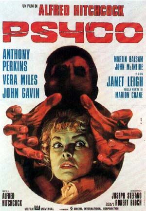
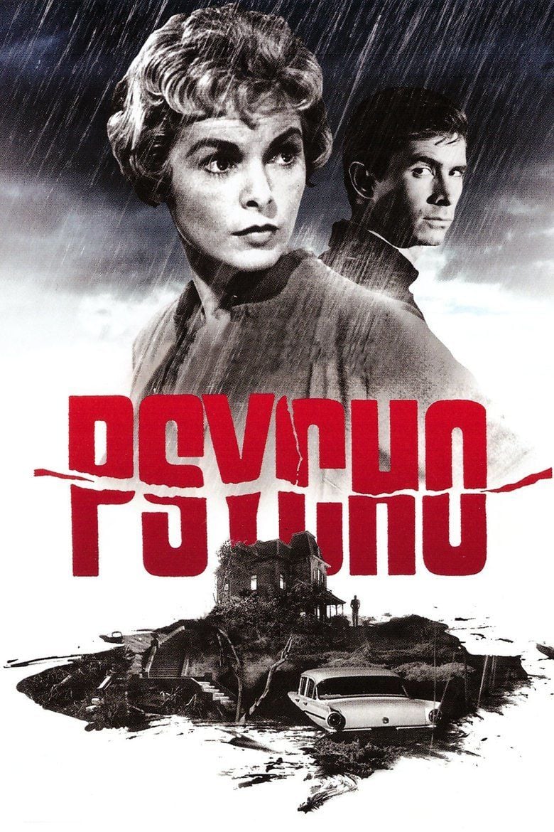
  sure, in a way it's the prototype slasher film, but it's not Friday 13th - this is a careful, considered psychological portrait. there's so much great artwork they could have used for the steel. admittedly the official cinema release poster is just 'look at Janet Leigh in her underwear' - and i am happy to do so - but the best they could come up with was a bloody drain?
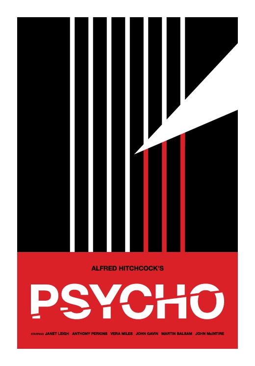
you could have had a super-graphics approach
 or
or
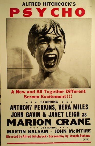
 or one of the multitude of classic posters:
 or
or
 but instead we get a drain in need of a janitor.
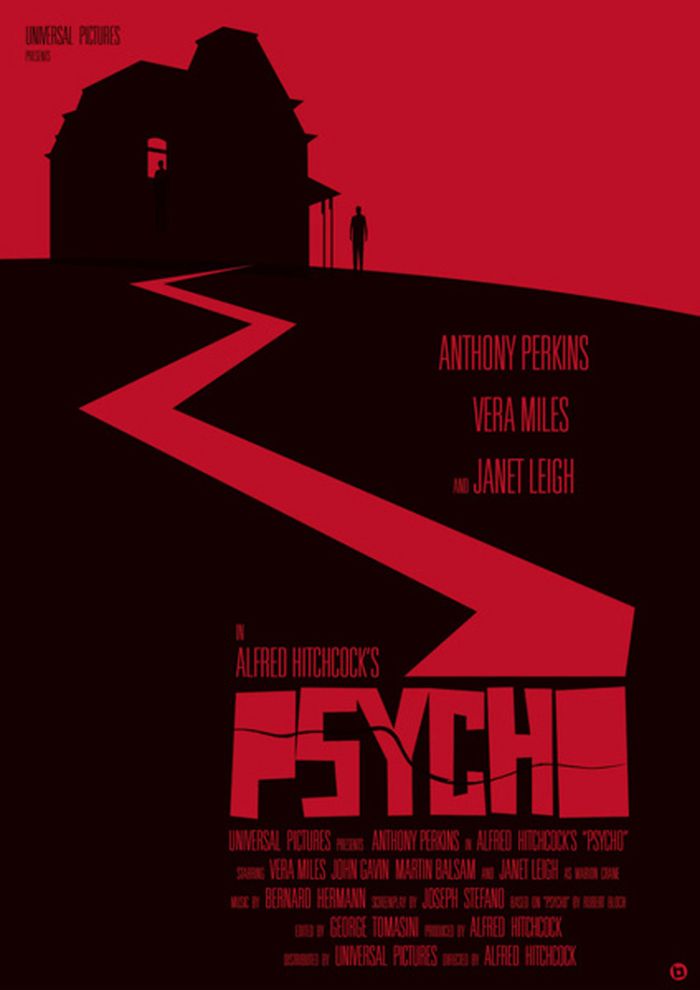
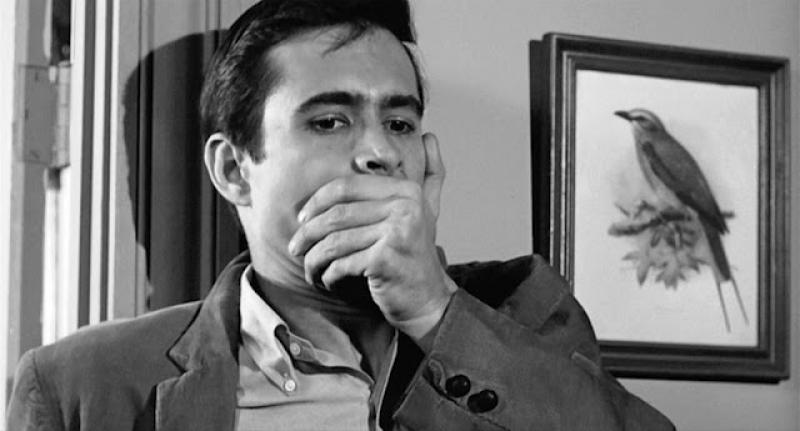
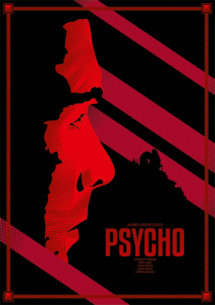
personally, i would have liked something like this for the back. the Hitch silhouette has been done a lot before. i like it when the artwork intrigues, but doesn't assume anyone picking it up has seen the film.
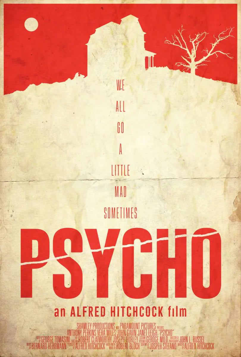
 or they could have varied the silhouette and used something like this:

in case you hadn't guessed, for me, this is an absolute classic, and it deserves the best possible approach. another missed opportunity for me. but hey, at least it's not the Gus Van Sant version!
but that front artwork, i don't like. sure, in a way it's the prototype slasher film, but it's not Friday 13th - this is a careful, considered psychological portrait. there's so much great artwork they could have used for the steel. admittedly the official cinema release poster is just 'look at Janet Leigh in her underwear' - and i am happy to do so - but the best they could come up with was a bloody drain?you could have had a super-graphics approach
personally, i would have liked something like this for the back. the Hitch silhouette has been done a lot before. i like it when the artwork intrigues, but doesn't assume anyone picking it up has seen the film.
in case you hadn't guessed, for me, this is an absolute classic, and it deserves the best possible approach. another missed opportunity for me. but hey, at least it's not the Gus Van Sant version!
I actually really like the front art... it's pretty creative IMO. I don't currently own a steelbook for the film either, so I'll more than likely pick this up if the price isn't too bad.
as i also don't own a steel of this, the irony is not lost on me that for all my ranting, i'll probably grab this as well if the price reaches an acceptable level.I actually really like the front art... it's pretty creative IMO. I don't currently own a steelbook for the film either, so I'll more than likely pick this up if the price isn't too bad.
Already own the original release so no point,
what is it with all the re releases when there are so many great movies they could fetch out ?
what is it with all the re releases when there are so many great movies they could fetch out ?
To be honest, the film is still yet to receive the treatment it deserves IMO... whether that be a better looking steelbook (obviously with great artwork both on the front AND back) or a premium edition, which would be pretty cool!as i also don't own a steel of this, the irony is not lost on me that for all my ranting, i'll probably grab this as well if the price reaches an acceptable level.
Yet another re-release! Got the original way back when it was £9.99.......... yep.... that was a lot back then for a steelbook!!!! Lol!
These were the days..................
These were the days..................
I'm sure it'll be £15.99 like most back catalogue releases. I'll wait for it to go to 9.99. Then I said that about Short Circuit and still haven't ordered it and its now £8.99. #tightgit
or they could have varied the silhouette and used something like this:
I'd have gone with a design like this but with a smaller portrait of Janet Leigh instead of Hitchcock. I don't like seeing the director as part of the art, it just seems weird to me - but for some reason it seem popular with Hitch's films.
The creepy house should be ESSENTIAL with any Psycho art though - and no I don't count that crappy pop-art version. This new zavvi steel is just pointless garbage though to me, and the thing with the blood spelling out Psycho has already been done once

One great film, 3 terrible steelbooks
Chocolate syrup actuallyI don't mind the concept of the artwork, but the blood looks like motor oil.

Quote:-
"Hitchcock has said that one reason he shot Psycho in black-and-white was because he thought the bloody murder might be too much for audiences. He used chocolate syrup as the blood swirling down the drain. Nevertheless, some audience members swore the scene was in color and that they saw red blood."
------------------------------------------------------------------------------------------------------------------------------------------------------------------------------------------------------------------------------------------------------------------------------------------------------------------
Quite like the clever artwork and an all white steelbook with spot glossed "blood" should look just fine in the flesh (lol) and probably has the edge on some of the modern poster takes on the film.
Of the original posters I'd pick this as my favourite:-
. . . as the other good 'un has been used already on the previous U.K. release:-
. . . and apart from those two there doesn't seem to be as many great "Psycho" poster design out there as there are for any number of other Hitch classics with Saul Bass or Saul Bass inspired artwork . . . with even those not covered in masses of print not great for steelbook cover art (imo).
(For great original poster artwork you won't find better than the ten WB classic steelbooks released here in the U.K. in January, 2013).
At least it goes well with this other creative and artistic Hitch steelbook:-


Not really a fan of the U.S. Iconic Art steelbooks (although I'm thinking these could look good as a collection . . . not just the odd one looking out of place by itself) but I don't mind the first U.K. and the similar German horizontal releases in spite of the then fashion of printing most of the info directly on to the steelbooks).
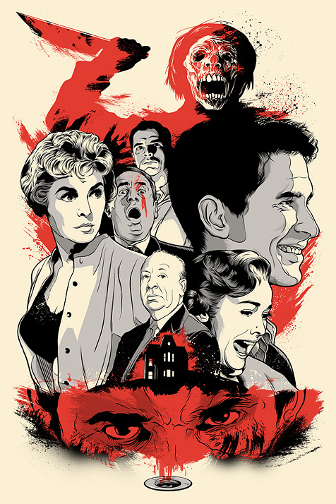
As for a modern take on the film poster to celebrate PSYCHO's 55th Anniversary a couple of these at least are first rate:-
II
V


============================================================================================================================================================
Poster art by DANIEL DANGER ---------------------------------------------------------------- JOSHUA BUDICH ---------------------------------------------------------------------------------- LAZ MARQUEZ


CHUNGKONG ART ------------------------------------------------------------------------------------ LAFAR 88 (fan art) ------------------------------------------------------------------------------- JOSH MILES (no relation . . . as far as I know)


Last edited:

Really don't like it.. there's a reason why the movie was made in b/w although it was 1960. Like this it ended up looking like the Saw steel :/

Similar threads
- Replies
- 4
- Views
- 601
- Replies
- 19
- Views
- 2K
- Replies
- 83
- Views
- 9K
- Replies
- 12
- Views
- 996