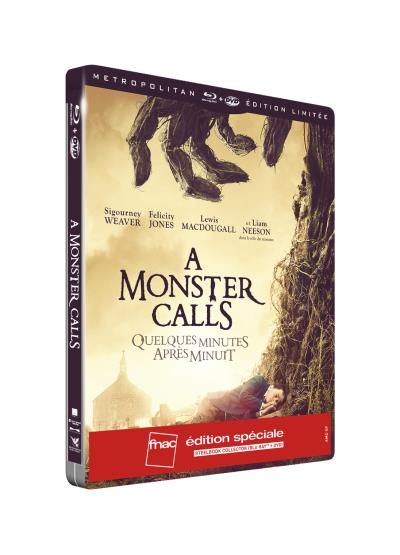
You would think after several years since inception, folks behind steelbook artwork selection or designing would have perfected the system by now. I think everyone shouldn't have a problem knowing these days that a steelbook edition is a limited release compare to the amarays. Is it really still necessary to include such texts? Frankly, the back art is decent, and have so much negative space. Why the logos were placed on the front rather than at the back? Not to mention, literally all logos were duplicated on the spine. The banner is probably my ultimate turn off for this steel. The front cover would have been 100 times better if they had kept it by itself.