Captain America: The First Avenger (3D+2D Blu-ray SteelBook) (KimchiDVD Exclusive #55) [Korea]

Which edition are you getting?

  • Lenticular

    Votes: 54 35.3%
  • Full Slip A1

    Votes: 58 37.9%
  • Full Slip A2

    Votes: 31 20.3%
  • One Click

    Votes: 36 23.5%

  • Total voters
    153
Jun 4, 2017
94
Release date: August 31, 2017
Purchase links: : One Click - Lenticular - Full Slip A1 - Full Slip A2 - (Pre-order August 17 at 2 PM Korea time) - All editions showing as OOS
Price: $46.99
Notes: Spot gloss with debossed title - Limited to 4000 numbered copies (Full Slip A1 1300 - Full Slip A2 1200 - Lenticular 1500)
Group Buys: hosted by cooey One Click - Lenticular - Full Slip A1 - Full Slip A2

20638932_2140421422851730_8492093618141931251_n.jpg 20638168_2140421506185055_534237518305182234_n.jpg 20638843_2140421539518385_4832710646608199514_n.jpg
20732979_1604775996260503_1444291850_n.gif
IMG_1563.JPG
IMG_1564.JPG

 
Last edited by a moderator:
Just a few things (and I'm not trying to convince anything)

But a lot of what you said is how this can be improved and kinda goes along the lines of what I said therefore can't be a great release tbh

"They left it too long and limited themselves" so don't bother doing it if the only option is crappy art and a not so colourful pallete

And this won't be reasonably priced will it. Will still be near £50 for a phase 1 marvel film with bad back art. I will wait for full slip reveal and beauty shot until final judgement but a shield design will be very lazy if they use it

Also another point mentioned In the thread: I think kimchi announcing stuff and then going up for sale pretty quickly after is a bad way of doing it, okay retailers like plain archive and Zeta announcing stuff a year and half before is bad too but these premiums need to give people time to afford and work out what's coming out in the months ahead. not everyone is in the position to drop x amount In 3 weeks time like kimchi seem to be doing all of a sudden. Personally I like knowing a few months ahead like manta and blufans so I can work out what's coming out in future months and what's affordable. Just saying

Yes I pointed out where it can be improved. But I never said it was great. I just said it wasn't terrible. Things don't go from great to terrible. There is a whole section in between. For me that's where this lies. Could have been really good but as it is it's just ok... for me. The art is more than ok. Very good art in fact. The image of Cap holding his shield is iconic and the rear art is ok just has been poorly cropped and placed. A little bit more care and more vibrant colours would improve this no end.

As for the price by reasonable I mean in comparison to the alternatives. Don't think you'd see much change out of £80 for brand new sealed versions of the existing ones. As I said that makes this reasonable for those that don't have the others.

It's all subjective anyway. You hate it. I think it's aight. Others love it. "One mans trash is another mans treasure"
#Philosophy

I just wish it was red skull on the back and my opinion on this release would be much more positive because I seriously hate that back. Was just saying to someone I can handle the front and agree it's iconic but it's one of my least fav posters used

Would of preferred this as the front

image.jpeg
 
  • Thanks
Reactions: YellowCake
Really glad Kimchi seems to share my taste for poster art then coz the back is one of my fave Cap pictures, especially coz it's Rescue Cap.
 
:woot::oohyeah: Thanks for the tag my good man :thumbs:;)

I've known about this for a looooong time! Nice to finally see it come to 'life'. I cannot wait for this
giphy.gif

:naughty::D

Forgive my photoshop skills, but I'm really puzzled why they wouldn't have framed the rear art more like this:
View attachment 324437
The two images of Rogers are better balanced in size and the heads are cropped around the same point for continuity.

And you have the added benefit of not amputating his legs below the knee. :hilarious:
Undoubtedly better! :thumbs: But hey, I'll still be buying this :joy::hungry:

The german one is also one of the best imo
Agreed :kiss::drool::naughty:
output_1QYiGI.gif
 
If they do a civil war steel (which im guessing they will) then I'm hoping they use the below art so it show caps side on the front and iron mans side on the back so when opened it shows the full image. That would be awesome (minus all credits and only 1 title obviously)

I know it's been used on slips for blufans and nova but would look great on a steel

image.jpeg
 
  • Like
Reactions: rj531
Ok...

I've decided (reluctantly) to get this one.
Firstly there's somewhat of a contradicition right there so...

a) Why buy it?

and

b) Why the reluctance in buying it?

I will buy it because I already own the HMV CA, the Zavvi 1st release CA, the Zavvi lenti magnet release CA and finally the Blufans fullslip lenti release.
I would quite like a kimchi release of this as I have kimchi Iron Man lenti and the rest may follow, making yet another nice little collection within a collection.
On top of that, I like the images that have been used... but hold that thought, not HOW they have been used.

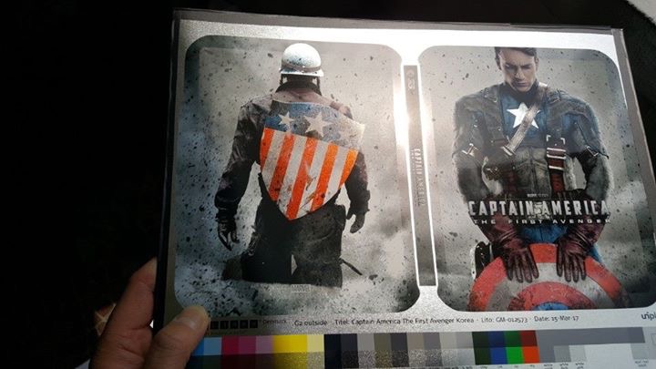
So why the reluctance? Pretty much like most of you on here that dislikes how they have done the rear artwork. i think the front is fine and the star on caps chest
is a good contrast in cutting off the shield at the bottom. You don't really need to see two stars here, and the image itself I have seen loads of times before, and it works
and I like the pose that Cap is doing. The background is fine as it makes Cap stand out more. Don't forget this film is showcasing his first outing in the MCU and it is called
'Captain America: The first Avenger' so this image should be about him and make him stand out sticking a spotlight on him.
Now then, the rear artwork... as mentioned on here previously, the scale of it isn't right when comparing it to the front. The example shown on here would have been far better imo.
Again, you have the spotlight on Cap and nothing else and you have the american colours there too. So why, oh why, have they decided to cut off the legs? No idea, but I'm going to
suspend what I can see (and what I have read on here) and ignore the phrase "cut off legs" and simply pretend that he is standing or walking in a trench!

Overall it isn't the best design I have seen and by no means isn't the worst either, and way back I missed out on getting a Cap Blufans quarter slip to showcase that work of art,
but I think I will pick me up a copy as most initial opinions on here cast negativity (and rightfully so, it is subjective afterall) but when the final product does roll out it tends to be much
nicer than what people predicted. I'm probably less disappointed in the artwork itself and more disappointed in the fact that it is a kimchi release. If this was Zavvi I think we would probably
be praising it! Haha!
 
  • Thanks
Reactions: Radagast
So why, oh why, have they decided to cut off the legs? No idea, but I'm going to suspend what I can see (and what I have read on here) and ignore the phrase "cut off legs" and simply pretend that he is standing or walking in a trench!
If they don't change it, I'll imagine what I first saw, when they showed it, Cap walking with dust/smoke around him. :LOL:
 
I just wish it was red skull on the back and my opinion on this release would be much more positive because I seriously hate that back. Was just saying to someone I can handle the front and agree it's iconic but it's one of my least fav posters used

Would of preferred this as the front

Think that's on the back of the Blufans slip! It's a great poster but as I said earlier leaving it so long has limited them in their choices. Ah well. I'm just glad I don't want it. If I was an o-ring I might have been tempted to get it to go with the other Kimchi/Nova lentis but as a slip box style lenticular... no dice.
 
Think that's on the back of the Blufans slip! It's a great poster but as I said earlier leaving it so long has limited them in their choices. Ah well. I'm just glad I don't want it. If I was an o-ring I might have been tempted to get it to go with the other Kimchi/Nova lentis but as a slip box style lenticular... no dice.

Back of blufans is just a shield (debossed).
That arts not been used on steel yet.

Yeah judging by previous Disney and marvel releases this will have a lenti slip box. Which is better imo
 
Wowsers . . . a classic beauty if ever I saw one with spot gloss, metallic reflections and the complete title de-bossed.
VOIR VIDEO du steelbook

I'd pick this up in a heartbeat if available from HMV / Zavvi for 25 quid. Heck, I'd even pick this up from elsewhere if just the steelbook without the "padding".
As for the design I don't see an issue. They've used all of THE classic poster for the front and the back image is just an image from the film with nothing taken away or added (save the background)and as it should be. Perfectly balancing the front image with the only difference being the legs on the front are hidden by the shield and the legs on the back by the level of the ground as Steve is going down a hill.

Anyway, with its mottled grey background and classic images of shields old and new it could be my new favourite "Captain America" steelbook :drool:

Original poster for the steelbook front and image from the film used on the steelbook back:-
II
V
Poster design by BLT Communications, LLC with photography by Michael Muller
1-captain-america-brown-back-large.jpg
 
Last edited: