Attachments
Last edited by a moderator:
") )
)
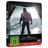
Am I the only one who thinks the front debossing is the weirdest ever? The right upper part, like on the left the line should be straight since it follows the opening. But instead, they debossed the... sunlight? on the right. Just doesn't make sense.
Here's the part I'm talking about:
I would have much preferred just the standard "frame" debossing and the embossed shield.
There's no pleasing some folks!
In this case though they were obviously aiming for something unique with the release (and achieved that).And there's no critical thinking in some others.
But seriously, I'm the guy that usually never has a problem with a release. I don't care about matt vs. gloss finish (because both can work great), I don't care about title/no title either on the front or the spine (because I usually know which movies I buy), I don't dismiss the lack of inner artwork (because it just isn't that big of a deal to me), I'm pretty lenient when it comes to artwork (because I don't really like to strongly criticize something that's very subjective).
If such obvious mistakes aren't enough of a reason to start questioning the artistic decisions of a release, then nothing is.
 ).
).It was clearly intentional. It's a hell of a lot more complex to deboss a border like that than a straight edge - if it was a mistake, it wouldn't follow the light pattern on the Steelbook.Following the borders of the opening with the debossing was a design decision, missing the borders on the right side was a mistake (at least I hope so, if it was intentional then I really have no idea why).


It was clearly intentional. There's no way that could possibly have been a mistake, it's a hell of a lot more complex to deboss a border like that than a straight edge - so there's no way it could have possibly been overlooked.
If it was a mistake, it wouldn't follow the light pattern on the Steelbook.
Back in stock....Hurry
")
No no, I completely understand what you're saying and am 99.9% sure that was intentional on their part - there's no way that would have got through the QA/testing then retail manufacturing process without someone at Scanavo asking if that's really what they intended, not for as high a profile release as this.Here, I'll illustrate what I'm talking about because I get the feeling some aren't really sure what I'm saying.

No no, I completely understand what you're saying
It wasn't directed at you specifically.and am 99.9% sure that was intentional on their part - there's no way that would have got through the QA/testing then retail manufacturing process without someone at Scanavo asking if that's really what they intended.
See my post above, I edited it to add a picture, the red lines added to illustrate the path I'd expect it to take if it were a mistake.I'm not going to say I'm 100% sure it wasn't intentional, because there's really no way for us to know, but to me personally it really does seem like a case of someone not paying enough attention.


