Last edited by a moderator:
Last Action Hero (Blu-ray SteelBook) (Zavvi Exclusive) [UK]
- Thread starter luke98
- Start date
You are using an out of date browser. It may not display this or other websites correctly.
You should upgrade or use an alternative browser.
You should upgrade or use an alternative browser.

they should have done it like this...
Front
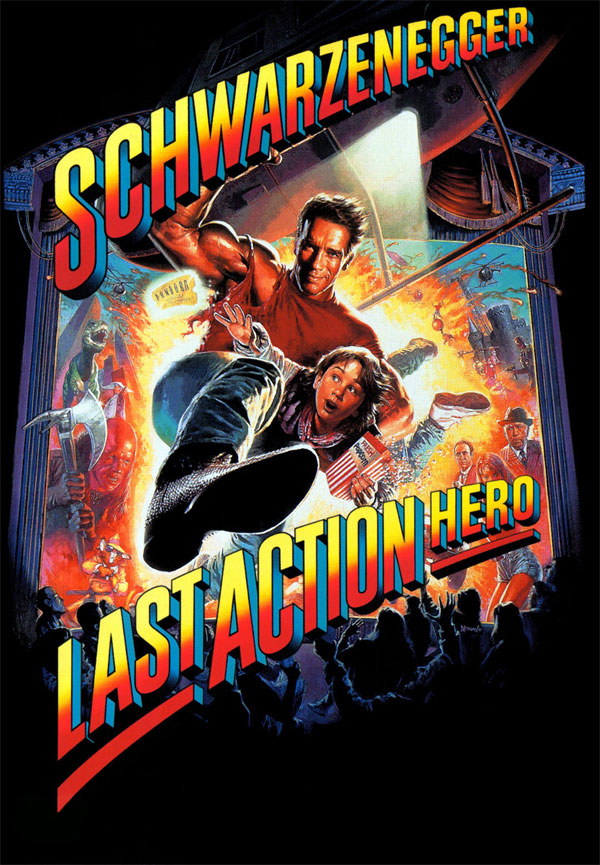
its so blindingly obvious that this is the strongest possible image to use. why did they go against all rational thought?
and i wouldnt have minded a quote for the back, or even a plain black back lol
the art they have used and they way they have used it makes this film go from a highly anticipated steelbook, to a down the drain, wasted opportunity that is almost impossible to want.
Front
its so blindingly obvious that this is the strongest possible image to use. why did they go against all rational thought?
and i wouldnt have minded a quote for the back, or even a plain black back lol
the art they have used and they way they have used it makes this film go from a highly anticipated steelbook, to a down the drain, wasted opportunity that is almost impossible to want.
they should have done it like this...
Front
its so blindingly obvious that this is the strongest possible image to use. why did they go against all rational thought?
and i wouldnt have minded a quote for the back, or even a plain black back lol
the art they have used and they way they have used it makes this film go from a highly anticipated steelbook, to a down the drain, wasted opportunity that is almost impossible to want.
Well, to be honest, the art isn't that bad. Of course, the original poster would be preffered but I don't mind the "ticket" art. At least it's something different.
And I have a feeling front and back will both be debossed which could come out very nicely.
Love this artwork and definite instabuy for me 
Going to make an exception in this case as this is surely one that will not hang around for long.
Loads better than the old Amaray artwork with "The Terminator" vibe and preferable to the later U.S. / Canadian releases with the "Back to the Future" vibe.
TBH not too bothered in this case about the finish though would be nice to see some kind of 'bossing on that ticket !
Maybe, if I had to choose, I would go for a gold gold steelbook like THE DEVIL'S DOUBLE, BEN HUR, THE EMPEROR'S NEW GROOVE or the second ROGER RABBIT as against the yellow gold/yellow of SICARO, THE FULL MONTY, THE INBETWEENERS 2 or SNATCH.
I don't hold out much hope of a gold gold steelbook and I'd guess it will probably have the same colouring as the recent SICARIO
Last edited:
Wow. I almost want to get this. I actually got to see an advanced screening of this when I was in high school. They changed the ending from the version I saw. I think he brought more villains to the real world. It was a long time ago so I don't remember all the details but I remember when I saw it on home video I was like "this isn't the same movie I saw".
EUGH! 
This artwork (if you can call it that) is terrible! The film had an awesome theatrical poster, so why didn't they go with that? This looks like it was knocked up in a graphics designer's tea break! A complete lack of effort, and Sony should really be making their SteelBook releases look like a premium product, and not a bargain bin budget Dvd release! This sort of thing is what you expect to see underneath the disc, not on the front cover of the release!
FAIL!")
This artwork (if you can call it that) is terrible! The film had an awesome theatrical poster, so why didn't they go with that? This looks like it was knocked up in a graphics designer's tea break! A complete lack of effort, and Sony should really be making their SteelBook releases look like a premium product, and not a bargain bin budget Dvd release! This sort of thing is what you expect to see underneath the disc, not on the front cover of the release!
FAIL!
EUGH!
This artwork (if you can call it that) is terrible! The film had an awesome theatrical poster, so why didn't they go with that? This looks like it was knocked up in a graphics designer's tea break! A complete lack of effort, and Sony should really be making their SteelBook releases look like a premium product, and not a bargain bin budget Dvd release! This sort of thing is what you expect to see underneath the disc, not on the front cover of the release!
FAIL!
Still, could be worse, right?
They could not have released the steelbook at all. Wouldn't that be a b***h?
")
It is not Arni's best..but still very entertaining and I am liking the steelbook design..will definitely order..
I agree. Definitely not the best film but also not the worst
Wow. I almost want to get this. I actually got to see an advanced screening of this when I was in high school. They changed the ending from the version I saw. I think he brought more villains to the real world. It was a long time ago so I don't remember all the details but I remember when I saw it on home video I was like "this isn't the same movie I saw".
Yes, quite so, but the audience reaction to the test screenings was so bad that a new writer was called in (Shane Black) to rewrite certain parts and other bits were hastily reshot. Memorable comments from the audience at the time ranged from "Juvenile", "Off the mark", "Confusing towards the end", "Willy Wonka with guns", "The movie just sat there like a big fried egg" to harsh stuff like "This movie has cancer".
The audience test score cards (to show how many of the audience would definitely recommend the film) ranged from 46% to 72% with no sign of the hoped for 90% or over.
The only other "alternative versions" of the film were those shown on TV by (1) Channel 5 which was cut by up to 10 minutes of profane language and violence and (2) ITV cut to under two hours with entire scenes removed such as the burglar at Danny's house and subsequent police station scene to cuts for violence including when Arnie kicks a SWAT member in the ghoulies.
As printed on the back of the BD case the film should run for "Approx.131 mins.".
I personally take all the negativity surrounding this film and flush it down the toilet - "THIS FILM IS A GREAT DEAL OF FUN" is my opinion
Will always like this movie, still remains a funny adventure movie, with action from one of the last action heroes,  the critics went nuts and bashed it for years and years, some of them reviewed it not understanding it.
  Will pre-order this today.
the critics went nuts and bashed it for years and years, some of them reviewed it not understanding it. Will pre-order this today.
Last edited:
Still, could be worse, right?
They could not have released the steelbook at all. Wouldn't that be a b***h?
I'd prefer no steelbook to a bad one. This is just BAD on an epic level.


Similar threads
- Replies
- 2
- Views
- 2K
- Replies
- 1
- Views
- 175
- Replies
- 13
- Views
- 2K
- Replies
- 3
- Views
- 512