Last edited by a moderator:
Money Monster (Blu-ray SteelBook) (HMV Exclusive) [UK]
- Thread starter snooloui
- Start date
You are using an out of date browser. It may not display this or other websites correctly.
You should upgrade or use an alternative browser.
You should upgrade or use an alternative browser.

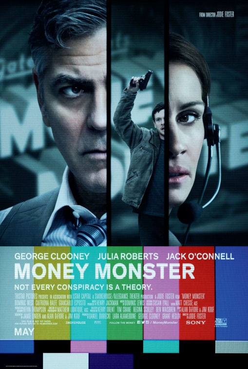
Looks ok, but I'd rather they stuck with the old mock-up for the front. Would've looked better if they lined up the coloured bars (don't know the technical term for them) from front to back somehow.
I really prefered the mock up art. Shame really

Likewise dude.Cool, enjoy @Noodles")

Yeah, it looked a lot cleaner and easier on the eye. Hopefully it at least receives a decent finish!I really prefered the mock up art. Shame really
Just came across the new art on HMV before visiting here (at least they used "mine" on the back LOL) and looking at it again to tell the truth I kind of like what they've done with balancing images etc. and agree that it is probably the best choice after all and certainly a better choice of colours for the colour bars than on the original steelbook mock-up and poster and better positioning of title
A wee bit disappointed they took away the colour blocks under the spine title though")
Reportedly glossy so in this case should be very easy on the eye.
One to happily add to the collection when it's in a "2 for GBP 25" promotion.
Original colours as seen on the poster:-
and agree that it is probably the best choice after all and certainly a better choice of colours for the colour bars than on the original steelbook mock-up and poster and better positioning of title A wee bit disappointed they took away the colour blocks under the spine title though
Reportedly glossy so in this case should be very easy on the eye.
One to happily add to the collection when it's in a "2 for GBP 25" promotion.
Original colours as seen on the poster:-
Last edited:


Confirmed gloss.finish? Seriously as the above pics says otherwise.

Yes, confirmed by the author pictures.Confirmed gloss.finish? Seriously as the above pics says otherwise.
Looks very smart and I like it but it appears to my eyes more Satin than Gloss.
(Hoping for close-up pics . . . wouldn't be first time a steelbook specified as Gloss ended up with different finish when released).
EDIT: Possibly looks a bit more glossy here:-
(don't know if it's just me but I'm seeing horizontal lines across the front of the steelbook . . . or is it that my eyes are picking up on the horizontal lines in the carpet . . . lol?)

Anyway, will hopefully pick this up together with THE REVENANT if they ever make it into HMV's "2 For GBP 25" promotion.
(Hoping for close-up pics . . . wouldn't be first time a steelbook specified as Gloss ended up with different finish when released).
EDIT: Possibly looks a bit more glossy here:-
(don't know if it's just me but I'm seeing horizontal lines across the front of the steelbook . . . or is it that my eyes are picking up on the horizontal lines in the carpet . . . lol?)
Anyway, will hopefully pick this up together with THE REVENANT if they ever make it into HMV's "2 For GBP 25" promotion.
Last edited:
I believe it's a design choice that's supposed to give it a television/static effect... you can see the lines on the mock-up in the OP too.EDIT: Possibly looks a bit more glossy here:-
(don't know if it's just me but I'm seeing horizontal lines across the front of the steelbook . . . or is it that my eyes are picking up on the horizontal lines in the carpet . . . lol?)

Speak of the Devil - now in HMV's "2 for GBP 25" something like a week after release.
Now hoping for one of the following to join it in the promotion - THE REVENANT, THE 5TH WAVE, LONDON HAS FALLEN or even KINGSGLAIVE.
EDIT: Just bought it with THE DARK CRYSTAL
Now hoping for one of the following to join it in the promotion - THE REVENANT, THE 5TH WAVE, LONDON HAS FALLEN or even KINGSGLAIVE.
EDIT: Just bought it with THE DARK CRYSTAL
Last edited:
i just watched this yesterday, fun movie, but i dont think i can justify to buy it since is not the film you watch over n over......
See http://www.ebay.co.uk/itm/Money-Mon...714974?hash=item2cb3d61d9e:g:Z~oAAOSwNRdYAOHv
Language: English, Italian
Subs: English, Italian, Polish
Language: English, Italian
Subs: English, Italian, Polish
i just watched this yesterday, fun movie, but i dont think i can justify to buy it since is not the film you watch over n over......
Totally agree it's an ok film totally watchable good performances by Julia,George and Jack but for me it's definitely a one watch film. I also saw the steelbok in the shop and the colours are fairly flat.

Similar threads
- Replies
- 24
- Views
- 3K
- Replies
- 4
- Views
- 341
- Replies
- 47
- Views
- 3K
- Replies
- 11
- Views
- 1K