Prometheus (3D+2D Blu-ray SteelBook) (FilmArena Collection #103) [Czech Republic]

martinouchou

Premium Supporter
Sep 20, 2015
1,647
France
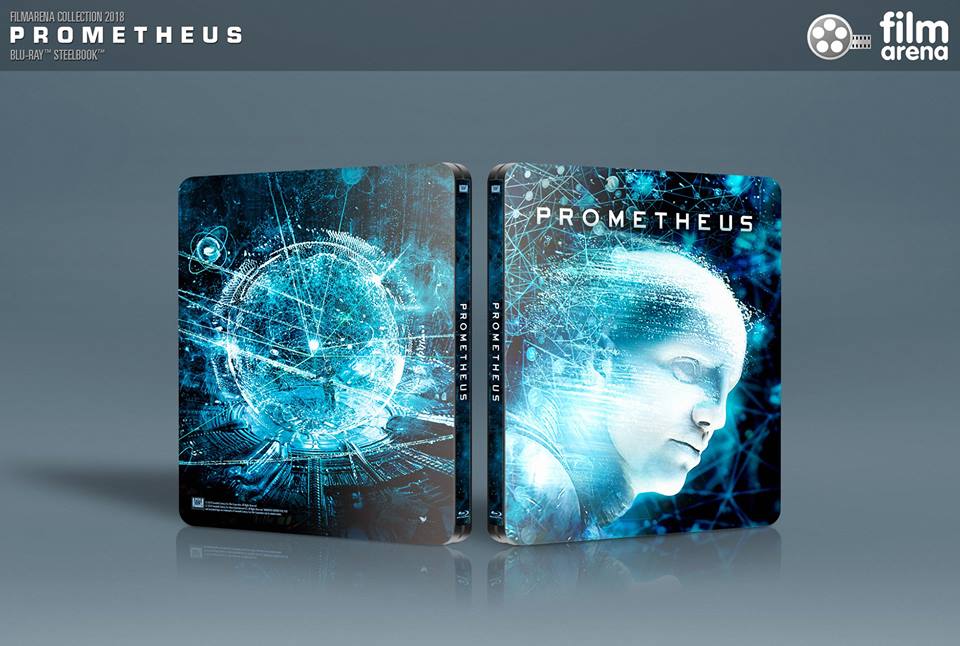
Release date: August 24, 2018 (E5A, E5B) - August 29 (E1) - September 3 (E2) - September 19 (E3) - October 10 (E4)
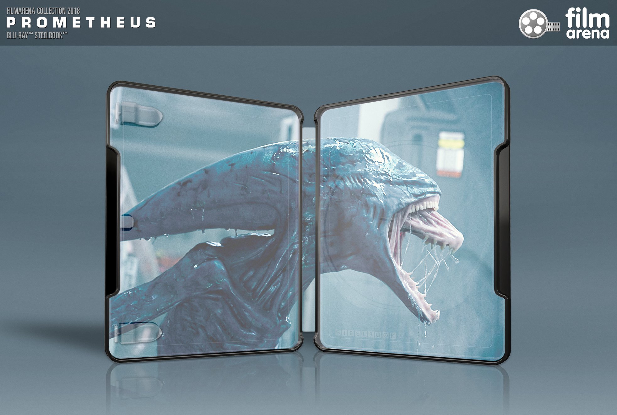
Purchase links: Filmarena E1 - E2 - E3 - E4 - E5A (4K) - E5B
Price: CZK 1099 (E1) - 1299 (E2) - 1199 (E3) - 4888 (E4) - 1099 (E5A) - 699 (E5B)
Group buy: hosted by carllenc E1 - E2 - E3 - E4 - E5A - E5B

37043078_1948389961944637_7054772353942683648_n (1).jpg 37080581_1948390648611235_2546068677631934464_n.jpg37179078_1949213768528923_4948141073357602816_n.jpg 37156798_1948389861944647_3994464961333035008_n.jpg


32737085_1843699245747043_5913865324561694720_n-jpg.374335

32839197_1843699239080377_966155435855839232_o-jpg.374336
21730966_1909493302400548_8075892591016681145_n.jpg
From FB:

Dear Collectors,

we are happy to inform you that our WEA concept of SteelBook ALIEN COVENANT has been approved.

We are also in the beginning of a long journey starting with ALIEN COVENANT and ending with ALIEN to offer you complete WEA FAC SteelBook Collection of ALIEN
1f609.png
;-)

More info including official mock-up coming soon!

Stay tuned and thank you for your support
1f642.png
:)

Team FA
21246403_1483412808442357_7884759566827717291_o.jpg
 
Last edited by a moderator:
and I particularly like the title treatment which reminds me of the beginning of ALIEN where the title came together bit by bit
funny that it reminds you of alien and not of Prometheus, because it is in the beginning too and this font on the front is used as well (or at least a font that comes close to it):rofl:
 
Last edited:
  • Thanks
Reactions: CleverLoginName
As I got the FAC iPod coventant instead of Manta I'm in for the full ride of the series. If they do all of them as WEA it would be epic. Bring it on!
 
funny that it reminds you of alien and not of Prometheus, because it is in the beginning too and this font on the front is used as well (or at least a font that comes close to it):rofl:
Ah, yes, there too.
Point being made that the title treatment is not coming out of nowhere.
. . . and, anyway, perfect position and a million miles better than having it cut across the face like on the futurepak.
D9Zut.png


prometheus.png


A couple of the original poster designs (with this font):. . . actually, even more interesting treatment with the first "E" and the "T" running into eachother . . . and with shades of the other interesting sci-fi title treatment for the classy and undeniably elegant PASSENGERS steelbook (the "E"s at least):-
fotografias-del-steelbook-de-passengers-en-4k-ultra-hd-blu-ray-original.jpg

prometheus-movie-poster.jpg

prometheus-poster.jpg


lol
prometheus0.png
[/SPOILER][/SPOILER]
 
Last edited by a moderator:
Steelbook looks great but agree with those that don't like the title. Maybe with enough *polite criticism and feedback, FA can look into altering the title font :angel:;)

*N.B. Has to be polite and courteous or we risk losing eligibility for future FA purchases and revoked collectible numbers :LOL:
 
  • Thanks
Reactions: harry
I like it, but also have issues with the title... mine's just with the placement though, as I feel it should be centered between the top of the steelbook and the top of the Engineer's head (if that makes sense).
 
I like it, but also have issues with the title... mine's just with the placement though, as I feel it should be centered between the top of the steelbook and the top of the Engineer's head (if that makes sense).

Make the font smaller and wider. There is something off with the title. It ruins the artwork.
 
  • Thanks
Reactions: Huguito
Shame FAC are putting the cart before the horse. Don't they have several titles announced from years gone by that have yet to see the light of day and here they are debuting their Prometheus steel...