Last edited by a moderator:
Rear Window (Blu-ray SteelBook) [Germany]
- Thread starter Scraggy
- Start date
You are using an out of date browser. It may not display this or other websites correctly.
You should upgrade or use an alternative browser.
You should upgrade or use an alternative browser.

Here's what I came up with, but I'm not hopeful. ")


I read somewhere in the last week that Black Barons is planning a big Universal release for sometime in the next year. I wondered at the time if it could possibly be another Hitchcock; perhaps this confirms it. I hope so!Be interesting to see what the artwork will be
I expect this will also get a UK release
I hope Black Barons pick this up to complement Vertigo and Birds Black Barons releases
Alas, following recent tradition the REAR WINDOW steelbook will most likely be 'interesting' rather than classic . . . as recent Hitch steelbooks have been 'interesting' and could never be described as classic (unlike the earliest releases in the UK) ... fingers crossed for classic though.
100% 'interesting' / original:-
 +
+
 +
+

50% 'interesting' / 50% classic:-

100% classic:-
 +
+
 +
+

PS. The modern remake (kind of) DISTURBIA ain't bad either.
100% 'interesting' / original:-
50% 'interesting' / 50% classic:-
100% classic:-
PS. The modern remake (kind of) DISTURBIA ain't bad either.
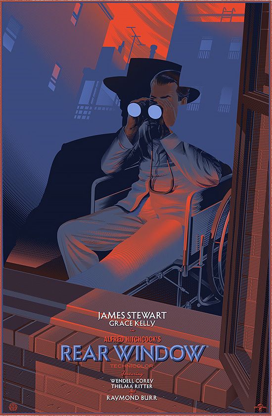
Looks like a good match for VERTIGO artwork-wise and in the 'interesting/original' category instead of the 'classic' category . . . from the mock-up looks like all the red art is on a translucent slip . . . great to see the title in English and looking forward to a UK release.
Last edited:
That's a trio of artwork that only you would think of, @virkia. ") I don't see the translucent slip. Looks like just the steel, with the blue banner card over the top. Pretty good art, I think, though definitely not Durieux. I don't like that the binoculars are showing the image as we see it in the movie, where it should be reversed as it's reflected in the lenses.
I don't see the translucent slip. Looks like just the steel, with the blue banner card over the top. Pretty good art, I think, though definitely not Durieux. I don't like that the binoculars are showing the image as we see it in the movie, where it should be reversed as it's reflected in the lenses.
I wish they'd used the same fonts as on the Vertigo/Birds steelbooks. This is close, but not the same, so no match.
Here's hoping for a Black Barons slip to make this a better edition.
I don't see the translucent slip. Looks like just the steel, with the blue banner card over the top. Pretty good art, I think, though definitely not Durieux. I don't like that the binoculars are showing the image as we see it in the movie, where it should be reversed as it's reflected in the lenses.I wish they'd used the same fonts as on the Vertigo/Birds steelbooks. This is close, but not the same, so no match.
Here's hoping for a Black Barons slip to make this a better edition.
Last edited:
Too bad there aren't tons of classic poster images they could have used instead of this garbage....
Oh wait.....There are.
Apparently "interesting" is rationalization euphemism for terrible.
I hope someone can slap a nice slipcover over that ORANGE abomination. (Orange is not a color with any significance in the film)
It's basically the Disturbia cover with Darkman on the bottom.
Oh wait.....There are.
Apparently "interesting" is rationalization euphemism for terrible.
I hope someone can slap a nice slipcover over that ORANGE abomination. (Orange is not a color with any significance in the film)
It's basically the Disturbia cover with Darkman on the bottom.
Last edited:
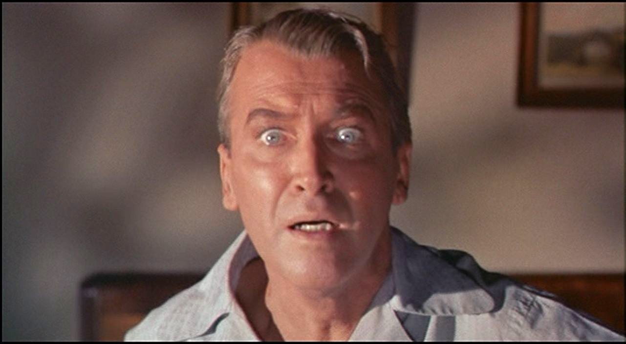
Even Jimmy Stewart looks aghast at that terrible artwork.Too bad there aren't tons of classic poster images they could have used instead of this garbage....
Oh wait.....There are.
Apparently "interesting" is rationalization euphemism for terrible.
I hope someone can slap a nice slipcover over that ORANGE abomination. (Orange is not a color with any significance in the film)
It's basically the Disturbia cover with Darkman on the bottom.


What do they have against Hitchcock? First that Vertigo Steelbook which is a strong contender for ugliest Steelbook ever (I have it & look at it from time to time just to admire its supreme ugliness). Now this! How could anyone come up with that image and think it looks good! And the studio had to approve that...just unbelievable!
Can you handle people having different opinions about subjective issues?What do they have against Hitchcock? First that Vertigo Steelbook which is a strong contender for ugliest Steelbook ever (I have it & look at it from time to time just to admire its supreme ugliness). Now this! How could anyone come up with that image and think it looks good! And the studio had to approve that...just unbelievable!
(Though I totally agree with you about the Vertigo steelbook.)It looks to me like someone asked an artist to do something kind of like Durieux.
I don't remember people complaining about orange when that poster was released.

I hear you....that Durieux was what I was hoping for if they ever did a steelbook for this. The art they chose could have been good but the top portion ruins it for me. Think I’ll contact atomic mist and ask him do a Lenticular magnet for this and while I’m at it for Vertigo as well.Can you handle people having different opinions about subjective issues?
It looks to me like someone asked an artist to do something kind of like Durieux.
I don't remember people complaining about orange when that poster was released.
Hmm. I was trying to figure out what still of Jimmy Stewart they used for the cover, and . . . I think it's from Vertigo. ?? I'll go ahead and agree with the rest of you now, that this steelbook art is disappointing.
Similar threads
- Replies
- 0
- Views
- 766
- Replies
- 0
- Views
- 155
- Replies
- 1
- Views
- 442
- Replies
- 0
- Views
- 135