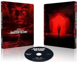
... but I agree that red for a SHUTTER ISLAND release is a total first . . . more used to cold colour artwork with red unsurprisingly more associated with horror steelbooks (A QUIET PLACE, SHAUN OF THE DEAD, 28 DAYS/WEEKS LATER etc.) although could be argued that this is a psychological horror / thriller ...
... red also unsurprisingly associated with steelbooks with "red" in the title:-
Etc.
Got to also admit the more I look at the artwork the more I see a genie exiting a bottle (especially with the pointy ears).