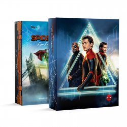
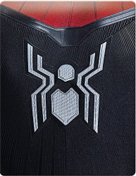
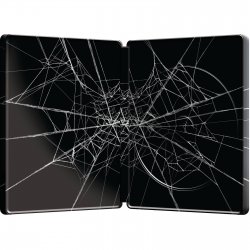
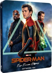
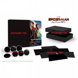
Spider-Man: Far From Home (4K+2D Blu-ray SteelBook) (Zavvi Exclusive) [UK]

paulboland

Contributor Steels/Arrow
Contributor
Premium Supporter
Sep 10, 2012
38,407
Navan/Ireland
Release date: November 11, 2019
Purchase links: 4K+2D - 4K+2D Collector's Edition (Pre-order live at Midnight July 2)
Price: £32.99 (4K+2D) - £74.99 (4K+2D Collector's Edition)
Notes: 3 Discs (4K UHD + 2D Blu-ray + Bonus Disc World Wide Web-Slinger)
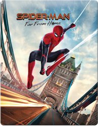
12203577-1384708744830876.jpg

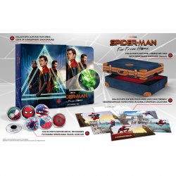
Collector's Edition with above steelbook
Collector's Edition Artwork to be updated as it still has mock up steelbook
12203580-1344.jpg 12203580-6964.jpg

12203577-6844708744881201.jpg 12203577-1154708741882539.jpg

12203577-1654684650152070.jpg

12203580-3004686046702845.jpg
 
Last edited:
for me the web isn't so important but off center title really bugs me... i did a quick photoshop with the same size original title and it didn't even overlap with the web at all, so i don't know why they need to put the logo there... not good, not good at all...

View attachment 449167

tell me, this doesn't look better?

can someone let Zavvi know? is there a chance they might fix this?
6 of 1 half a dozen of the other. I think it ‘d look better if there was no title at all. Never understood why people want a title mucking up the art, but to each his own.
 
Offcenter title, looks like crap.
Looks fine to me. If you enter it, it ruins the line from the top web. That said, I come down firmly on leaving the title off the steelbook. I only want to see it on the spine.
for me the web isn't so important but off center title really bugs me... i did a quick photoshop with the same size original title and it didn't even overlap with the web at all, so i don't know why they need to put the logo there... not good, not good at all...

View attachment 449167

tell me, this doesn't look better?

can someone let Zavvi know? is there a chance they might fix this?
I did a Photoshop too and even have the ruler going and as you can see very plainly in my image it's perfectly centered so I'm not sure what you all are talking about. There is roughly between 165-175 pixels from the edges of the title to the edge of the steelbook give or take a few.

CaptureSMFFH.JPG
 
I did a Photoshop too and even have the ruler going and as you can see very plainly in my image it's perfectly centered so I'm not sure what you all are talking about. There is roughly between 165-175 pixels from the edges of the title to the edge of the steelbook give or take a few.

View attachment 449192
I think you took the one that I photoshopped already, look at the one at the OP that’s clearly off center..
 
It looks like what they did was center it between the suspension cables and his web. Tough for me to compare the images directly, because the colors on the updated image aren’t as good (esp on Spider-Man and the logo) and they may be less sharp. Anyway, if anyone hates it, I’ll be glad to take a copy of their hands :D
 
for me the web isn't so important but off center title really bugs me... i did a quick photoshop (see below) with the same size original title and it didn't even overlap with the web at all, so i don't know why they need to put the logo there... not good, not good at all...

View attachment 449167

tell me, this doesn't look better?

can someone let Zavvi know? is there a chance they might fix this?
You're absolutely right sir! There is no reason why the title shouldn't be centred on this, it's basic design and an easy fix at that.

My flabber will be well and truly gasted if they release it off centre!
 
  • Like
Reactions: goufcustom
That's the second WWA (much better than the fish bowl, IMHO :)). The same artwork appears on many 4K releases, e.g., the US, CA, AU, TW, NL, and DE 4K SteelBooks, and also the Amazon FR Exclusive Blu-ray SteelBook.
Ah okay. :)

Yeah, I quite like it too! It's a bit strange though, cause all of the Spider-Man films (and Venom) seem to have their steelbook designs flipped with the UK. E.g. the red Venom steelbook was the 4K version in Scandinavia, and the black one was regular Blu-ray. Spider-Verse's designs were flipped too and FFH seems to be the same.
 
  • Like
Reactions: Ranavalone
for me the web isn't so important but off center title really bugs me... i did a quick photoshop (see below) with the same size original title and it didn't even overlap with the web at all, so i don't know why they need to put the logo there... not good, not good at all...

View attachment 449167

tell me, this doesn't look better?

can someone let Zavvi know? is there a chance they might fix this?
My OCD approves. :thumbs:
 
i have all the slipcovers as well which were HMV exclusives ;)

121.png
I had the majority of these too... recently started selling them all though and now only have a few left. Loved them until they started getting a bit crazy and started doing them for films that weren't at all comic book related... not that it stopped me from buying most of them however lol.
 
Considering the wonky angle of the artwork on the front I don't mind the slightly off-centre title falling as it does almost perfectly between the web and the suspension chain ... back's a bit on the wonky side too if truth be told.

As for the car light trails: would have looked so much better had Spidey visited at night:-
1569889516588.png
1569889957604.png


Fun fact: not called Tower Bridge because of those two massive towers but because it's close by The Tower of London - the architecture of which influenced the design of the bridge.
Fun fact #2: Spidey may not know it but where he's prancing around shooting his webs was once a regular haunt for 'ladies of the night'.
 
And another interesting factoid. The guy who purchased London Bridge and had it shipped back to Arizona actually believed he’d purchased Tower Bridge. Apparently he was just a little bit butted when it arrived.
Another fact, I was born less than a mile away, in Whitechapel.
 
Considering the wonky angle of the artwork on the front I don't mind the slightly off-centre title falling as it does almost perfectly between the web and the suspension chain ... back's a bit on the wonky side too if truth be told.

As for the car light trails: would have looked so much better had Spidey visited at night:-
View attachment 449349 View attachment 449350

Fun fact: not called Tower Bridge because of those two massive towers but because it's close by The Tower of London - the architecture of which influenced the design of the bridge.
Fun fact #2: Spidey may not know it but where he's prancing around shooting his webs was once a regular haunt for 'ladies of the night'.
Is it no longer a haunt for those "ladies of the night?" Asking for a friend.
 
And another interesting factoid. The guy who purchased London Bridge and had it shipped back to Arizona actually believed he’d purchased Tower Bridge. Apparently he was just a little bit butted when it arrived.
And cue the QI kaxon!

That was a myth that the buyer was happy to allow circulate, as it just created additional publicity for his new attraction. The full story is set out here and in many other places:

A rumour that McCulloch - a millionaire and successful businessman - had “bought the wrong bridge” probably didn’t help, though it was, of course, complete nonsense.

“I know for a fact they knew exactly which bridge they were going to buy,” says Michael.

“Do you think anyone in their right mind would look at Tower Bridge and think they could take it apart and bring it here?

“But RP and CV felt that by allowing that rumour to perpetuate, it gave them continued publicity, so they let it go.”
 
  • Like
Reactions: Ephoenix