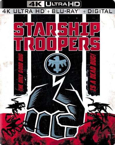
I actually like the message/idea they're trying to bring across, but despise the sledgehammer approach they chose by using this artwork. We all know the movie draws upon the Third Reich (a fascistic, deeply militarized society, naive youths indoctrinated with a strange idea of "citizenship through (military) service", racialized rhetoric of "us" and "them", total destruction of the enemy or total defeat, uniforms, etc.). All this was achieved in a subtle way in the movie (besides the "Do you want to know more?" infomercials, which clearly counteracted the subtleness, and added a parodic element). The use of the Reich colors in the artwork alone takes away much of Vorhoeven's ingenuity and makes Starship Troopers look less the smart and meaningful film that it actually is.