

Last edited by a moderator:
The Martian - Extended Edition (Blu-ray SteelBook) (Best Buy Exclusive) [USA]
- Thread starter luke98
- Start date
You are using an out of date browser. It may not display this or other websites correctly.
You should upgrade or use an alternative browser.
You should upgrade or use an alternative browser.


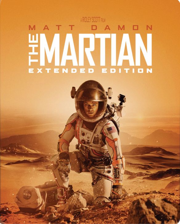
Sure it's on the word Martian, that's why it's superimposed. I beg to differ on your explanation and I really like this and it looks normal to me. I guess I see things in a different light as some others but that's ok as long as I like it.lol no dude a designer would NEVER center to one word, this art has been released before on slipcover and its center. They messed up with the steelbook margins and its super obvious. Look at the artwork up on bestbuy.com and look at other releases, youll see what it was supposed to look like. It doesnt make sense to center it to the word martian since "extended edition" and "Matt Damon" expands farther than martian. Also look where it says " A RIDLEY SCOTT FILM" this is always centered to the title. The title IS centered to Damon, but its not that the title itself is off center, its that the entire image artwork is off center, you can see the artwork mockup below where both Damon and the title are perfectly centered.
")
I would say if you don't like the artwork, a) don't buy it and b) find out who did the package design (it may well be on the card on the back) and write to them, not an email but a proper letter, expressing your disapproval of their steelbook artwork design, pointing out the differences between it and the regular slipcase, and impressing upon them the need for higher levels of production for a premium release.
Picked this up and didn't even notice anything off center. Guess I just focused on MARTIAN as the center point. It is common in design to place things somewhat off center, but seeing the slip cover it does seem possible it was a pressing error. But again, it's likewise conceivable they wanted the steel to be a little different and stand on its own, using the same artwork, but varying it a little.
Either way, it's a steelbook of The Martian and it's an extended edition which is not available on the UK Martian steel. I would get it regardless due to it being a longer version, Just happy to have the steel.
Either way, it's a steelbook of The Martian and it's an extended edition which is not available on the UK Martian steel. I would get it regardless due to it being a longer version, Just happy to have the steel.
Either way, it's a steelbook of The Martian and it's an extended edition which is not available on the UK Martian steel. I would get it regardless due to it being a longer version, Just happy to have the steel.
Zavvi's steelbook is the extended version too.
Those of you still of the belief that they intentionally centered "Martian" should take a closer look.
Left side margin is still significantly shorter than right side margin (even ignoring the word "THE", which I think is a mistake in the first place)
Red line much longer than the blue line.
Major Fail.

Left side margin is still significantly shorter than right side margin (even ignoring the word "THE", which I think is a mistake in the first place)
Red line much longer than the blue line.
Major Fail.

My steelbook feels usedThose of you still of the belief that they intentionally centered "Martian" should take a closer look.
Left side margin is still significantly shorter than right side margin (even ignoring the word "THE", which I think is a mistake in the first place)
Red line much longer than the blue line.
Major Fail.
View attachment 273201
 lol
lolYeah I couldn't tell from the images that were posted but now that I have it in-hand I can definitely tell it's off center. It does look weird.Those of you still of the belief that they intentionally centered "Martian" should take a closer look.
Left side margin is still significantly shorter than right side margin (even ignoring the word "THE", which I think is a mistake in the first place)
Red line much longer than the blue line.
Major Fail.
View attachment 273201

Yeah I couldn't tell from the images that were posted but now that I have it in-hand I can definitely tell it's off center. It does look weird.
it's a real shame. The color palette on this one is very attractive. It "feels" like Mars. I wanted to like when I first saw it. Truly.
Is it blank inside?
No it has Watney looking out across the plains of Mars for inside artwork.it's a real shame. The color palette on this one is very attractive. It "feels" like Mars. I wanted to like when I first saw it. Truly.
Is it blank inside?
no offense really but whoever didn't see that off center title (when you seriously take a look) you should better have your eyes checked... lol
Maybe you should try a new tune buddy, I honestly couldn't tell until I had it in-hand and my vision is 20/20. The point is moot already so why not just drop it.no offense really but whoever didn't see that off center title (when you seriously take a look) you should better have your eyes checked... lol
Anyone know if this is region free before I open it? Thanks
Is this region free? Can anyone clarify?
No region markings on the discs.
Many thanks, I just bought it on the hope it wasn't lockedNo region markings on the discs.
")
anyone who owns this can confirm if region locked or not, and by that i mean does it work it region B uk player.
as disc in machine and working
thanks
basil
as disc in machine and working
thanks
basil
Hi Basil,
both discs work perfectly in my "german" BR player...so it should work at your side as well ! Good luck...
both discs work perfectly in my "german" BR player...so it should work at your side as well ! Good luck...
Similar threads
- Replies
- 0
- Views
- 408
- Replies
- 24
- Views
- 2K
- Replies
- 46
- Views
- 2K
- Replies
- 1
- Views
- 130
Horror-Arrow-Limited Ed
Killer Party (1986) (Blu-ray Limited Edition) (Arrow Video) [UK]
- Replies
- 1
- Views
- 122