Last edited by a moderator:
The Shining (4K+2D Blu-ray SteelBook) (Best Buy Exclusive) [USA]
- Thread starter dfoles
- Start date
-
- Tags
- 4k steelbook
You are using an out of date browser. It may not display this or other websites correctly.
You should upgrade or use an alternative browser.
You should upgrade or use an alternative browser.


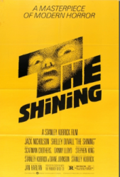
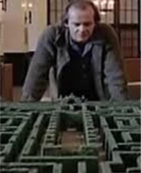
What's with the bright yellow? Surely they could have pulled off some pattern that goes well, such as the carpet or the maze within a snow scene. Hell, even a map of the hotel. This is Awful. Obviously there's text there and I'm guessing it's "...makes Jack a dull boy" etc?
I think the yellow is from an original cover art. But the pattern has nothing to do with the carpet pattern or the maze pattern.
I think the yellow is from an original cover art. But the pattern has nothing to do with the carpet pattern or the maze pattern.
Yea, I never said it did lol. I said they could have pulled off a different pattern and then named examples they could have done. I am pretty sure the pattern they have used though is supposed to be the maze!
Right, we’re in agreement. I meant to say it’s a random pattern and they were lazy to not use something from the movie (other than the quote)Yea, I never said it did lol. I said they could have pulled off a different pattern and then named examples they could have done. I am pretty sure the pattern they have used though is supposed to be the maze!
")
I'm probably in the minority in that I hated the movie (Well, me and Stephen King). Glad this is so ugly. I won't be tempted to get it.
I'm probably in the minority in that I hated the movie (Well, me and Stephen King). Glad this is so ugly. I won't be tempted to get it.
lol if you hated the movie then why would you be tempted to buy it even if it looked decent? Peer pressure? A decent SteelBook is never going to happen for The Shining but I guess people will still dream about one for the rest of their lives.
Yes Artwork is terribleAh man. Pass.
Why the obsession with the maze? None of the characters make an appearance?
At least Liverpool won the Champions League (again) to cheer me up!
")
If warner plan doing a 4K steelbook release in UK I hope it's different artwork to USA release
Liverpool brilliant win last night even though the midfield did not play at their usual best
The back 4 defence and Allison was brilliant last night stopped spurs getting anything
6 time winners of European Cup/Champions League and more wins to come
The back 4 defence and Allison was brilliant last night stopped spurs getting anything
6 time winners of European Cup/Champions League and more wins to come

Quite like that yellow 'n' black/grey colour scheme not often used on steelbooks . . . although doubtful that Mr. Kubrick would've liked it much considering his dislike of maze/maze style artwork on the posters for his film ...


and liking the way the inside artwork kind of mimics the front only turned 90% although bit irritating that it's slightly off-centre.
The yellow colour certainly foremost in Mr. Kubrick's mind for the poster for his film after ditching the white and the red ...


Some of the previous (300) iterations courtesy Saul Bass --------------------------------------------------------------------------------------------------------------before Mr. Kubrick settled on this:-
 =
=


and liking the way the inside artwork kind of mimics the front only turned 90% although bit irritating that it's slightly off-centre.
The yellow colour certainly foremost in Mr. Kubrick's mind for the poster for his film after ditching the white and the red ...
Some of the previous (300) iterations courtesy Saul Bass --------------------------------------------------------------------------------------------------------------before Mr. Kubrick settled on this:-
Attachments
lol if you hated the movie then why would you be tempted to buy it even if it looked decent? Peer pressure? A decent SteelBook is never going to happen for The Shining but I guess people will still dream about one for the rest of their lives.
I like Stephen King. I would have been tempted to leave it unopened on a shelf next to my copies of the movies of his I liked like Shawshank, Cat's Eye, Christine, etc.....
Yes Artwork is terrible
If warner plan doing a 4K steelbook release in UK I hope it's different artwork to USA release
[/SPOILER]
Apparently This will be Live Tuesday - Jun 04, 2019 @ Noon UK Time on Zavvi. Same art.
Only pre order date is known at the momentApparently This will be Live Tuesday - Jun 04, 2019 @ Noon UK Time on Zavvi. Same art.
View attachment 430498
Time not been confirmed so it might not be noon but I expect it will be
Terrible! The slip design would have made such a better steelbook.
Every time I look at it now I think of The Lego Movie!!
Every time I look at it now I think of The Lego Movie!!

Terrible! The slip design would have made such a better steelbook.
Every time I look at it now I think of The Lego Movie!!
I chose the slipcover. Love that artwork
Did anybody else notice that the stats for the 4K amaray say Dolby Vision & HDR 10+, but the 4K steelbook just says HDR10?
Similar threads
- Replies
- 24
- Views
- 2K
- Replies
- 0
- Views
- 360
- Replies
- 2
- Views
- 380
- Replies
- 19
- Views
- 2K