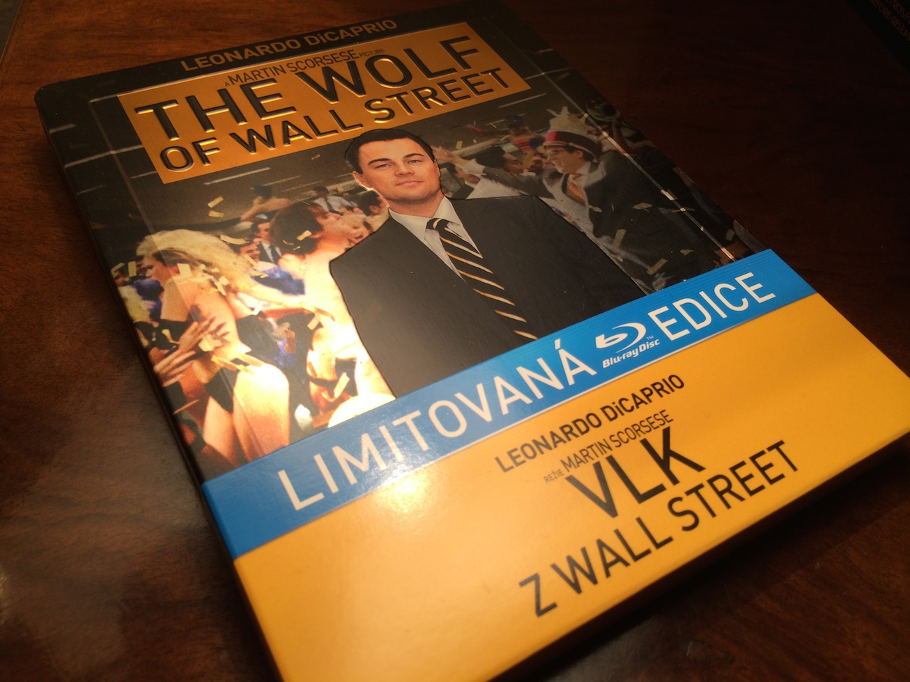
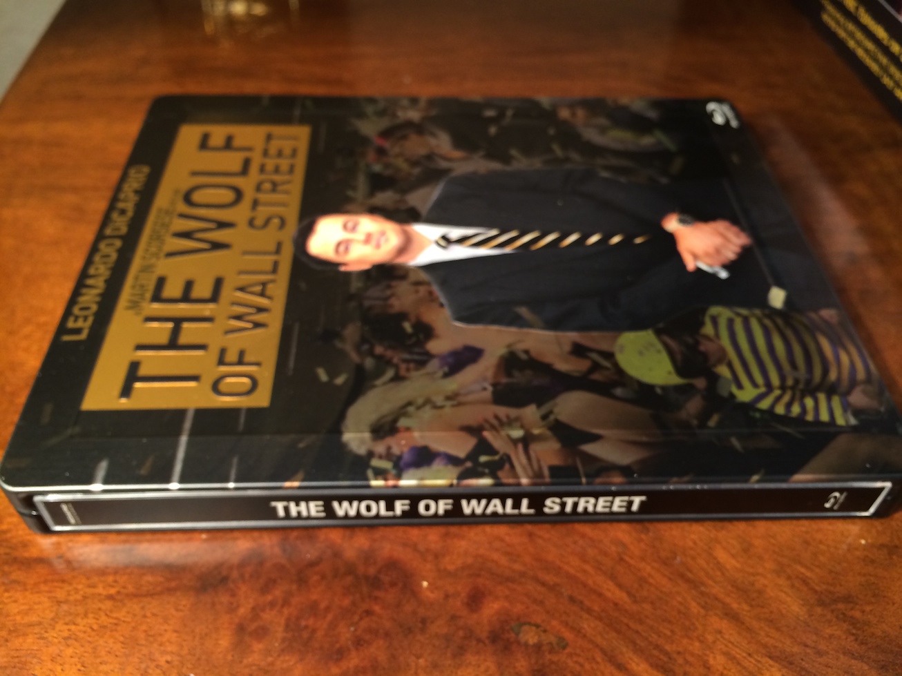
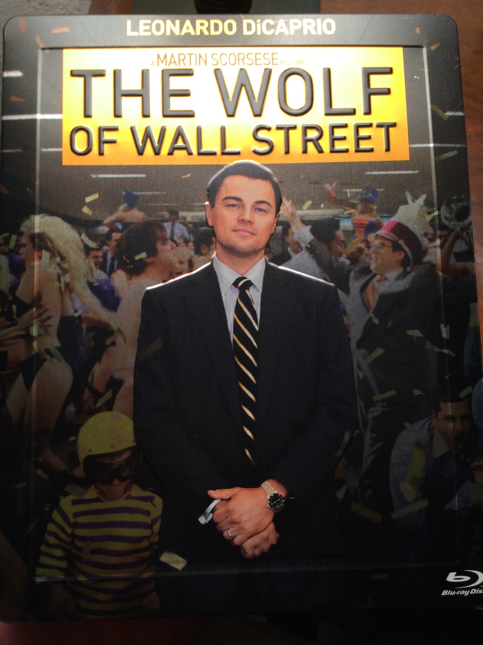
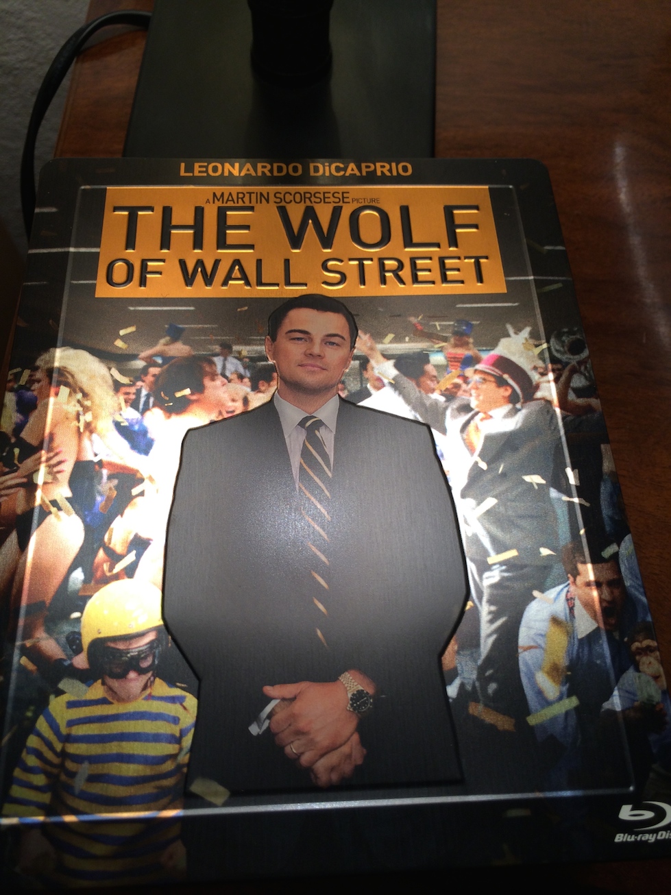
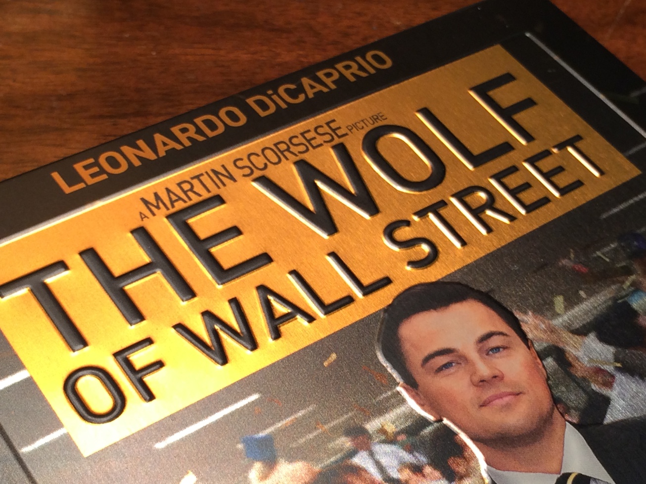
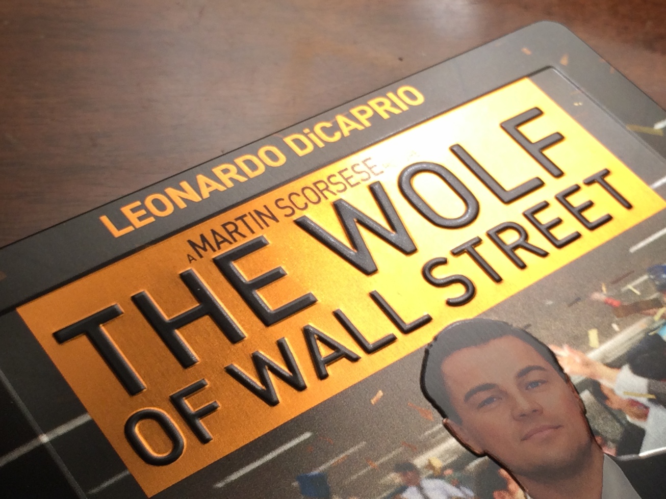
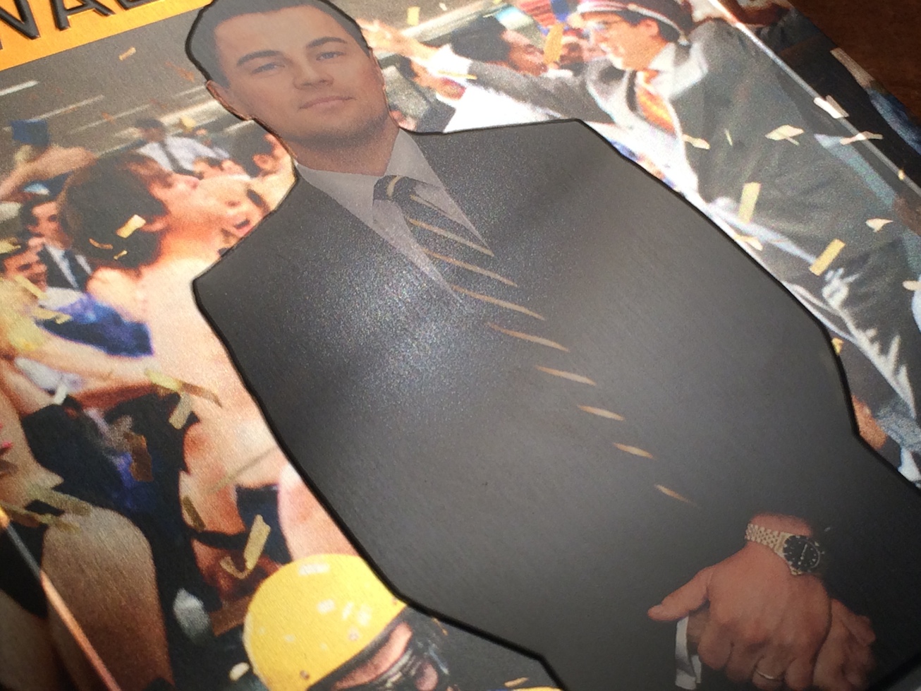
I cant for the love of anything understand how some of you think this is a good release. Its sloppy, poor quality and misaligned. Who the hell designed this? He/she must be squinting and have no sense of aesthetics.
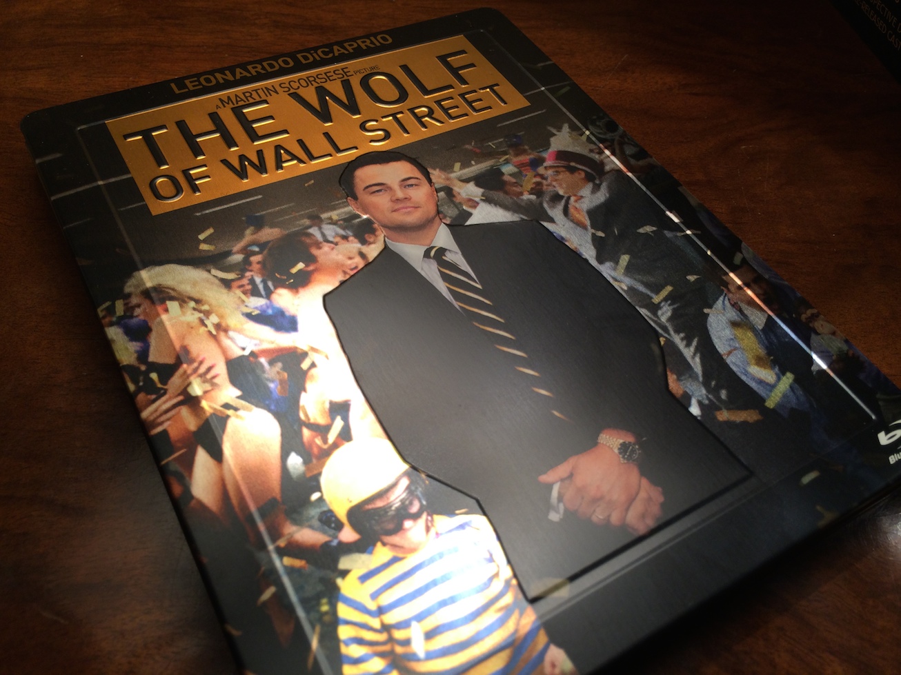
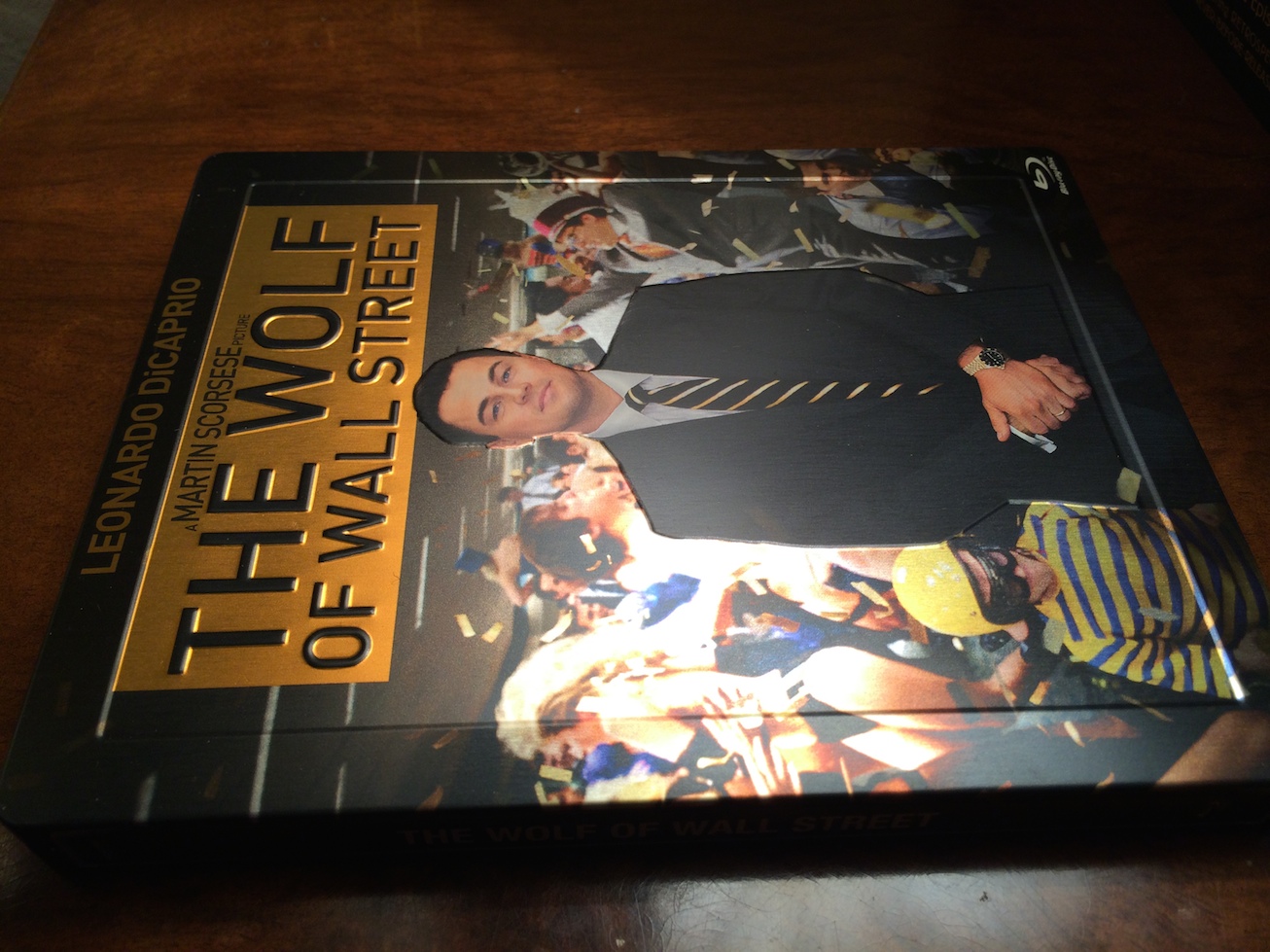
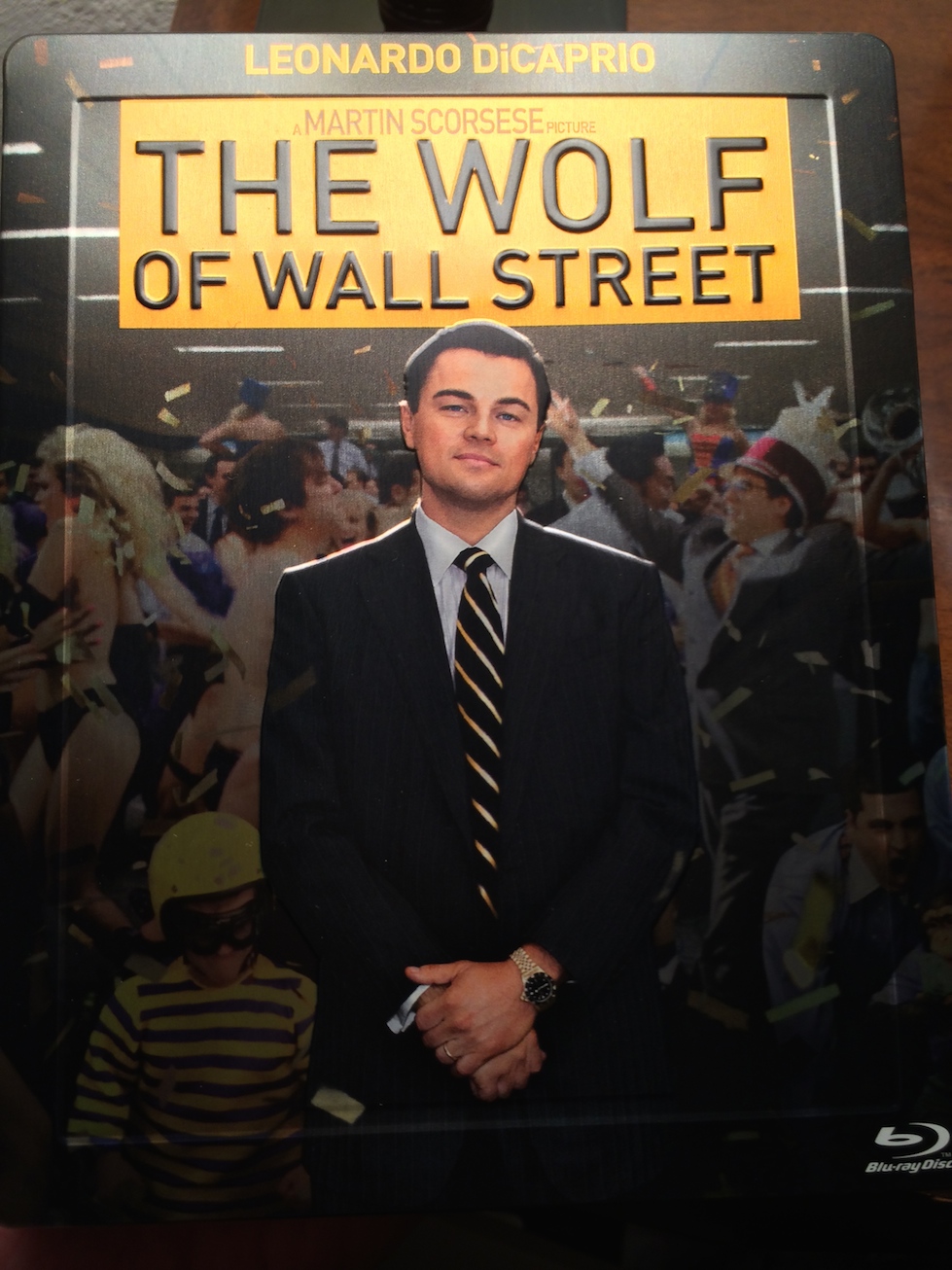
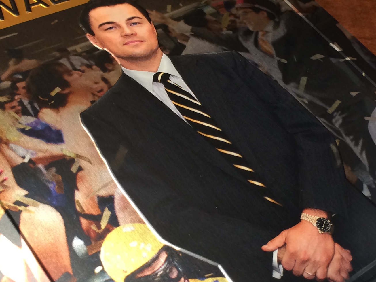
Leo beeing cut in the bottom looks horrible...
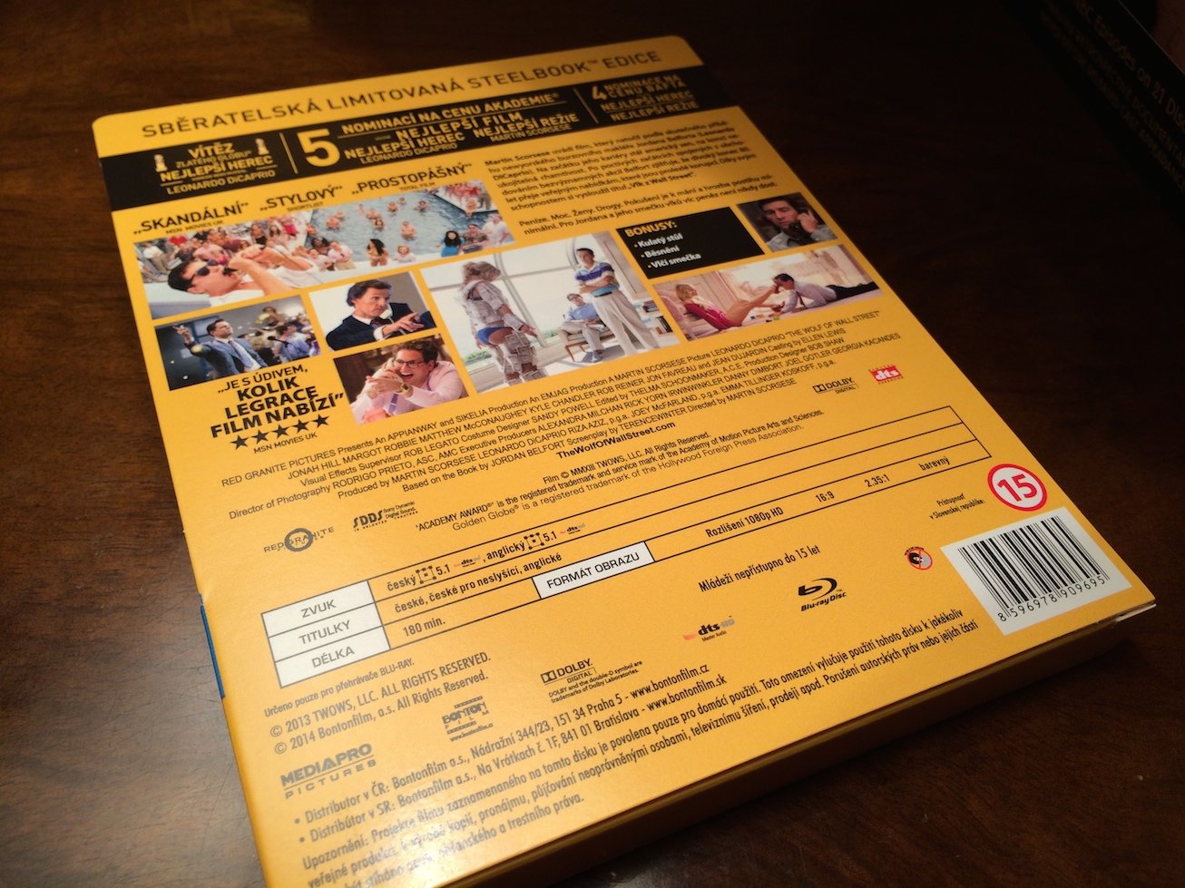
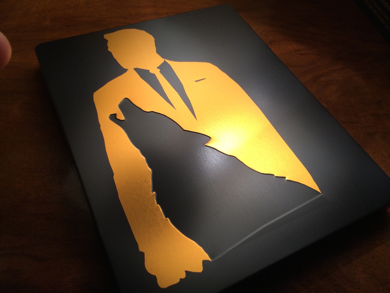
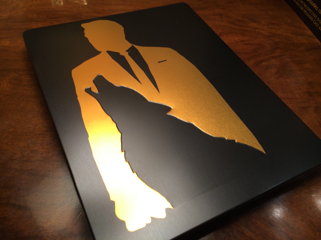
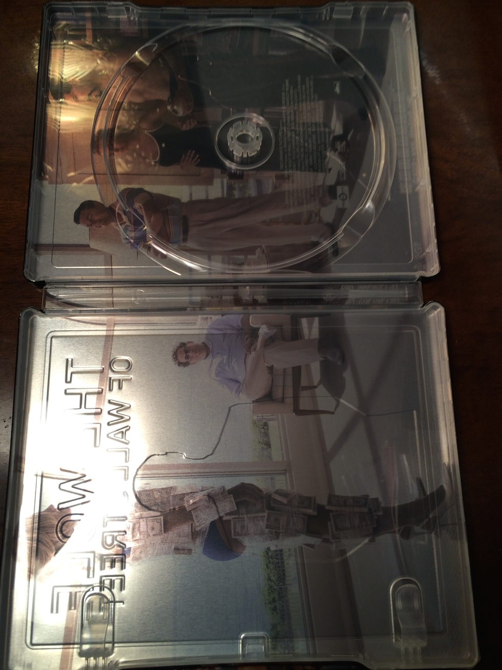
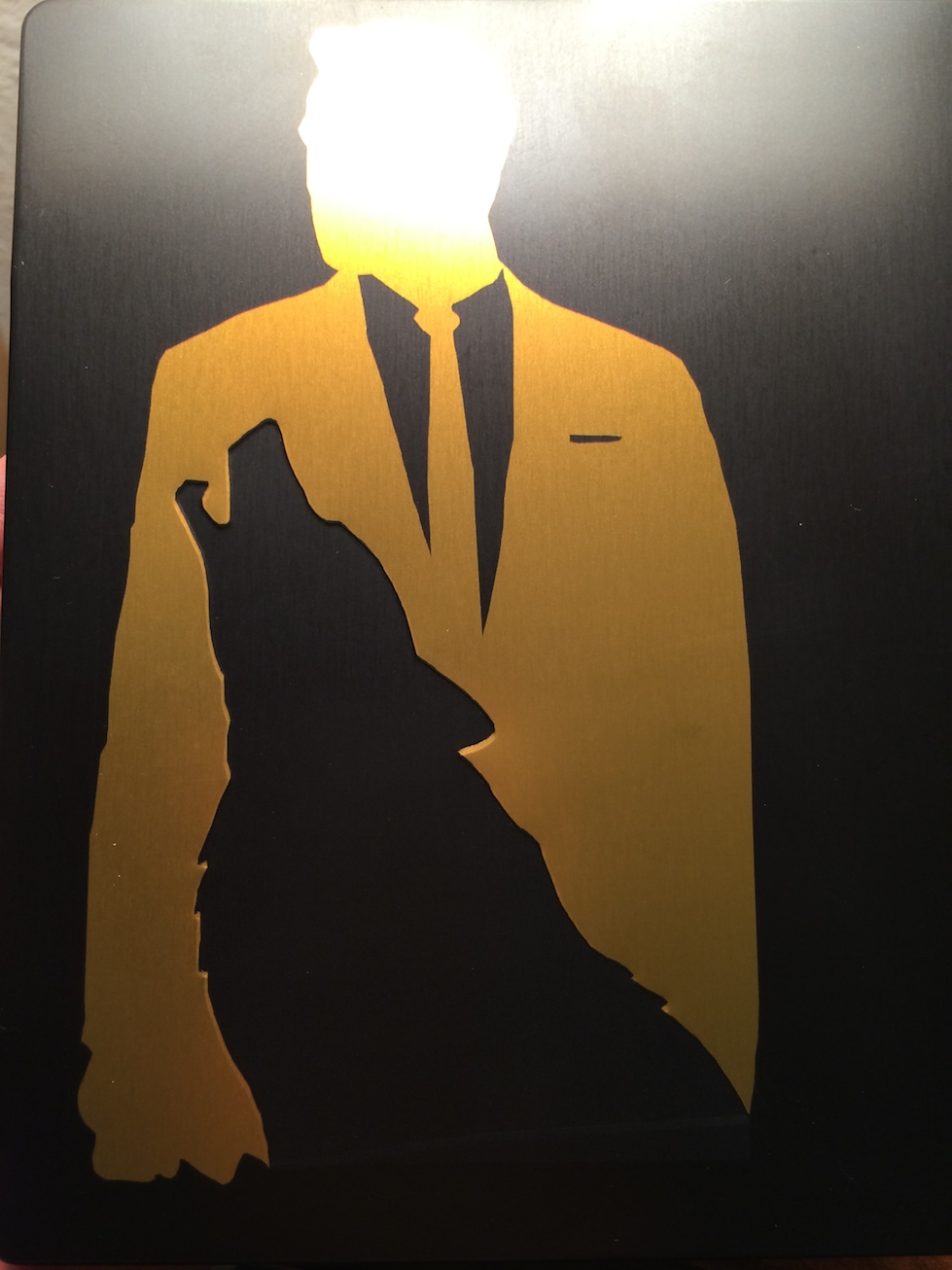
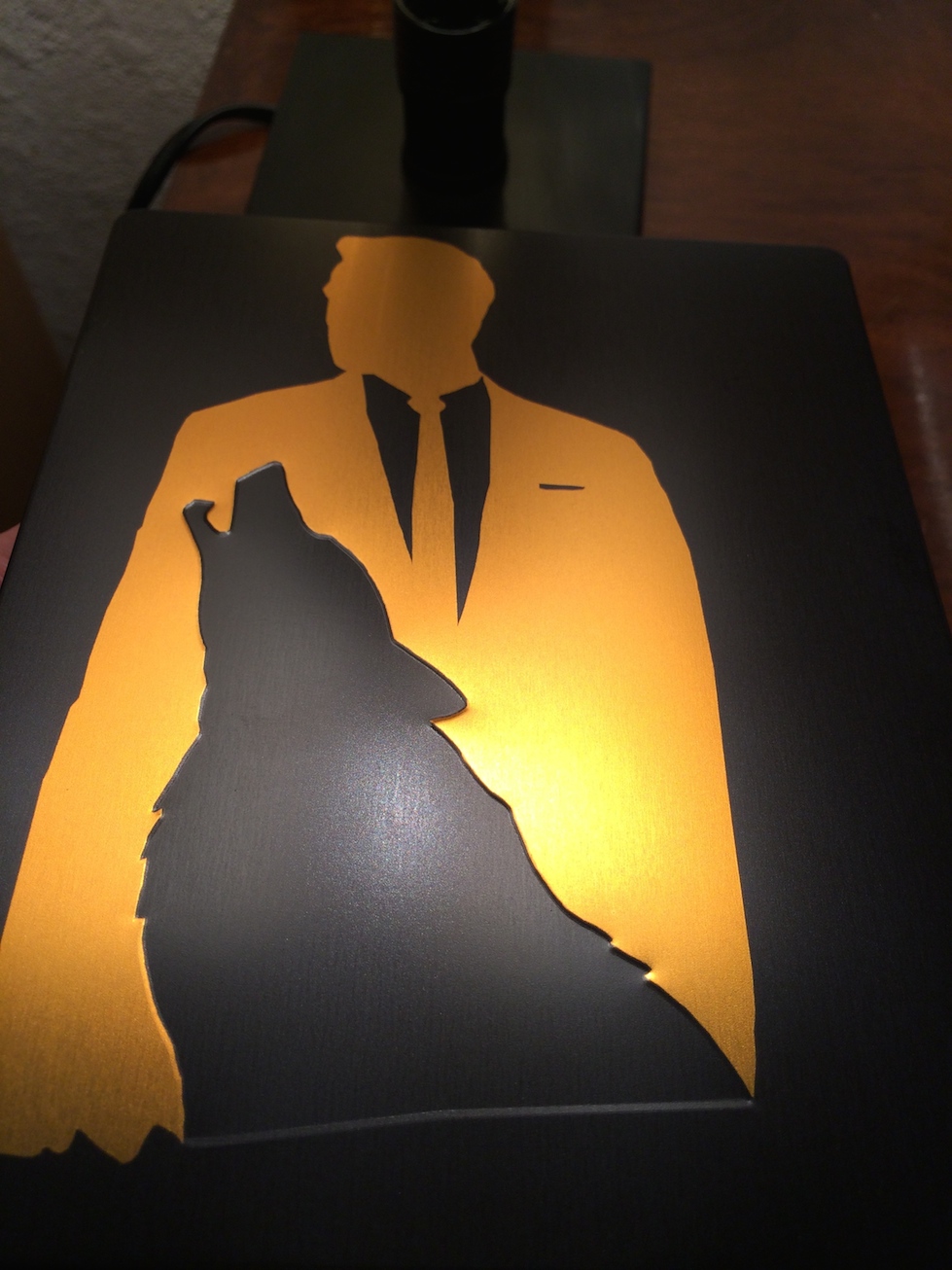
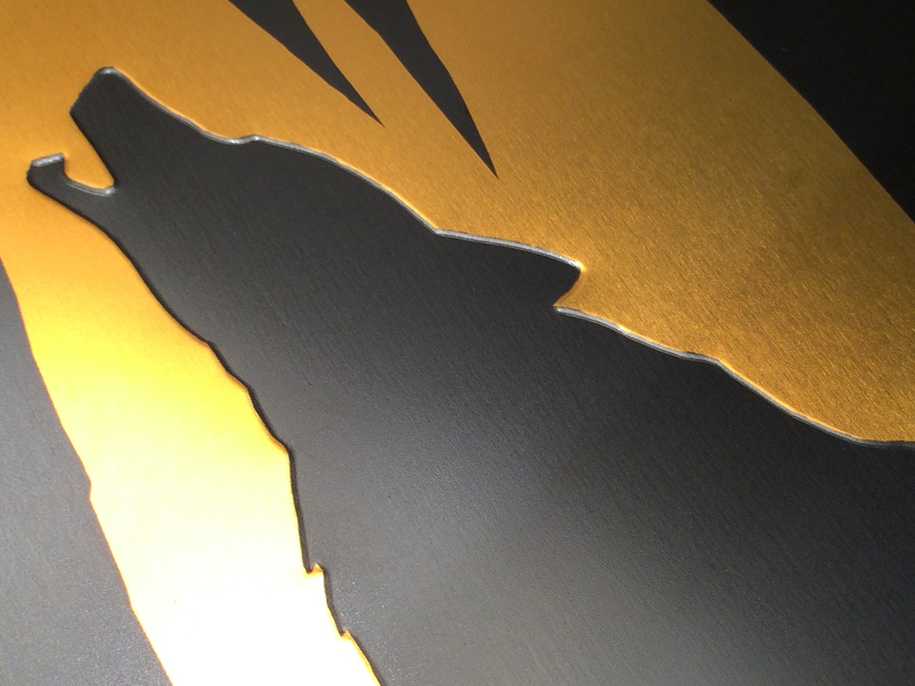
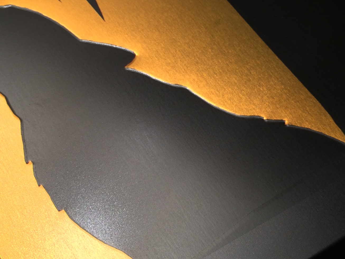
The uncentered back is aestheticly hurtful for the eyes and the completely botched the deboss. Why the hell choose to deboss the wolf!? It looks like crap!
It looks like a really poor attempt at piracy from a skew machine in someones basement.
All they had to really do was to center the back and deboss Leos yellow shape instead of the wolf (and perhaps make the image a little smaller, like the first pictures) and not cut Leo in the front bottom. If that was done it would probably look really good!

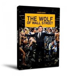


") Face it, it's still better than the Target release.
Face it, it's still better than the Target release.