X-Men: Days of Future Past (3D+2D Blu-ray SteelBook) (HMV Exclusive) [UK]

Feb 10, 2013
1,920
Surrey
Release date: November 10, 2014
Purchase link: In-store only
Price:


steelbook.jpg


Actual Image courtesy kevindublin
1.jpg 2.jpg
3.jpg 4.jpg

Picture kindly sent to us by HMV -
!xmendofp.jpg

It "should" include 3D
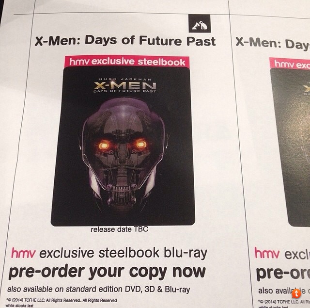
i posted this pic i took from inside my hmv store in my town a few posts back, should stick this in the Original post also as it states it is the 3D steelbook and will save confusion.

914E2D5F-0C70-4C32-BF77-7BC18D13A3C9_zps7rol8bt1.jpg
a4uzetyv.jpg
 

Attachments

  • XMenDoFP.jpg
    XMenDoFP.jpg
    133.1 KB · Views: 920
Last edited by a moderator:
tough question, it doesnt bring up a screen with them them all listed, you have to scroll through them. theres 7 or 8, Ive no idea what language some of them are as well
I'm interested in EU languages only
BTW now I know the 3D disc is the same as the US edition (ENG DTS HD MA 7.1, RUS DTS5.1, FRE/POR/SPA/UKR/THAI DD5.1; same subs plus SCAND and BALTIC subs); I'd like to know if the 2D disc has the same specs (plus JAPAN and CEC) or if it's the same as ITA/FRE/GER editions, with GER/ITA/FRE/SPA DTS5.1 and other less important langs/subs).
Thanks a lot
 
Last edited:
Does this come with an Ultraviolet code?

can't see why it wouldn't have one as it is listed as being included with the normal blu-ray same as Godzilla and Edge Of Tomorrow and they both had an ultraviolet code inside their steelbooks
My girlfriend has her amaray version of this and it definitely includes an Ultraviolet code. :) Can't use it yet as it's not technically out until Monday!! :(
 
Rogue Cut out next year... blatently going to get some fancy ass picture of Rogue for the Steelbook version for that release as well.
DoFP was one the biggest X-Men film to date and really overdid Fox's expectations, (hence the Jackson dick move of doing a delayed Extended Cut the year after release). They'd be daft not to release a Steelbook for that one as well.
 
I get the feeling this design was initially supposed to be embossed with a border going around be ause it seems the "X-Men Title" in the upper left and the Trask logos in the bottom right have been moved in extremely close to the Sentinel head to perhaps accomodate a border. This same design is ised on the Best Buy Slipcase and the Title and Logos in the corners have more breathing space.
 
Doesnt look too bad, looks way better then the German counterpart. The inside art is nice, just wish it continued on to both and not just 1 inside cover. Will pass on this though, as I got the Czech version a few weeks back which IMO looks better (mainly because of the back art and inside art)
 
  • Like
Reactions: BluSteel2012