22 Jump Street (Blu-ray SteelBook) (Zavvi Exclusive) [UK]

digitalbabe

Premium Supporter
Apr 12, 2009
42,350
USA
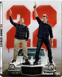
Release date: November 17th, 2014
Price: £22.99
Purchase link: 22 Jump Street
Notes: Limited to 4000 units.
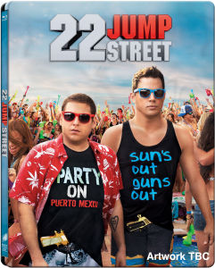
A limited 21 Jump Street Zavvi Exclusive Blu-ray SteelBook will be released at the same time. It will be priced £14.99 if purchased individually but will be automatically priced at £9.99 when purchased together with 22 Jump Street Zavvi Exclusive SteelBook!

22.jpg


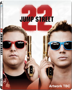
Sony Pictures will also be running a competition to decide on the final artwork.

Vote here https://m.facebook.com/story.php?story_fbid=701931476532099&id=196699947055257

Studio running independent art competition with 3 choices:

10963111-1401984841-152332.jpg


10963111-1401984841-152282.jpg


10963111-1401984841-152428.jpg
 
Last edited by a moderator:
It's really annoyed me that this vote has gone on facebook - the amount of people liking the photos probably won't even buy it. I'd be happy with 1 or 3, if 2 wins as it looks like it will, i'll probably cancel both. Have the first one already in amaray. Just a shame the vote hasn't gone to the people that buy steelbooks and has been open to anyone who can find the like button.

Yeah, I get the impression the majority of people on that Facebook page don't even buy steelbooks... I'll be surprised if most of them even know what a steelbook is to be honest. I'll be disappointed if the horrible Photoshopped art (#2) wins, but I'll still probably buy it just to go with the first one.
 
It's really annoyed me that this vote has gone on facebook - the amount of people liking the photos probably won't even buy it. I'd be happy with 1 or 3, if 2 wins as it looks like it will, i'll probably cancel both. Have the first one already in amaray. Just a shame the vote hasn't gone to the people that buy steelbooks and has been open to anyone who can find the like button.

Agreed - most of the people voting will probably not even buy the film or are just throwing down a like to enter the competition attached to voting.

Number 2 is a terrible photoshop job really. I don't mind the image of the two leads, as long as they made it seem even remotely consistent with the background. As it is, it will make one ugly steelbook. Maybe they will salvage it with something nice on the back/interior?
 
I'm really surprised that #2 is in the lead. When I first saw the 3 pictures, I didn't think #2 even had a chance at 5% of the votes.

I'd be curious to hear someone's opinion who really likes #2 on why they picked it and like it better than the other two.
 
I'm really surprised that #2 is in the lead. When I first saw the 3 pictures, I didn't think #2 even had a chance at 5% of the votes.

I'd be curious to hear someone's opinion who really likes #2 on why they picked it and like it better than the other two.

My reasons are:

Against #1 - no front title
Against #3 - Too many large face artworks (I own some, but not my preference) Jack Reacher, Men In Black, Adjustment Bureau, Leon, Prisoners, etc

I don't think #2 is great, but I like it the best
 
Well I've picked number 2 because I liked it since the second all 3 was announced. The other 2 to me just look boring, more colour on 2 with a better background which I prefer. Chances are the other 2 are silver which I personally don't want. The title on option 2 matches 21 jump street and I just prefer the pic. But I wouldn't be too annoyed if option 3 was chosen (think they are different on Facebook but the close up one of the faces) the pic on the car is just awful. Just my opinion
 
  • Like
Reactions: mlmaier84
I'm really surprised that #2 is in the lead. When I first saw the 3 pictures, I didn't think #2 even had a chance at 5% of the votes.

I'd be curious to hear someone's opinion who really likes #2 on why they picked it and like it better than the other two.

The obvious reason is because it matches with the artwork for the first film. I initially preferred the first option, but now I think two is the better choice for that reason.
 
  • Like
Reactions: mlmaier84
Well I've picked number 2 because I liked it since the second all 3 was announced. The other 2 to me just look boring, more colour on 2 with a better background which I prefer. Chances are the other 2 are silver which I personally don't want. The title on option 2 matches 21 jump street and I just prefer the pic. But I wouldn't be too annoyed if option 3 was chosen (think they are different on Facebook but the close up one of the faces) the pic on the car is just awful. Just my opinion


My reasons are:

Against #1 - no front title
Against #3 - Too many large face artworks (I own some, but not my preference) Jack Reacher, Men In Black, Adjustment Bureau, Leon, Prisoners, etc

I don't think #2 is great, but I like it the best


Thanks guys! I really appreciate you sharing your thoughts on it!
 
  • Like
Reactions: Flloydo
I picked number 2 not because it's my favourite but because 1 is too dull with the Grey background, number 3 is my favourite but it is the same as the amaray and they would mess it up by making the background silver and not white.
 
I'm beginning to wish they'd just let an actor/director choose the artwork... at least then I'd only be disappointed with one persons choice. :p
 
Just ordered the 21/22 deal with the new discount code..... came in at £29 for both which I'm quite happy to pay.
 
  • Like
Reactions: Jace88
I really like 2 :dunno:

Saw the film on Saturday and think out of the 3 art choices, it suits the film the most, and matches the 21 Jump Street steel more as well

Would like something like 2 on the front and a variation of 1 on the back without the giant 22 (replace it with a city skyline or something)