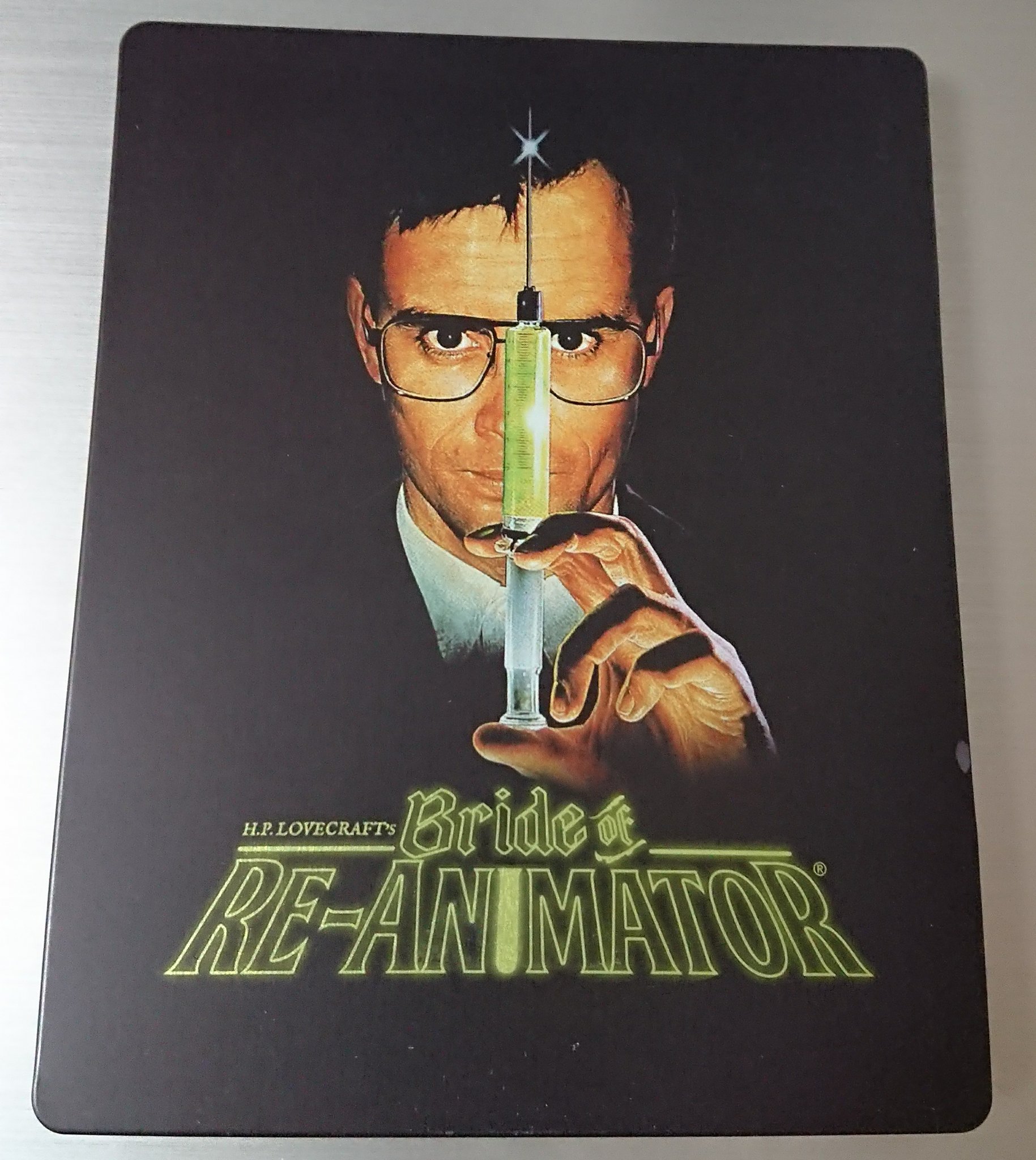
Well, it'll go just about OK with the first one . . .not as well as it might've done what with artwork by Graham Humphreys on #1 and original poster art on this new one by no-one of note.
I've said it already and I'll say it again - wish they could've got hold of Graham Humphreys' poster for this one too to make for a v. nice matching pair with artwork on both by one of the best in the business:-
Also, the specially commissioned artwork for BRIDE by Gary Pullin - as seen on the Arrow boxset - maybe would have been a decent alternative but can understand why they didn't use it for both products:-
Oh, and before I forget, surely there's room for proper artwork from recognised and sometimes world renowned artists on steelbooks as well as glossy poster images (which I feel better suit bigger budget, more flashy films) !?
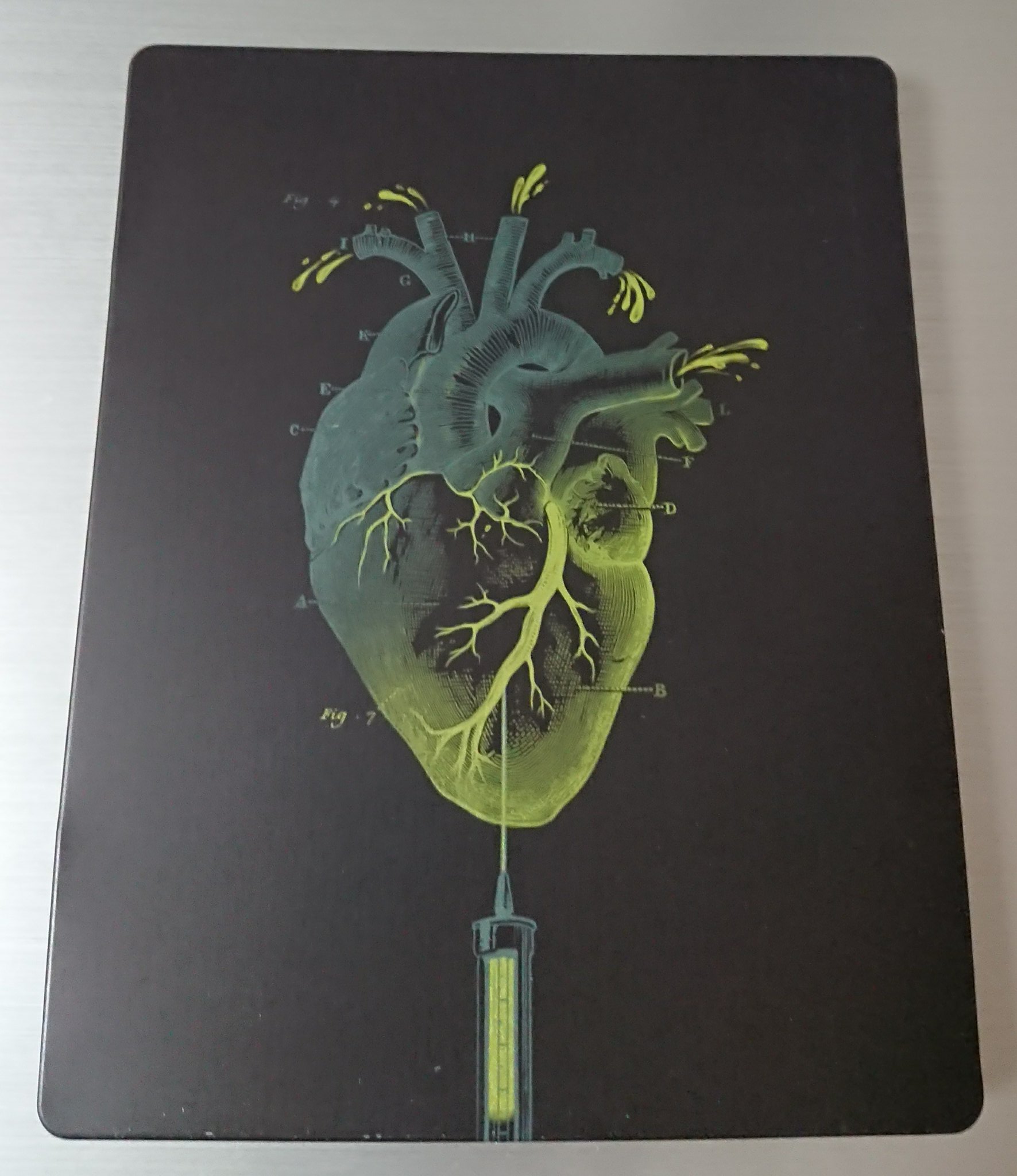
On the one hand it could be argued that a matte, zero or satin finish suits this type of cult film coming out of the Arrow, Eureka or other cult boutique label stable better than a full gloss finish . . . while on the other hand it could be argued that the steelbook finish has nothing whatsoever to do with the particular film inside the steelbook.
I will be in the minority when I state that I subscribe to the former school of thinking.
Quick look at RE-ANIMATOR and BRIDE:-