Attachments
Last edited by a moderator:
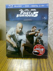
 The steelbook/slipcase looked so nice, until I removed the slipcase: a dent.
Studios and merchants need to look at the way this one was was done. The banner at the top looks cool when it is a metalic looking. ALso the clean look of the steelbook with no writing on it. This is indeed about as good as it gets. The only thing that could make it better would be emobossing, but this steel doesn't need it.
")
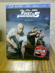
love the blu-ray logo bar with a different color beside blue... I wish those logo bar was a standard for all steelbook because I miss them. It looks beautiful stacking them on the shelves with the bar.
* love the back of the artwork...the best ever in this series with that angle of the car in a vertical shot.