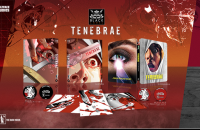
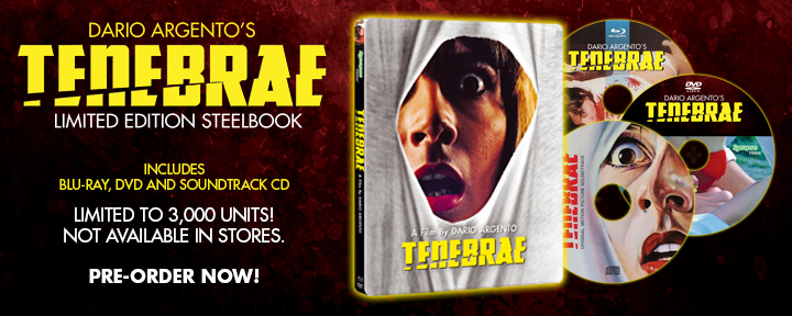
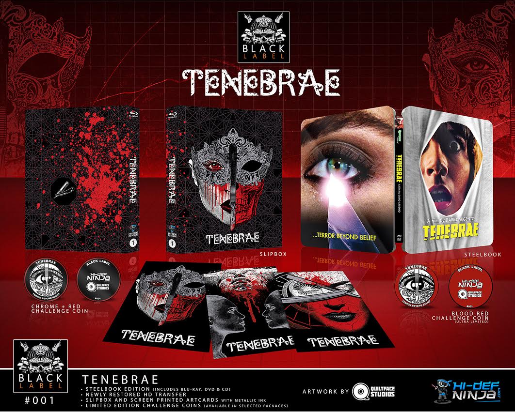
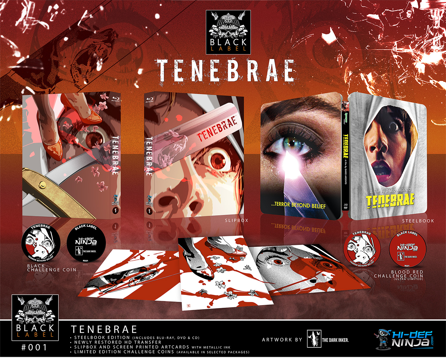
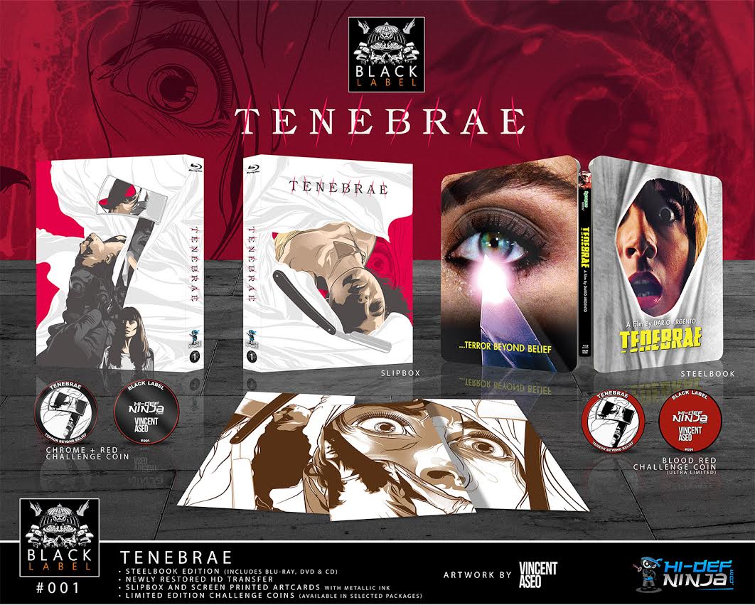
Last October while at MondoCon in Austin, Texas, Hi-Def Ninja announced the new Black Label line of horror SteelBooks with #001 in the series, Dario Argento’s TENEBRAE. Alongside Synapse Films’ glorious new SteelBook that includes a Blu-ray, DVD, and remastered soundtrack on CD, the full package also contains a collectible slipbox, three screen-printed art cards, and limited challenge coins.
For the first release in the Black Label line, HDN went to three celebrated artists to collaborate on the project: Chris Garofalo of Quiltface Studios, Vincent Aseo, and The Dark Inker (aka Stephen Sampson). With the TENEBRAE release now shipping out to collectors, we thought it’d be a good time to chat with all three artists regarding how they went about their creations.
HI-DEF NINJA: Were you a fan of TENEBRAE before being approached to work on this project?
QUILTFACE STUDIOS: I was already a longtime fan of Dario Argento’s entire catalog before being approached to work on this project. He’s a legend in the genre and has perfected the Giallo aesthetic over the years, which I really enjoy.
VINCENT ASEO: I wasn’t even aware of Argento’s films until the movie and I must say that it got me curious and made me watch some of his classics. Boy, they were great.
THE DARK INKER: Simple answer is yes! I’ve always had a bit of a dark spot for horror movies. The first time I saw the movie was on a dodgy VHS tape. If memory serves me right, I believe that when the movie was first released in the UK, it was deemed a “video nasty” and banned, which of course made it a “must see” movie! So I have very fond memories of watching many banned movies such as TENEBRAE when I was younger.
HDN: Did Dario Argento’s own visual style influence you with your overall design?
QS: Oh yes. Argento’s signature style of filmmaking along with his use of lighting, soundtrack, and suspense heavily influenced my artistic direction on this project. His films are an equal mixture of beauty and brutality, which I wanted to capture in my design.
VA: In a way it kinda did because I don’t usually do horror genres, so I had to adapt and make it work to represent what I think is best for the film.
TDI: Of course the imagery and mood of the movie plays into my approach for the design of the slipbox, and this movie has so many striking visuals to draw inspiration from. But like any project I’m lucky to be asked to do, I try and inject my own take and style as much as possible. I kind of feel my design had a bit of a Hitchcock vibe to it, even if that’s not completely obvious to anyone else.
HDN: How would you describe your work process on this project and how did you decide on which artwork to use for the slipbox, coin, and art cards?
QS: I had previously done a screen print for SUSPIRIA, which I really enjoyed conceptually. So I figured, why not apply the same concept and approach to TENEBRAE? I’d rather capture the feel and idea of the film rather than a bunch of likenesses and characters, so it was fun to really explore the potential on this. Argento is easy to get weird with.
VA: Upon taking the project, my first move was to see all the assets and visuals made for the film. The thing that stands out the most are the facial expressions and the iconic eyes which I think perfectly captures every bit of suspense/horror of the genre.
TDI: The process for this project was to re-watch the movie a few times, then start to sketch out the imagery that had the most effect upon me. Once I had the elements that I was happy with, I then started to play around with a layout that worked for the slipbox. When I was happy with my slipbox design, the art for the coin and art cards really just came together in a very natural and organic way. The slipbox was the big challenge and the coin and cards were a very cool bonus that allowed me to have even more fun with what I had already created!
HDN: Finally, if you could work on any other classic horror project in the future, which film would you want it to be based on?
QS: SteelBook wise, I’d love to do slipcovers for MANIAC, PIECES, and EVENT HORIZON. Poster wise, I’d love to tackle CRITTERS, SILENT NIGHT DEADLY NIGHT, and HALLOWEEN II.
VA: I would love to do a FRIDAY THE 13TH or A NIGHTMARE ON ELM STREET version if given the opportunity.
TDI: Great question! I’m sure I could give a different answer depending on my mood at the time, but right now my answer is Hideo Nakata’s original RINGU movie. I’m a big fan of many Japanese horror movies and RINGU had such a massive effect on me when I first saw it. But in truth, there is just an endless list of classic horror movies and given the chance, I’d love to work on any that came my way!
Could I also just finish by saying a BIG thanks to all at Hi-Def Ninja for giving me the opportunity to work on such a cool project. It really was a blast to work on and I’m very honoured to have my work featured alongside such major art talents as Chris Garofalo and Vincent Aseo, who also just happen to be top class gentlemen!
Thank you to Chris, Vincent, and Steve for taking the time to talk to us and for giving the collectors such an amazing SteelBook package. So, what do you think? Which horror-inspired artwork would you love to see these guys work on next?
There’s still a few TENEBRAE Black Label SteelBooks leftover at the Ninja Shop, so be sure to head here and grab one before it’s too late!