Avengers: Infinity War (3D+2D Blu-ray SteelBook) (Blufans Exclusive #50) [China]

luke98

Premium Supporter
Jun 30, 2014
9,950
Alexandria Safe-Zone
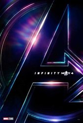
Release date: 2018 TBC
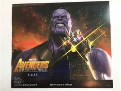
Group buy: To be hosted by cooey
Price: TBA
Note: Limited to 4000 copies

Group buy update - click the spoiler for info

GB will be live Friday 16th November at around 7:30 - 8:00 PM UK time.

All editions will be available apart from fullslip and quarter slip. Limited quantity of complete package and one click.

Notes - If you have transferred your Black Panther purchase to this, you cannot join the GB. If you do, your purchase will be immedialtely cancelled and refunded. And these are extremely limited at 1 edition per member - if you buy a Complete/One Click/DL/SL, you cannot then purchase any other edition, if you do your order will be immediately cancelled on the additional item and refunded.

Double Lenticular | Single Lenticular | Full Slip | One Click | 1/4 Slip

9a438038gy1fwzd3ld1w9j221l18i4bl.jpg9a438038gy1fwzd3mgpj3j221l18m47e.jpg9a438038gy1fwzd3pdwblj221k18j7hy.jpg9a438038gy1fwzd3k106pj221m18iwse.jpg9a438038gy1fwtnqjdtm2j221n18mn92.jpg
222BC943-C7E9-4113-8507-8A3E834CFEB9.jpeg
 
Last edited by a moderator:
Whilst I agree that the other way round (noodles art) works a little better I’m still 100% happy with that design. And 100% the art I wanted
 
Looks awesome

Same as @Noodles but reversed

View attachment 387224


Clearer image

View attachment 387226
They're getting clever now... switching the artwork around to disguise the fact they've copied my design. :cautious:

I joke of course! Looks good IMO. :)

Noodles design looks much cleaner. The Infinity war logo covering Thanos is what makes it feel crowded, where the logo on the rocks feels very natural. Wish they would switch it.
I also agree that part of what makes Noodles’ design better is the title doesn’t make the image so crowded on the image he used for the front
Whilst it does still look great, I do agree that having them the other way around (like my concept) would work better... the inclusion of both the A logo and the title on the front makes it look a little cluttered, and that image is already crowded anyway.

Not saying this is definitely the case, but if they did just switch them around to avoid the same old comparison to my concepts, then they've no need to worry about that... I'm only pulling their leg when I tease them about such things. And if anything, I use BF as inspiration when making Marvel concepts (I basically just try to imagine how they'd do it lol). I obviously don't own the rights to the posters either, so even if I did have a problem with them "copying" mine, then tough poop! They're welcome to use them as they please.

But anyhoo... I look forward to seeing the slips. :D
 
:shipped: May not want to admit that on here since it's not "out" until next week at the very earliest. Did it have AR switching for IMAX scenes?

Nope, black bars throughout the entire film (n)
No Dolby Vision either, just regular HDR, PQ was still good though albeit far from the best UHD disc I own
 
Agghh, this design is fine, but I also think that it is a mistake to put it that way, the other way around, I don't know if it can be changed, but it is much better the other way around, I don't understand why they have changed it.
Happy on the one hand and sad on the other ...
 
  • Thanks
Reactions: djfab
I like that they used the main movie poster for the cover. I know that the single and double lenticular slips will have different covers. We all know that those moving pictures will be like candy to us:)
 
I also really hope they switch the front and back. I love the composition of the rear poster and the empty space underneath Spider-Man was designed to show the title and the IMAX art they used for the front is just too crowded with the A logo essentially on there twice.

I also think we’re way beyond coincidence with Noodles art constantly being used, I’m not complaining since the art is great I just hope he gets compensated or at the very least he should get some free steelbooks. :spoil:
 
Last edited:
I also really hope they switch the front and back. I love the composition of the rear poster and the empty space underneath Spider-Man was designed to show the title and the IMAX art they used for the front is just too crowded with the A logo essentially on there twice.

I also think we’re way beyond coincidence with Noodles art constantly being used, I’m not complaining since the art is great I just hope he gets compensated or at the very least he should get some free steelbooks.

Like @Noodles has said himself all he does is use the posters he feels Blufans will use themselves. you'll notice they went in a completely different direction to his concepts with both Coco and The Last Jedi and before them the likes of Guardians of the Galaxy Vol 2 and Civil War.

That being said they bloody better use his concept for Ant Man and the Wasp :p
 
I really like the steelbook and that it wasn't far off from @Noodles concept as usual. That's always good to see.

As far as slips go, hopefully they go down the Black Panther route with this edition and have 3 main slips and a quarter slip. The more the merrier!
Also, as it is Infinity War I would like to see them do something a bit special. I don't know what... but something.

There are many options they could explore with the slips but I would like to see one of them being a 'Thanos only' design.
 
  • Like
Reactions: Noodles
Like @Noodles has said himself all he does is use the posters he feels Blufans will use themselves. you'll notice they went in a completely different direction to his concepts with both Coco and The Last Jedi and before them the likes of Guardians of the Galaxy Vol 2 and Civil War.

That being said they bloody better use his concept for Ant Man and the Wasp :p

I'm only half joking I'm sure they're not stealing his designs theres only so much available art they could use. But yeah, his Ant-Man and The Wasp design was fantastic so hopefully they steal that too lol

There are many options they could explore with the slips but I would like to see one of them being a 'Thanos only' design.

A lot of people keep asking for a Thanos only art, but Blufans can only use whats available to them by Disney and there wasn't any official solo Thanos artwork. He didn't even get a character banner and they put out 23 of them. The only other thing was Ryan Meinerding's original concept art, that they gave away at a D23 expo, but who knows if they're allowed to use that:

ryan-meinerding-38.jpg


Guaranteed it will be something from here:
http://www.impawards.com/2018/avengers_infinity_war.html
 
Last edited:
  • Thanks
Reactions: Noodles and ta0151
I too would prefer to see the rear image on the front. In the Blufans design, the 'A' logo on the front is redundant and fights againt the title. However, the image they've placed on the rear has space for a title at the bottom without overcrowding the design. I also like the fact that Thanos is the biggest, most prominent character in the image, and is placed symbolically ON TOP of the Avengers (instead of right at the bottom, partly hidden behind the title). The way that Iron Man is holding his arms out is also more symbolic of the character's motivations in the movie: it's as if he's trying to protect the other Avengers from the mad titan.
Another issue is the repetition between the two images. Look at Thanos, Spidey, Cap and Star-Lord especially. They're essentially the same image/pose on the front and back, with a bit of Photoshopping / flipping.
Rather than swapping the two images around, I'd like to see BluFans use the front image on a slip instead. Replace it with the image they've chosen for the back of the steel, and go with something more simple for the rear of the steelbook. Perhaps the big A poster or a cropped version of the D23 poster (photo not my own).
Just my two cents.

EDIT: I see @BlackDevil just beat me in posting the D23 Thanos art :LOL:
 

Attachments

  • Big A.jpg
    Big A.jpg
    18.1 KB · Views: 162
  • Thanos.jpg
    Thanos.jpg
    29.4 KB · Views: 151