It's not even rushed.
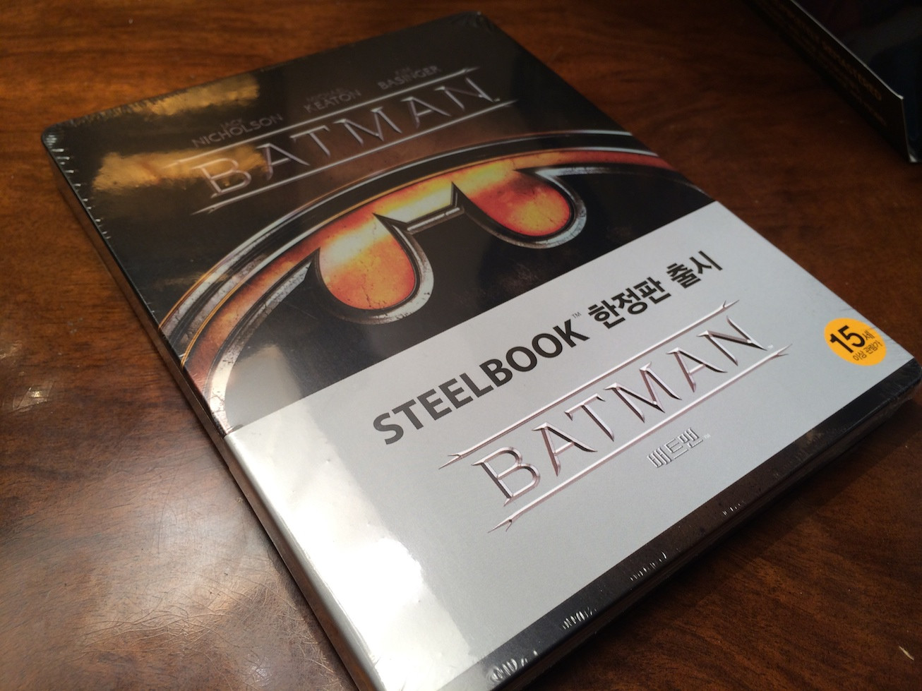
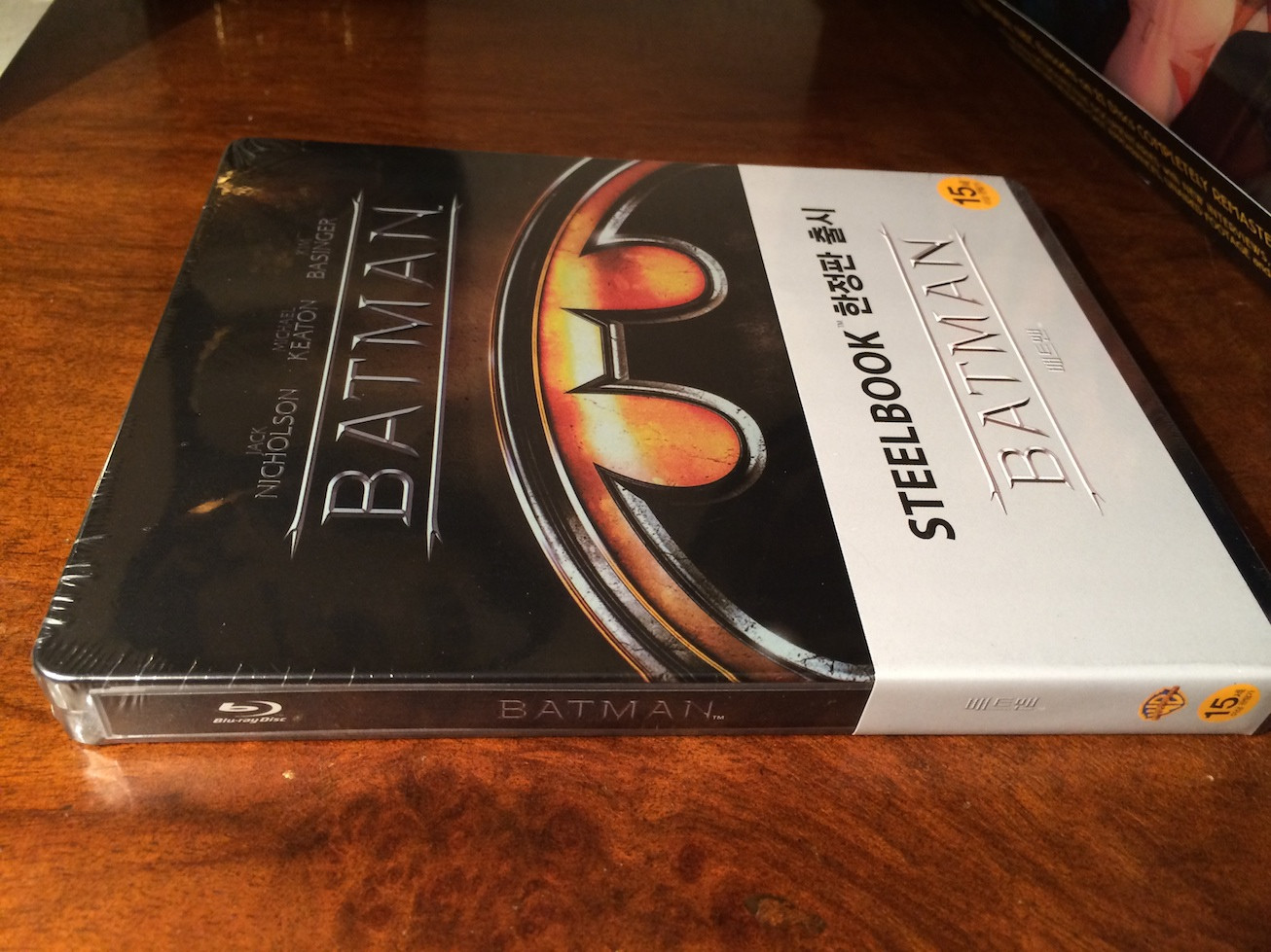
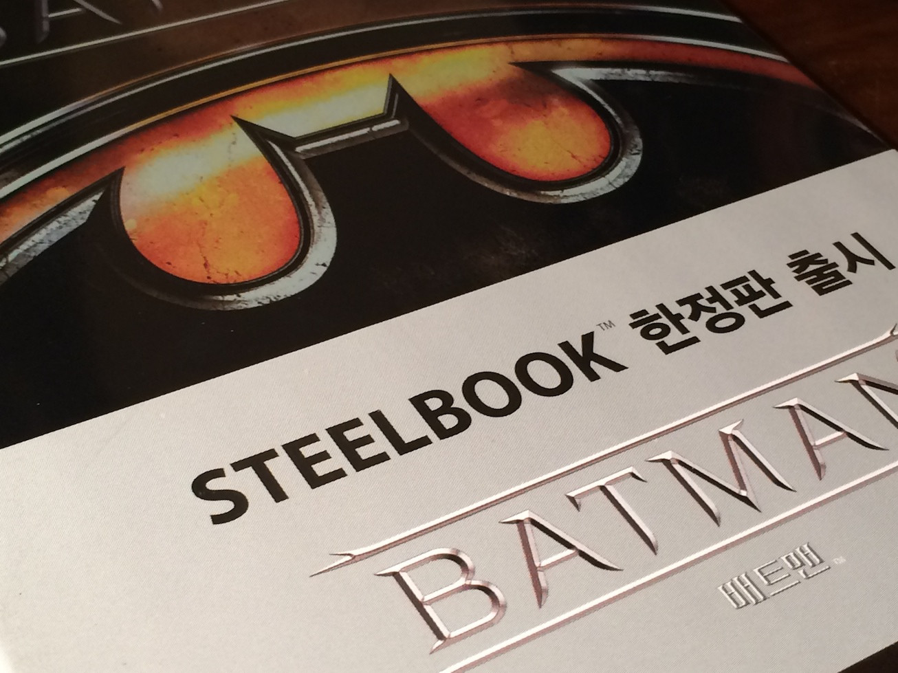
It's just the same old grey slip. Steelbook at top in English and translation to the right of it.
Then a clone of the font format of the title from the steelbook on the slip. Even worse, is that they are churning out the old slips for the re-releases.
It's was ok having it for the original Warner whites when they came out, but to have it with every damn Warner release is really taking the piss.
At least with 300, it was a bit creative with the background.
They really need to ditch this design.