Justice League (3D+2D Blu-ray SteelBook) (HMV Exclusive) [UK]
- Thread starter Noodles
- Start date
You are using an out of date browser. It may not display this or other websites correctly.
You should upgrade or use an alternative browser.
You should upgrade or use an alternative browser.

Back art muy simpatico and is certainly not out of place with the front art 
At a pinch wouldn't have objected to the waxworks on the back . . . or even the Illustrated Art -with or without Superman . . . but prefer the simplicity of what we've been given . . .


RE: FINISH - looks same Gloss Varnish as on THOR RAGNAROK:-


Not forgetting those original THOR RAGNAROK pics from Film Arena which were so dull that t'was difficult to believe steelbook was anything but matte . . . for example:-

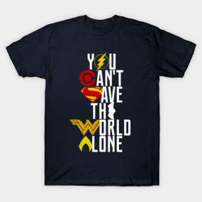
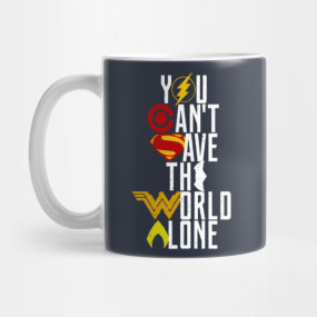
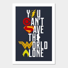
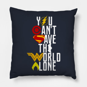
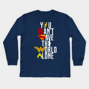
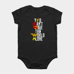
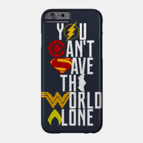
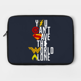
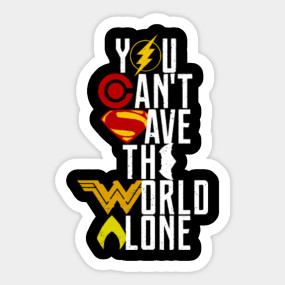
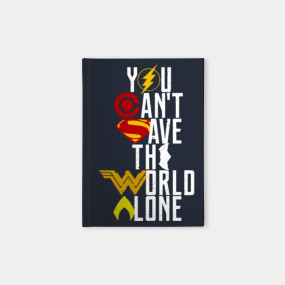
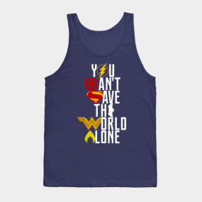
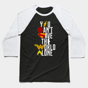
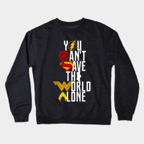
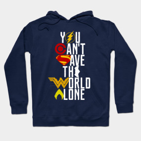
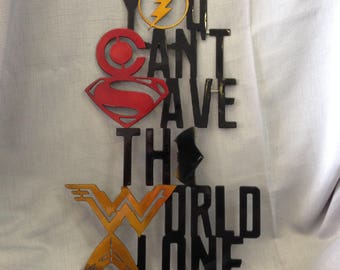
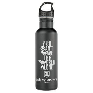
RE: what we've been given - the BACK ART DESIGN: very much out there on JL merchandise - from mugs to clothing via stickers and household stuff:-
At a pinch wouldn't have objected to the waxworks on the back . . . or even the Illustrated Art -with or without Superman . . . but prefer the simplicity of what we've been given . . .
RE: FINISH - looks same Gloss Varnish as on THOR RAGNAROK:-
Not forgetting those original THOR RAGNAROK pics from Film Arena which were so dull that t'was difficult to believe steelbook was anything but matte . . . for example:-
RE: what we've been given - the BACK ART DESIGN: very much out there on JL merchandise - from mugs to clothing via stickers and household stuff:-

Last edited:
One doubt, HMV will be the same?In hand WWA steelbook pics courtesy of FilmArena. ......
View attachment 363358 View attachment 363357 View attachment 363356 View attachment 363359 View attachment 363360
Back art muy simpatico and is certainly not out of place with the front art
At a pinch wouldn't have objected to the waxworks on the back . . . or even the Illustrated Art -with or without Superman . . . but prefer the simplicity of what we've been given . . .
View attachment 363576 View attachment 363579 View attachment 363577 View attachment 363578
RE: FINISH - looks same Gloss Varnish as on THOR RAGNAROK:-
View attachment 363604View attachment 363603
Not forgetting those original THOR RAGNAROK pics from Film Arena which were so dull that t'was difficult to believe steelbook was anything but matte . . . for example:-
View attachment 363606
RE: what we've been given - the BACK ART DESIGN: very much out there on JL merchandise - from mugs to clothing via stickers and household stuff:-
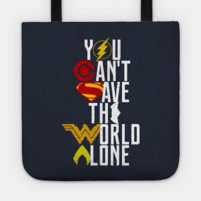
Doesn’t matter how many times they slap that logo/tagline on a lunchbox or baby grow.... still looks terrible.
In France this steelbook confirmed *the same . . . no need to worry about ours in the UK being any different to the one in the Film Arena pics.One doubt, HMV will be the same?
*Source Steelbookpro:-
"MAJ le 09 mars 2018 — Va-t-il falloir annuler sa précommande FR pour avoir une meilleure finition en important une autre édition ? Ce ne sera pas nécessaire ! Steelbookpro peut confirmer la finition de l’édition française, elle sera bien vernie (glossy) et embossée."
Looks like whoever approved the embossing for Blufans Iron Man V1 has found a new job.
Seriously, what's up with the embossing under the title... like they had no idea what to do.
So, how else do you suppose they could've done it to still keep the title in line with the top of the steelbook ?Looks like whoever approved the embossing for Blufans Iron Man V1 has found a new job.
Seriously, what's up with the embossing under the title... like they had no idea what to do.
Having the title in line with the JL logo would've looked a lot odder than what we have here . . . no two ways about it.
Should of just left off the angled embossing of the top part of the logo (under JUSTICE) and continued with the border up and around the JUSTICE LEAGUE title and embossed the title. Not rocket science, but regardless, it looks OK, such a shame the film is a complete turd, a clear abomination, well according to some people anyway, haven't actually seen it yet, so will reserve judgement when I get mine from HMV and watch (or endure) it....")
Actually very easily. The red part would be debossed, the green part would be embossed.So, how else do you suppose they could've done it to still keep the title in line with the top of the steelbook ?
Having the title in line with the JL logo would've looked a lot odder than what we have here . . . no two ways about it.
Should of just left off the angled embossing of the top part of the logo (under JUSTICE) and continued with the border up and around the JUSTICE LEAGUE title and embossed the title. Not rocket science, but regardless, it looks OK, such a shame the film is a complete turd, a clear abomination, well according to some people anyway, haven't actually seen it yet, so will reserve judgement when I get mine from HMV and watch (or endure) it....
Literally described what I was doing while I was doing it.
Yes, that would work to a certain degree but for two issues that I can see:-
1) The "DC" logo would have to be scaled considerably smaller to keep it on the frame . . . perish the thought they push it further into the corner where you get this abomination:-

2) Embossed full title would look too fussy and odd as part of the main 'bossed design instead of separate and flat on the frame as it is now.
1) The "DC" logo would have to be scaled considerably smaller to keep it on the frame . . . perish the thought they push it further into the corner where you get this abomination:-
2) Embossed full title would look too fussy and odd as part of the main 'bossed design instead of separate and flat on the frame as it is now.
Yes, that would work to a certain degree but for two issues that I can see:-
1) The "DC" logo would have to be scaled considerably smaller to keep it on the frame . . . perish the thought they push it further into the corner where you get this abomination:-
View attachment 363785
2) Embossed full title would look too fussy and odd as part of the main 'bossed design instead of separate and flat on the frame as it is now.
1. I accommodated for the D.C. logo on my edit, you can see a quarter of it is green.
2. I think it would work perfectly to emboss the title
1. I accommodated for the D.C. logo on my edit, you can see a quarter of it is green.
2. I think it would work perfectly to emboss the title
1) There would have to be a larger raised quarter than in your design as there should be a similar sized area all around the logo at the same raised level for the logo to not look off balance.
2) As there's no way of finding out if an embossed title within a larger de-bossed area is better or worse than what we have here I think we'll just have to agree to disagree.
I personally like the creative poster design treatment on this steelbook and I'm glad that the main title is on the frame and separate from the artwork.
Of course an embossed title looks good when it fits in with the design . . . such as on the recent CA: CIVIL WAR steelbook:-

1. My quarter green of the D.C. Logo would raise it to the same height as the frame. It could definitely be given a little more edge space too, this was just a quick mockup.1) There would have to be a larger raised quarter than in your design as there should be a similar sized area all around the logo at the same raised level for the logo to not look off balance.
2) As there's no way of finding out if an embossed title within a larger de-bossed area is better or worse than what we have here I think we'll just have to agree to disagree.
I personally like the creative poster design treatment on this steelbook and I'm glad that the main title is on the frame and separate from the artwork.
Of course an embossed title looks good when it fits in with the design . . . such as on the recent CA: CIVIL WAR steelbook:-
View attachment 363807
2. I agree to disagree.
Just to lasso and corral the JUSTICE LEAGUE steelbooks . . . not quite a "Wonder Woman" situation . . . with three very different styles to choose from (which can't be a bad thing) :-
The Americas ............................................................................................................................... UK etc. ..................................................................................................................... Italy / Germany ................................................................
 ------------- /---------
 -------------/-------------
 ------------------------------------
 -------------------------- / --------
 --------/-------
 ----------
HDZeta .................................................................................................................... Manta Lab .........................................
 ----- / -----
 --------
The Americas ............................................................................................................................... UK etc. ..................................................................................................................... Italy / Germany ................................................................
HDZeta .................................................................................................................... Manta Lab .........................................

Just to lasso and corral the JUSTICE LEAGUE steelbooks . . . not quite a "Wonder Woman" situation . . . with three very different styles to choose from (which can't be a bad thing) :-
The Americas ............................................................................................................................... UK etc. ..................................................................................................................... Italy / Germany ................................................................
View attachment 363875 ------------- /--------- View attachment 363877 -------------/------------- View attachment 363879------------------------------------
View attachment 363876 -------------------------- / -------- View attachment 363878--------/------- View attachment 363880----------
HDZeta .................................................................................................................... Manta Lab .........................................
View attachment 363881----- / ----- View attachment 363882 --------
Seeing them altogether like that, Manta's looks the nicest in my opinion as far as the steelbook itself goes.
That Italy/EU steelbook is an abomination! Flat matte no doubt.
The North American release is so laughable.
Rear artwork black and white repeat of front artwork and the interior would be better off being blank. Not even worth 5$
Rear artwork black and white repeat of front artwork and the interior would be better off being blank. Not even worth 5$
That Italy/EU steelbook is an abomination! Flat matte no doubt.
You could be right but hopefully they're not just going to use the back of the WWA and plonk the "DC" logo in the corner.
Would be a real treat if the complete artwork - logos and text - including title in this case - is embossed within a frame and then given a gloss varnish.
As for back art - front of U.K. / WWA?
IMO the pick of the bunch - steelbook-wise - is the HDZeta thanks to the elegant grouping of the characters . . . although not a fan of the back art on the back and would prefer it inside . . . as on the WWA.
Next up would be the U.K. / WWA followed by the announcement for Italy/Germany (and other territories TBC) . . . although that one could look equally good if treated right.
The Illustrated Art from The Americas will please collectors of similar style DC steelbooks (nice continuity of style with MAN OF STEEL etc.) and the gloss finish on this style of art is always a plus.
Reserving comment on The Manta Lab artwork until the back is revealed . . . confused by the design with the group just standing there gazing skywards at something which will maybe/ hopefully be revealed in the wraparound art (if that's to be the design) . . . wraparound art being the only way this design will click.
------------------------------------------------------------------------------------------------------------------------------------------------------------------------------------------------------------------------------------------------------------------

Last edited:
Similar threads
- Replies
- 11
- Views
- 1K
- Replies
- 18
- Views
- 2K
- Replies
- 2
- Views
- 427
- Replies
- 0
- Views
- 396