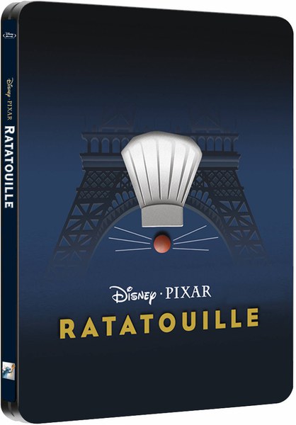
This artwork is lazy. I understand that it's minimalistic, but it doesn't look right for a PREMIUM SteelBook release! This is not what I expected the final artwork to look like. It works as a promotional poster, or maybe rear artwork, but not as a SteelBook cover. Don't get me wrong, I like the artwork for what it is, but I don't think it's appropriate for this particular product (like I say, it's poster artwork). There's a time and a place for minimalist artwork, and this is NOT it!
I'm 100% certain that the Disney designers could have come up with something better. Literally any of the promotional artwork available for this title would have been suitable and acceptable! Now is not the time to be experimenting with designs, and I can see a vast majority of collectors disapproving of this artwork choice! Not that a few unhappy comments on a collectors' forum will influence Disney's final decision...


")