Rogue One: A Star Wars Story (Blu-ray SteelBook) (Blufans Exclusive #41) [China]

harry

Premium Supporter
Nov 12, 2012
13,016
Release date: Late December, 2017
Group Buy: One Click - One Click (deposit) - Double Lenti - Single Lenti - Full Slip
Group Buy Prices:
One Click - $205, DL - $70.99, SL - $67.99, FS - $64.99
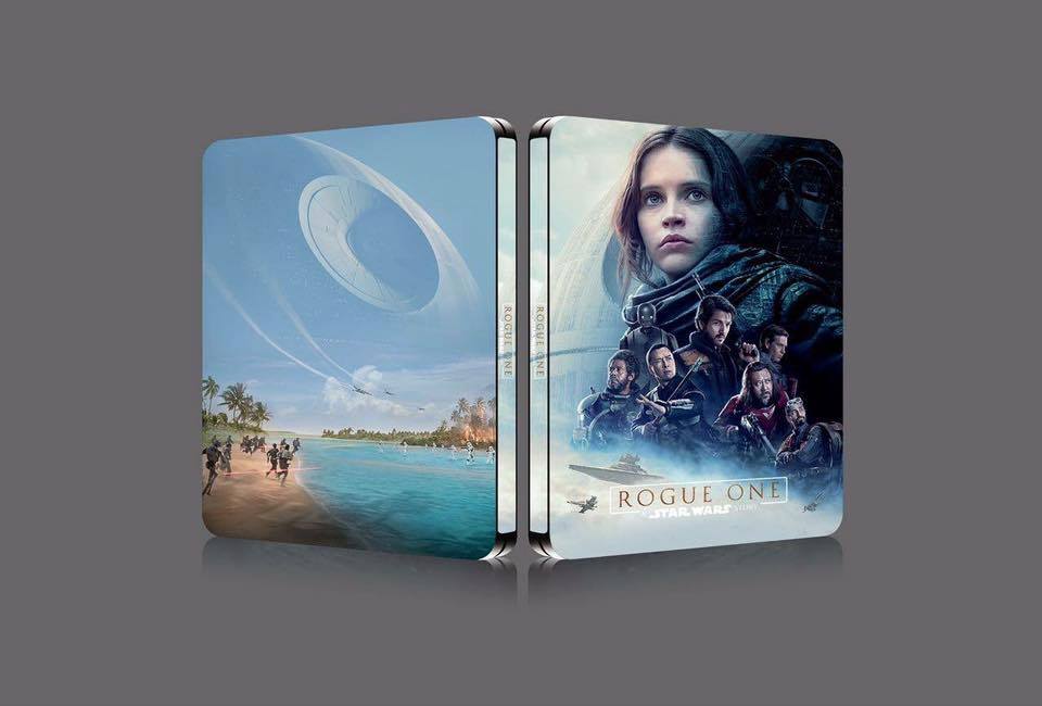
Note: Glossy and embossed finish on the steelbook
Double lenticular
-3D+2D+bonus BD
-44 page booklet
-Exclusive Storm Trooper collector's card
Single lenticular
-3D+2D
-triple lenticular effects
-8 art cards
-Exclusive Death Trooper collector's card
Full slip
-3D+2D
-embossed
-4 IMAX poster cards
-Exclusive K-2SO collector's card
One Click

-all three editions plus fold out poster

RogueOneBlufansDoublelenti.jpgBlufansRogueOneSinglelenti.jpgRogueOneFullSlip.jpgBlufansRogueOneOneClick.jpg

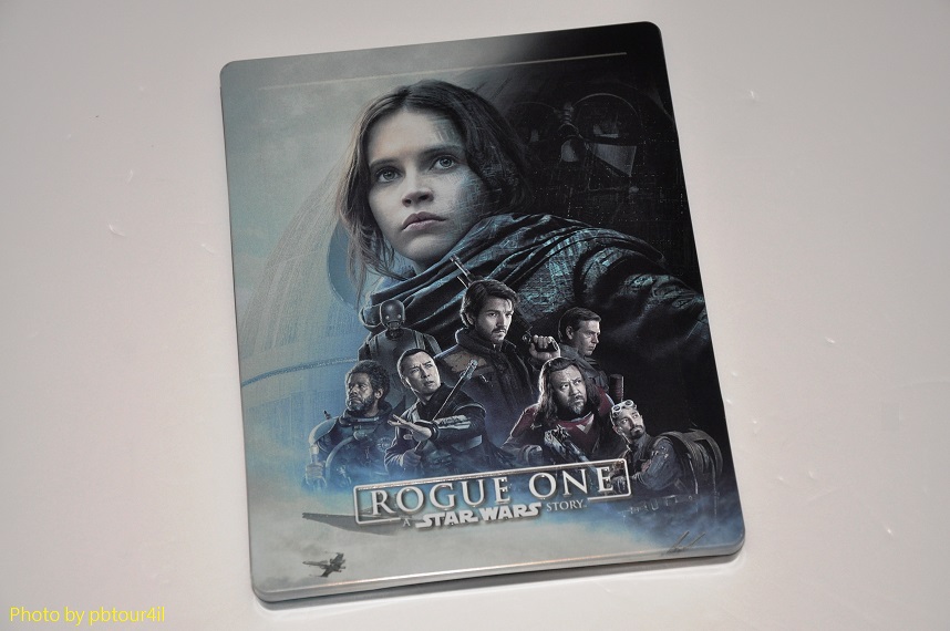
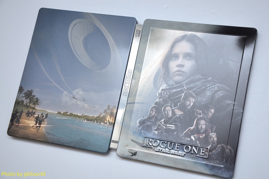
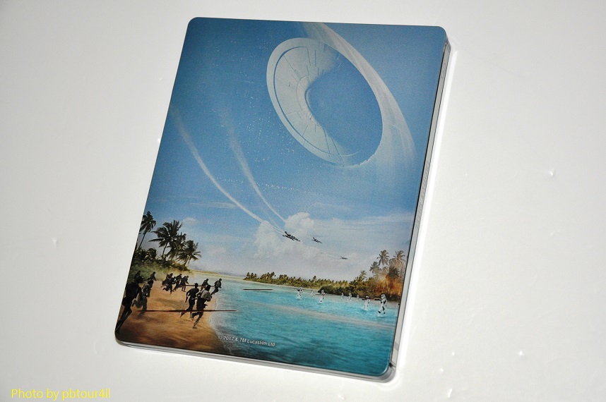
Old info with live pictures of steelbook -
Thank you to member @pbtour4il for these live shots
dsc_1643-jpg.329268


dsc_1647-jpg.329280


dsc_1644-jpg.329269
dsc_1649-jpg.329283


IMG_3819.JPG
135831z5s98i3s8sh5iz5g.jpg
rogue-one-jpg.304288


image.jpeg
 
Last edited by a moderator:
Meh, kinda bummed they are going with the amaray cover. Its exactly the same here.
I am disappointed for the same reason, however, this is way better artwork than WWA.
I hope they'll release a 1/4 slip. So i dont have to buy the Amaray.
 
I missed out on the UK version and will not pay £40 - £50 on ebay. So I guess this is the alternative. Will keep a close eye on this one.
 
  • Thanks
Reactions: davhyl
Front artwork now showing as slightly better positioned but unimaginative and uncreative photoshopped nightmare unable to save this steelbook from epic fail status . . . unless . . .the whole poster image is embossed in line with the frame (as on the black 'n' gold "Ben-Hur" steelbook for example).

Would have been much more successful (IMO) had the image been totally contained within the framing border in the style of say the original Zavvi "Beauty and the Beast".

Panoramic back art is poor with too small an image compared to the front and something better should definitely have been chosen for there.

Hopefully inside art is good.

Best thing I can say currently is that the soft aqua colours are pleasant enough although I have to qualify that too and question the severe black colour of the three opening edges. A much paler colour there would have gone better with the softer background shades used on the steelbook covers but probably deemed unsuitable from a design POV what with the positioning at the steelbook edge of the much darker poster artwork - artwork which does nothing for me and is certainly NOT the best poster image they could have chosen - and does not look nice the two tone effect of pale spine against the three other dark edges.
 
Last edited:
  • Thanks
Reactions: Lionet and nafosb
Front artwork now showing as slightly better positioned but unimaginative and uncreative photoshopped nightmare unable to save this steelbook from epic fail status . . . unless . . .the whole poster image is embossed in line with the frame (as on the black 'n' gold "Ben-Hur" steelbook for example).

Would have been much more successful (IMO) had the image been totally contained within the framing border in the style of say the original Zavvi "Beauty and the Beast".

Panoramic back art is poor with too small an image compared to the front and something better should definitely have been chosen for there.

Hopefully inside art is good.

Best thing I can say currently is that the soft aqua colours are pleasant enough although I have to qualify that too and question the severe black colour of the three opening edges. A much paler colour there would have gone better with the softer background shades used on the steelbook covers but probably deemed unsuitable from a design POV what with the positioning at the steelbook edge of the much darker poster artwork - artwork which does nothing for me and is certainly NOT the best poster image they could have chosen - and does not look nice the two tone effect of pale spine against the three other dark edges.

You lost me at "epic fail" :sleep:
 
You lost me at "epic fail" :sleep:
LOL . . . yes, short attention spans in this day and age are to be expected :rolleyes:

I remember someone posted this recently... ;)

View attachment 304469
If you take the time to read my post nowhere do I say that I hate the steelbook. I just feel it's not good enough with back art showing tiny insignificant figures and front art badly framed - an image certainly not the best (IMO) out of the poster choices available but as mentioned previously could still look good on the steelbook front if embossed in its totality.
-----------------------------------------------------------------------------------------------------------------------------------------------------------------------------------------------------
. . . and keeping to the pale colour theme a mainly WHITE STEELBOOK for this film using original poster art would have been g-r-r-r-eat (as Tony the Tiger used to say) making for a better glossy presentation.

Anyway, all they've done here is crop the lower quarter and stick it, or something similar, on the lower quarter of the back:-


3179558add37d9ce69.jpg


WHITE STEELBOOK including cool off-centre title and more of the undeniably pretty Jyn Erso making for my favourite cover art (out of the paler design choices):-


I can just hear the design "experts" at Blufans Towers panic-deciding to play it safe (after the kerfuffle regarding their original choice of artwork) going with something very similar to this overused image for their main steelbook artwork :banghead:
II
V
U.S. / Canada Amaray ............... U.K. Amarays ......................German Amaray ........................... France Amaray ....................
139135_large.jpg
170563_large.jpg
170581_large.jpg
170663_large.jpg

Japan Amaray ................................ Italy Amaray
175879_large.jpg
174504_large.jpg

Anyway, this . . .
PHJjjqSSbcWTNN_1_l.jpg
. . . or this for the inside . . .
PHIfM0GDuCwSML_1_l.jpg
 
Last edited:
LOL . . . yes, short attention spans in this day and age are to be expected :rolleyes:


If you take the time to read my post nowhere do I say that I hate the steelbook. I just feel it's not good enough with back art showing tiny insignificant figures and front art badly framed - an image certainly not the best (IMO) out of the poster choices available but as mentioned previously could still look good on the steelbook front if embossed in its totality.
-----------------------------------------------------------------------------------------------------------------------------------------------------------------------------------------------------
. . . and keeping to the pale colour theme a mainly WHITE STEELBOOK for this film using original poster art would have been g-r-r-r-eat (as Tony the Tiger used to say) making for a better glossy presentation.

Anyway, all they've done here is crop the lower quarter and stick it, or something similar, on the lower quarter of the back:-


WHITE STEELBOOK including cool off-centre title and more of the undeniably pretty Jyn Erso making for my favourite cover art (out of the paler design choices):-


I can just hear the design "experts" at Blufans Towers panic-deciding to play it safe (after the kerfuffle regarding their original choice of artwork) going with something very similar to this overused image for their main steelbook artwork :banghead:
II
V
U.S. / Canada Amaray ............... U.K. Amarays ......................German Amaray ........................... France Amaray ....................
139135_large.jpg
170563_large.jpg
170581_large.jpg
170663_large.jpg

Japan Amaray ................................ Italy Amaray
175879_large.jpg
174504_large.jpg


Anyway, this . . .

. . . or this for the inside . . .
Why would you put Force Awakens characters on the inside of a steelbook for Rogue One?:confused:
 
We haven't even seen the whole package yet, you may get some of that art on lenticular or full slip so 'epic fail' is a tad much.

LOL . . . yes, short attention spans in this day and age are to be expected :rolleyes:


If you take the time to read my post nowhere do I say that I hate the steelbook. I just feel it's not good enough with back art showing tiny insignificant figures and front art badly framed - an image certainly not the best (IMO) out of the poster choices available but as mentioned previously could still look good on the steelbook front if embossed in its totality.
-----------------------------------------------------------------------------------------------------------------------------------------------------------------------------------------------------
. . . and keeping to the pale colour theme a mainly WHITE STEELBOOK for this film using original poster art would have been g-r-r-r-eat (as Tony the Tiger used to say) making for a better glossy presentation.

Anyway, all they've done here is crop the lower quarter and stick it, or something similar, on the lower quarter of the back:-


WHITE STEELBOOK including cool off-centre title and more of the undeniably pretty Jyn Erso making for my favourite cover art (out of the paler design choices):-


I can just hear the design "experts" at Blufans Towers panic-deciding to play it safe (after the kerfuffle regarding their original choice of artwork) going with something very similar to this overused image for their main steelbook artwork :banghead:
II
V
U.S. / Canada Amaray ............... U.K. Amarays ......................German Amaray ........................... France Amaray ....................
139135_large.jpg
170563_large.jpg
170581_large.jpg
170663_large.jpg

Japan Amaray ................................ Italy Amaray
175879_large.jpg
174504_large.jpg


Anyway, this . . .

. . . or this for the inside . . .
 
Last edited:
...back art showing tiny insignificant figures...

...undeniably pretty Jyn Erso making for my favourite cover art (out of the paler design choices):-
I agree with you that that Imax poster is by far the best official art for the movie. If the slip uses that image, I'll be thrilled.

As for the "tiny insignificant figures," I think the point is that compared to the Death Star, individual people, whether Rebel or Imperial, ought to seem pathetically insignificant. Hence the plot's dramatic tension.

As for Jyn Erso, the feminist in me wants to point out that her character is about something more than being "undeniably pretty."