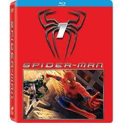
Spider-Man (Blu-ray SteelBook) (Future Shop Exclusive) [Canada]

Drum18

Super Moderator
Premium Supporter
May 3, 2011
16,627
Montreal
From this week Future Shop flyer and some little digging on FutureShop.ca.
Coming September 21, 2012.

Order here http://www.futureshop.ca/en-CA/prod...spx?path=5a7ef3f8fa7a946dc38fd7c99cf5fa14en02

M2200934.jpg


Source: Pic from Drum's flyer:
attachment.php
 

Attachments

  • M2200934_1.jpg
    M2200934_1.jpg
    187.3 KB · Views: 287
Last edited by a moderator:
I never had any intentions on buying this set b/c I absolutely can't stand this trilogy, well aside from #2, but after seeing these awful designs I am glad that I never had any intention on buying them. These just look bad.. very amateurish.

This one should have just had the Spiderman logo on it (embossed) with a red background.

#2 Should have had the Spiderman logo and maybe the Doc Oc tentacles surrounding it on a red background

#3 should have had the white spiderman/venom logo on a black background.
 
Yep il stick with my German trilogy as well. FS usually come up with some great artwork on there steels, but this is just awfull
 
Its better then the Blu-ray release:

m2198416.jpg


Not by much though...
They seriously need to fire whoever is in charge of designing these. Unacceptable.
 
Thank you FS for saving me money!:rolleyes: What a fugly design!!:( Everything would have been better than this red with a picture atrocity.
 
I'm not a huge fan of the "1", "2", "3"... But if the studio HAD to use them... why not just go simple? Something like this:

View attachment 15676

Maybe do some embossing. Would have made a much better Steelbook.

---------- Post added at 10:31 AM ---------- Previous post was at 10:30 AM ----------

And hire you!!!!! I vote/dream for that!!!! Such awesome design!!!!

HAHA thanks Drum!
 
Last edited by a moderator:
It will be a very nice steelbook set if the number and title are debossed in silver or white against that red glossy background just like Play's Shaun of the Dead.
 
These would be AWESOME if the red area was a slipcover and the rest of the front and back were clean! But otherwise I think these are the WORST steels FS has ever released!
 
These would be AWESOME if the red area was a slipcover and the rest of the front and back were clean! But otherwise I think these are the WORST steels FS has ever released!

Agreed. I'm guessing since the release date is so close that these have already been produced which means if they are terrible, no chance of them changing the artwork :ohno:
 
This is the final artwork?? Each little child of five years can make this too. The German versions are much better! Epic fail!!