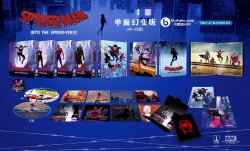
Spider-Man: Into the Spider-Verse (4K+3D+2D Blu-ray SteelBook) (Blufans Exclusive #53) [China]

Aug 25, 2011
3,724
Hong Kong
Release date: November 2019
Purchase links: Group Buys
Price: TBA
Group Buy: To be hosted by Wreck / HDN GB to happen Wednesday 4:30-5pm CST
Note: Print run 3000

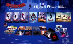
One-Click Box Set (DL+SL+FS, DL includes only the 4K disc):
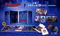
Spider-Man; Into the Spider-Verse, one-click box set.jpg

Fan Box (4K+3D quarter slip & bonus items):
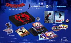
Spider-Man; Into the Spider-Verse, fan box.jpg

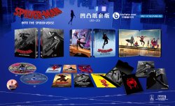
Double Lenticular (4K+3D+2D):
Spider-Man; Into the Spider-Verse, double lenticular.jpg

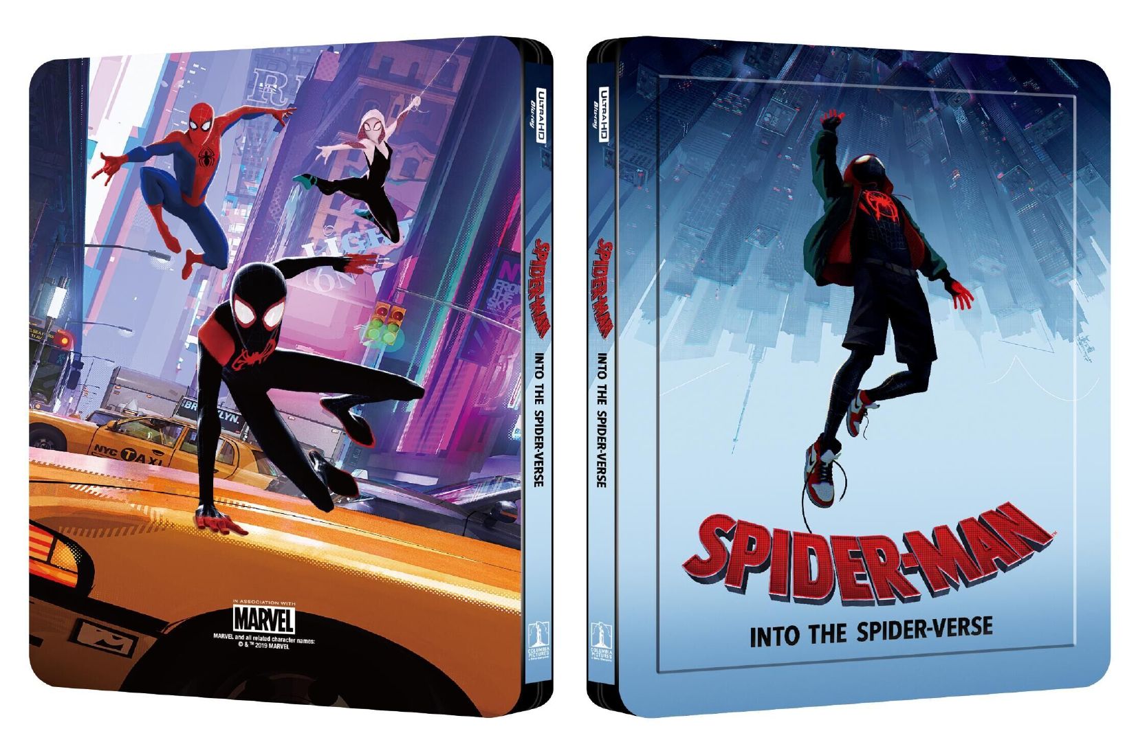
Single Lenticular (4K+Bonus Disc):
spiderman-lenti.jpg

Full Slip (3D+2D):
Spider-Man; Into the Spider-Verse, full slip.jpg
Blufans_SMITSV-01.jpeg
Blufans_SMITSV-02.jpeg
Blufans_SMITSV-03.jpeg
Spider-Man; Into the Spider-Verse, single lenticular.jpg
 
Last edited by a moderator:
Its already been stated that the OAB is an error and will be corrected, it is a Blufans exclusive. I am absolutely going one click for this one, its just stunning ...what a release!
 
Its already been stated that the OAB is an error and will be corrected, it is a Blufans exclusive. I am absolutely going one click for this one, its just stunning ...what a release!

?

This has always been a WEA exclusive.

Do you mean Spider-Man Far from home? I can’t see any mention of that being a WEA
 
?

This has always been a WEA exclusive.

Do you mean Spider-Man Far from home? I can’t see any mention of that being a WEA
If you look at the artwork pictures that are shown, OAB is written on top right and its been confirmed thats an error. I was reading few comments above mine and didnt realise they were mentioning OAB of Spiderman Home coming, i just assumed they were referring to the artwork reveal pics
 
If you look at the artwork pictures that are shown, OAB is written on top right and its been confirmed thats an error. I was reading few comments above mine and didnt realise they were mentioning OAB of Spiderman Home coming, i just assumed they were referring to the artwork reveal pics

Oh you mean on the beauty shots? Never even noticed that. Well we know it’s WEA anyway because of the steel.

Ah ok, yeah, that’s referring to why far from home is going to be OAB and just saying that homecoming was also OAB
 
Oh you mean on the beauty shots? Never even noticed that. Well we know it’s WEA anyway because of the steel.

Ah ok, yeah, that’s referring to why far from home is going to be OAB and just saying that homecoming was also OAB
Yes beauty shots lol...anyways back on topic...my jaw is still hanging from seeing the artwork, what a package!
 
  • Like
Reactions: Flloydo
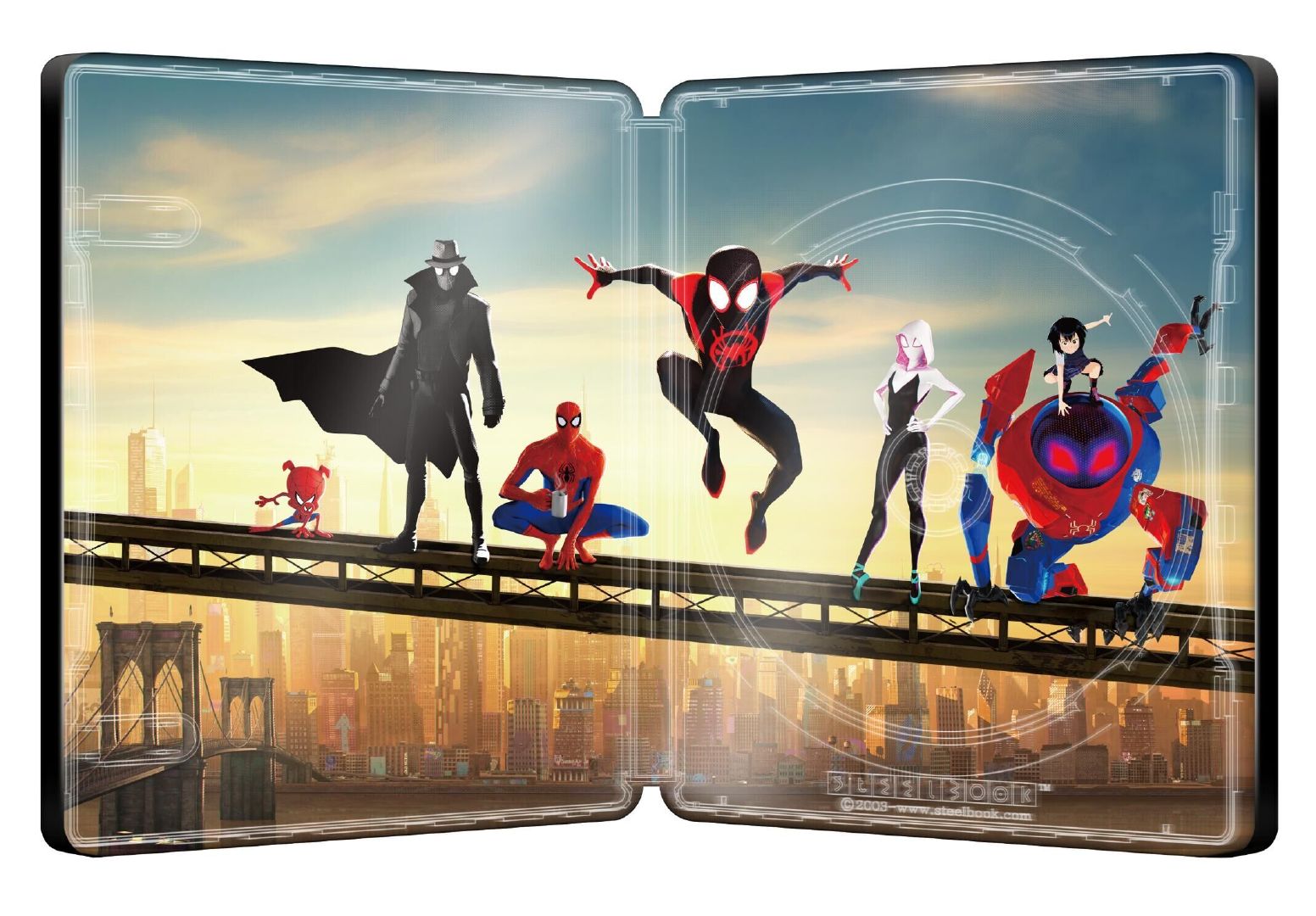
Not loving any of those slips unfortunately, and even the steel itself is a little disappointing IMO. I hate that BF editions have no continuity in terms of colour/style from front to back anymore... they're just two random images slapped together with no real thought put into it. The full slip actually looks the best to me, because both sides obviously look like they belong together since they're black and white... ironically that's also what I dislike about it (the fact they're b&w and not colour) lol. Love the wraparound art for the OC box though... gimme that on a slip!
 
Not loving any of those slips unfortunately, and even the steel itself is a little disappointing IMO. I hate that BF editions have no continuity in terms of colour/style from front to back anymore... they're just two random images slapped together with no real thought put into it. The full slip actually looks the best to me, because both sides obviously look like they belong together since they're black and white... ironically that's also what I dislike about it (the fact they're b&w and not colour) lol. Love the wraparound art for the OC box though... gimme that on a slip!

1565171290711.gif


You listening Blufans as @Noodles has hit the nail on the head :thanks: just abit mish mash really with none of that continuity flow from front to back that we’ve been spoiled with in the past, except for that OC that’s a beauty. My favourite slip design and steelbook for Spider-Verse which I thought BF used until I took a double take with the BS is this you may recognise it @Noodles :whistle::drool:

1565171928144.png
 
View attachment 441410

You listening Blufans as @Noodles has hit the nail on the head :thanks: just abit mish mash really with none of that continuity flow from front to back that we’ve been spoiled with in the past. My favourite slip design and steelbook for Spider-Verse which I thought BF used until I took a double take with the BS is this you may recognise it @Noodles :whistle::drool:

View attachment 441423
It's actually something they could probably easily fix too, at least with the single lenti anyway, since it'd just be a case of swapping artwork around that they're already using... if they swapped the back of the steel with the back of the slip (and vice versa), they'd work a lot better IMO, because then it'd be blue with blue for the steel, and purple with purple for the slip.

Here's a very rough edit (I flipped the images for quickness, so ignore that), but hopefully it gives you an idea of what I mean...

spiderman-lenti.jpg
 
It's actually something they could probably easily fix too, at least with the single lenti anyway, since it'd just be a case of swapping artwork around that they're already using... if they swapped the back of the steel with the back of the slip (and vice versa), they'd work a lot better IMO, because then it'd be blue with blue for the steel, and purple with purple for the slip.

Here's a very rough edit (I flipped the images for quickness, so ignore that), but hopefully it gives you an idea of what I mean...

View attachment 441438

and presto just like that you’ve made the SL and Steelbook transition nicely from front to back with correct colour bases just like you say blue ‘n’ blue and purple ‘n’ purple. Well done champ :thumbs:
 
  • Like
Reactions: Noodles
It's actually something they could probably easily fix too, at least with the single lenti anyway, since it'd just be a case of swapping artwork around that they're already using... if they swapped the back of the steel with the back of the slip (and vice versa), they'd work a lot better IMO, because then it'd be blue with blue for the steel, and purple with purple for the slip.

Here's a very rough edit (I flipped the images for quickness, so ignore that), but hopefully it gives you an idea of what I mean...

View attachment 441438
16b8d410b5a11f44f.gif
 
I thought it was the studios that decided on the design? Hence getting permissions and all that.....
It is the film studio distributor who decide what artwork will be used.


Scanavo just make steelbook based on what artwork film studio distributor has provided.
Scanavo give suggestions in regards to finish embossing/debossing and do samples
 
  • Like
Reactions: BluSteel2012
It is the film studio distributor who decide what artwork will be used.


Scanavo just make steelbook based on what artwork film studio distributor has provided.
Scanavo give suggestions in regards to finish embossing/debossing and do samples
Ok so maybe he’s the Art Liason or something that Scanavo sends to work with the studio artists who aren’t used to designing for SteelBooks.
 
  • Haha
Reactions: Noodles