You are using an out of date browser. It may not display this or other websites correctly.
You should upgrade or use an alternative browser.
You should upgrade or use an alternative browser.

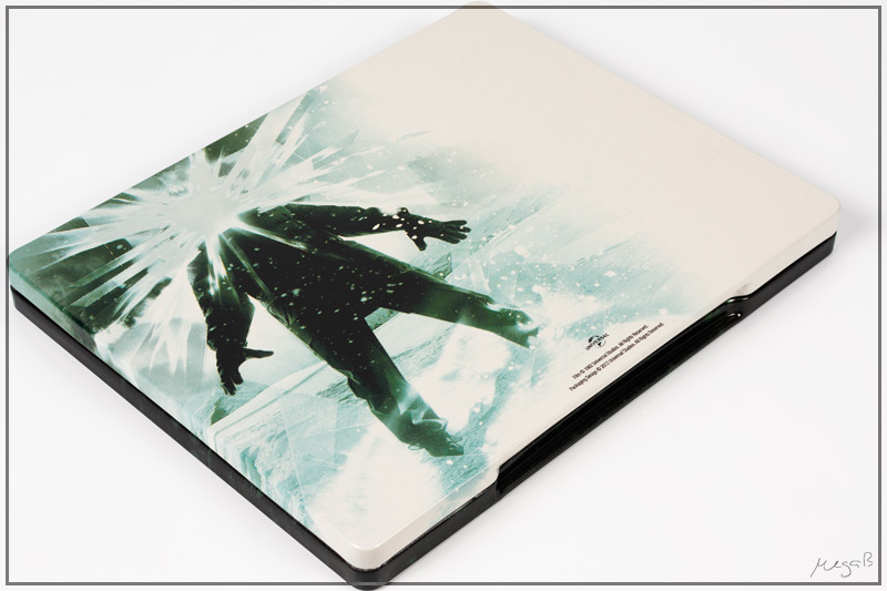

This looks ugly. Horizontal front and vertical back? Why not just make the back vertical like the image used requires? It just looks all wrong to me. The only thing that can save this now is some debossing/embossing or some cool paint effect.
This looks ugly. Horizontal front and vertical back? Why not just make the back vertical like the image used requires? It just looks all wrong to me. The only thing that can save this now is some debossing/embossing or some cool paint effect.
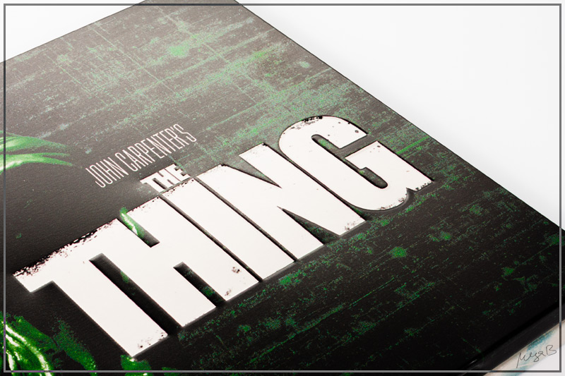
both sides are horizontal. check the photos. both horizontal.
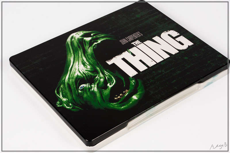
I'm still confused as to why this art has been chosen, take the wording away and I honestly couldn't guess that it would be The Thing! so many other possible pieces of artwork could have been chosen and you want something particular to be associated with the film, just looks like a conjoined twin which is abit of a freak to me.
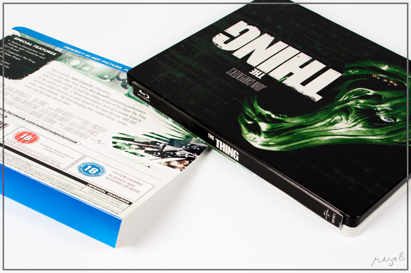
This is one of my all time favourite films but I don't feel this has been given the treatment it deserves. Although I'll still get a copy as the film itself I really enjoy, I'll forgive them if they release They Live or Big Trouble in Little China with some epic art!
This is one of my all time favourite films but I don't feel this has been given the treatment it deserves. Although I'll still get a copy as the film itself I really enjoy, I'll forgive them if they release They Live or Big Trouble in Little China with some epic art!
I'm still confused as to why this art has been chosen, take the wording away and I honestly couldn't guess that it would be The Thing! so many other possible pieces of artwork could have been chosen and you want something particular to be associated with the film, just looks like a conjoined twin which is abit of a freak to me.
This is one of my all time favourite films but I don't feel this has been given the treatment it deserves. Although I'll still get a copy as the film itself I really enjoy, I'll forgive them if they release They Live or Big Trouble in Little China with some epic art!
are you serious? The front art is probably the most famous part of the movie. It is ICONIC!!

are you serious? The front art is probably the most famous part of the movie. It is ICONIC!!
Which Art? I thought it's this two headed thing? Or has it changed? I've never seen this on any other releases?!

both sides are horizontal. check the photos. both horizontal.
Yeah, I know that both sides are printed horizontal but I was on about how they've used an image on the back that should be vertical so it doesn't fill the whole of the back being placed horizontally (unless it was stretched). I think it looks real bad where it fades to white, they could of at least made an effort to make the image central and have it fade to black/white/green at both sides.
Not liking this at all..the Universal wave has been a real mixed bag for me, some nice looking, Kick Ass, Hulk, Hellboy 2....some ok, American Werewolf, Casino..some not so great, shaun of the dead and Hot fuzz.....and this takes the prize of the worse one for me ...at least Im saving money by not buying them, money I can spend on the upcoming Paramount wave that looks like its gonna be as good if not better than the Fox exclusives from Play
Which Art? I thought it's this two headed thing? Or has it changed? I've never seen this on any other releases?!
Yes the 2 heads. It's iconic.
Iconic maybe, but the artwork is still a big disappointment... Universals steelbooks have been more miss then hit!
Worst possible artwork for one the best horror flicks of our time! Pre-order cancelled and atleast my money can now be better spent on something else. A major fail!!
+1
Also canceled my pre-order on this one. Still hope they gonna change the artwork but hope is almost gone.
If only the back was the front.
I am still on the fence on this one. :/
You can actually have that artwork on the front as well, just purchase 2 copies, dump Kermit and you are good to go. You will have a little bit of text on the lower section and no title. Pity it isn't ice blue like the original artwork.
Similar threads
- Replies
- 6
- Views
- 930
- Replies
- 0
- Views
- 339
- Replies
- 2
- Views
- 371
- Replies
- 39
- Views
- 3K
- Replies
- 55
- Views
- 5K