Vertigo (Blu-ray SteelBook) [Italy]
- Thread starter bradipolpo
- Start date
You are using an out of date browser. It may not display this or other websites correctly.
You should upgrade or use an alternative browser.
You should upgrade or use an alternative browser.


I'll join the queue of the folks waiting for the iconic poster artwork...Who ever approved this artwork failed to give what the consumers really waited / hoped for....Pass from me
If the Studios / folks needs a insight to poster artwork, watch this film http://www.imdb.com/title/tt5003654/
24x36: A Movie About Movie Posters (2016) - A documentary exploring the birth, death, and resurrection of the illustrated movie poster.
Covers the Poster artwork origins through to Mondo
24x36: A Movie About Movie Posters (2016) - A documentary exploring the birth, death, and resurrection of the illustrated movie poster.
Covers the Poster artwork origins through to Mondo
Okay, now THAT'S my favourite! Very smart looking design, and I love the colours... they work really well together.Thanks! Here's one more, that's a more vintage-y look, using some magazine ad promos.
View attachment 355441
")
Title of VERTIGO certainly better than ACROPHOBIA but on the other hand PSYCHO better than MENTAL (lol)
Artwork too colourful?
No, I don't think so . . . actually quite brilliant - if a bit garish - but suiting this lush film . . . with colour as important to the mood of the piece as B&W was to PSYCHO a couple of years later.
. . . and I quote,
"Alfred Hitchcock's "Vertigo" is one of the most ravishing Technicolor films ever made -- all the more so in its VistaVision-to-70mm restored version. And color plays a key part in the mystery, emotion and psychology, of the film. Colors evoke feelings, and while Hitchcock liked to say that "Psycho" (made two years later) was "pure cinema" in black-and-white, "Vertigo" is a symphony of color, its multi-hued themes and motifs as vividly orchestrated as Bernard Herrmann's famous score."
Steelbook cover art clearly inspired by Scottie's nightmare scene with his disembodied head floating amid flashing colors bombarding him and us with bursts of green, purple, red, blue, yellow/pink . . . each colour representing a different emotion:-


. . . a scene referred to previously on alternative posters:-


(OK, not as cool as the Salvador Dali designed dream sequence from SPELLBOUND)
As for the back art I'd have preferred something different . . . maybe the Laurent Durieux VERTIGO artwork:-

Artwork too colourful?
No, I don't think so . . . actually quite brilliant - if a bit garish - but suiting this lush film . . . with colour as important to the mood of the piece as B&W was to PSYCHO a couple of years later.
. . . and I quote,
"Alfred Hitchcock's "Vertigo" is one of the most ravishing Technicolor films ever made -- all the more so in its VistaVision-to-70mm restored version. And color plays a key part in the mystery, emotion and psychology, of the film. Colors evoke feelings, and while Hitchcock liked to say that "Psycho" (made two years later) was "pure cinema" in black-and-white, "Vertigo" is a symphony of color, its multi-hued themes and motifs as vividly orchestrated as Bernard Herrmann's famous score."
Steelbook cover art clearly inspired by Scottie's nightmare scene with his disembodied head floating amid flashing colors bombarding him and us with bursts of green, purple, red, blue, yellow/pink . . . each colour representing a different emotion:-
. . . a scene referred to previously on alternative posters:-
(OK, not as cool as the Salvador Dali designed dream sequence from SPELLBOUND)
As for the back art I'd have preferred something different . . . maybe the Laurent Durieux VERTIGO artwork:-
Last edited:
Don't think at the cover, @virkia -- just look at the cover. You really like this?? ") I dare you to explain away the title font, and the mismatch between that font and the "Alfred Hitchcock's" font.
I dare you to explain away the title font, and the mismatch between that font and the "Alfred Hitchcock's" font.
As for the other takes, Durieux is okay, but I prefer Adam Simpson's poster. I think it would make a great steelbook, with the same aesthetic as the Whalen Incredibles.

(But still not as good as Saul Bass.)
Even the Jonathan Burton or WBYK posters, which I don't especially love, would have been better than this steelbook.


I dare you to explain away the title font, and the mismatch between that font and the "Alfred Hitchcock's" font. As for the other takes, Durieux is okay, but I prefer Adam Simpson's poster. I think it would make a great steelbook, with the same aesthetic as the Whalen Incredibles.
(But still not as good as Saul Bass.)
Even the Jonathan Burton or WBYK posters, which I don't especially love, would have been better than this steelbook.

^ Yup, really like it and the more I look at it the more I like it.
I will support this brave and fresh approach when the steelbook comes to the UK just as I've supported previous Hitch steelbooks . . .
Yes, classic Saul Bass posters may look great - some of the others too - but I feel this steelbook deserves something with more oomph, less sterile if you will . . . and that a make-over is long overdue . . . and this is it.
As for Tom Whalen art for VERTIGO - a big NO!
Despite the recent/ish "PG" rating the film was released as an "A" in 1958 . . . and this is after all a psychological thriller / horror film of sorts dealing with kinkiness, implied necrophilia (OK, no NEKROMANTIK 1 or 2 lol), murder, loss, psychosis, perversion, infatuation and a whole tangled web of other emotions . . . and this nightmare artwork sums it up just fine for me, thank you.
Remember, as the saying goes, "There's no such thing as good taste and bad taste - only your taste and my taste"
. . . and actually better for me if no-one else likes the artwork as good chance of picking it up later for under a tenner

------------------------------------------------------------------------------------------------------------------------------------------------------------------------------------------------------------------------------------------------------------------------
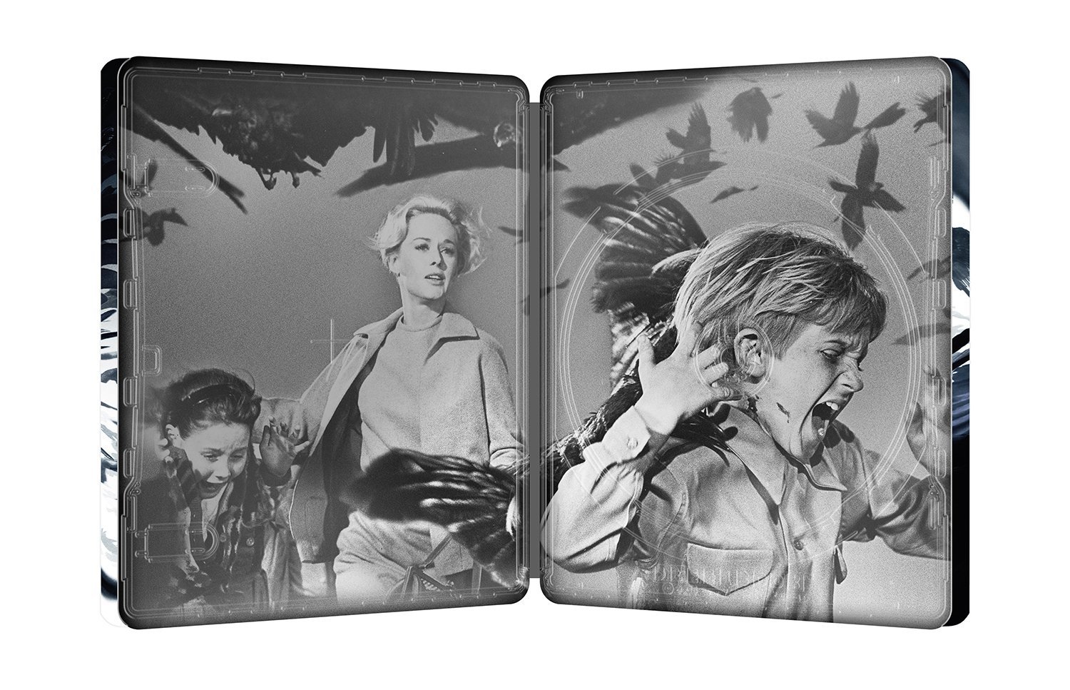
Not happy, though, about the B&W inside Jimmy Stewart production still artwork and should've been these two colour images:-

As for Hitchcock steelbooks: there are a few around but unsurprisingly nothing from his pre-Hollywood UK days . . .
. . . (pre REBECCA 1940) including THE LADY VANISHES, THE 39 STEPS and YOUNG AND INNOCENT.
Unsurprisingly also only one steelbook released - LIFEBOAT - from what I consider to be his best period - i.e. from REBECCA in 1940 through SUSPICION, LIFEBOAT, NOTORIOUS, I CONFESS, DIAL M FOR MURDER to REAR WINDOW in 1954.
. . . and we've previously had to wait in the UK until NORTH BY NORTHWEST in 1959 for the first Hitch steelbook. Now expecting VERTIGO from 1958 to be his earliest film in a UK steelbook and hopefully we'll be getting at least some of his other colour films including DIAL M..., REAR WINDOW, MARNIE and FRENZY on steelbooks before too long.
Spain has released STRANGERS ON A TRAIN and DIAL M FOR MURDER but I believe only in a 3-film steelbook.
Hitch steelbooks from here and there:-
]


-----------------------------------------------------------------------------------------------------------------------------------------------------------------------------------------------------------------------------------------------------------------------------------------------


------------------------------------------------------------------------------------------------------------------------------------------------------------------------------------------------------------------------------------------------------------------------------------------------

--
 -----------------------------------------------------------------------------------------------------------------------------------------------------------------------------------------------------------------------------------------------------------------------


--------------------------------------------------------------------------------------------------------------------------------------------------------------------------------------------------------------------------------------------------------------------------


------------------------------------------------------------------------------------------------------------------------------------------------------------------------------------------------------------------------------------------------------------------------------------------------
-----------------------------------------------------------------------------------------------------------------------------------------------------------------------------------------------------------------------------------------------------------------------------------------------
------------------------------------------------------------------------------------------------------------------------------------------------------------------------------------------------------------------------------------------------------------------------------------------------
--
--------------------------------------------------------------------------------------------------------------------------------------------------------------------------------------------------------------------------------------------------------------------------
------------------------------------------------------------------------------------------------------------------------------------------------------------------------------------------------------------------------------------------------------------------------------------------------
Last edited:
yup, good film ... on a few diff streaming service as well. I own the blu. I was there when Kevin was filming his Mondo con parts (mc2)If the Studios / folks needs a insight to poster artwork, watch this film http://www.imdb.com/title/tt5003654/
24x36: A Movie About Movie Posters (2016) - A documentary exploring the birth, death, and resurrection of the illustrated movie poster.
Covers the Poster artwork origins through to Mondo
Title of VERTIGO certainly better than ACROPHOBIA but on the other hand PSYCHO better than MENTAL (lol)
Artwork too colourful?
No, I don't think so . . . actually quite brilliant - if a bit garish - but suiting this lush film . . . with colour as important to the mood of the piece as B&W was to PSYCHO a couple of years later.
. . . and I quote,
"Alfred Hitchcock's "Vertigo" is one of the most ravishing Technicolor films ever made -- all the more so in its VistaVision-to-70mm restored version. And color plays a key part in the mystery, emotion and psychology, of the film. Colors evoke feelings, and while Hitchcock liked to say that "Psycho" (made two years later) was "pure cinema" in black-and-white, "Vertigo" is a symphony of color, its multi-hued themes and motifs as vividly orchestrated as Bernard Herrmann's famous score."
Steelbook cover art clearly inspired by Scottie's nightmare scene with his disembodied head floating amid flashing colors bombarding him and us with bursts of green, purple, red, blue, yellow/pink . . . each colour representing a different emotion:-
. . . a scene referred to previously on alternative posters:-
View attachment 355497 View attachment 355498
(OK, not as cool as the Salvador Dali designed dream sequence from SPELLBOUND)
As for the back art I'd have preferred something different . . . maybe the Laurent Durieux VERTIGO artwork:-
I really, REALLY want that Laurent Durieux 'Rear Window' as a Mondo X Steelbook.
Where's the tag line "Don't make me angry, you won't like me when I'm angry!". Don't see it anywhere?
I love it too... it's just the colours I'm not sure about, although they are kinda growing on me.Going to be honest, I really like this art!!!

Nah, thy just need to cut back on the alcopops . . .Maybe the hostile feedback will make them change it.

-----------------------------------------------------------------------------------------------------------------------------------------------------------------------------------------------------------------------------------------------------------------------------------------------
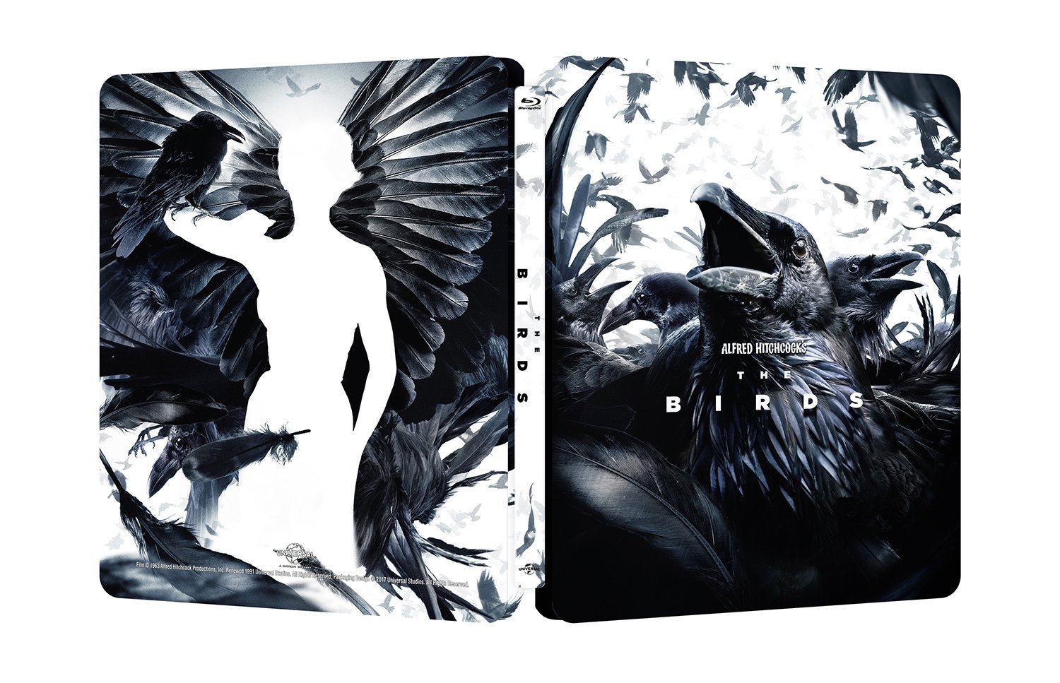
No, seriously, all they're doing is continuing the concept art instead of poster art route . . . thinking outside the box artwork started with THE BIRDS and more recently with PSYCHO . . . and If you look at it like that this artwork fits in nicely with those two.
If the design brief was to "Be creative without resorting to original poster art designs . . . come up with a fresh, edgy and unexpected deign for VERTIGO" or even, "Take an important scene from VERTIGO and create a design for our steelbook" then I'd say they've done a great job on this and indeed on all of these Hitch steelbook releases below:-
Last edited:
Does anyone know who the artist is? I assume it's the same person who also did the artwork for the recent The Birds release. Personally, I'm a big fan of this style, so hope to see them continue. Fingers crossed for Rear Window next!
Similar threads
- Replies
- 0
- Views
- 186
- Replies
- 24
- Views
- 2K
- Replies
- 16
- Views
- 2K
- Replies
- 0
- Views
- 178