Release Date: September 9, 2013
Purchase link: Iron Man 3
Price: £23.99
Notes: Embossed arc on chest plate, Print run: 10'000


Actual Pics
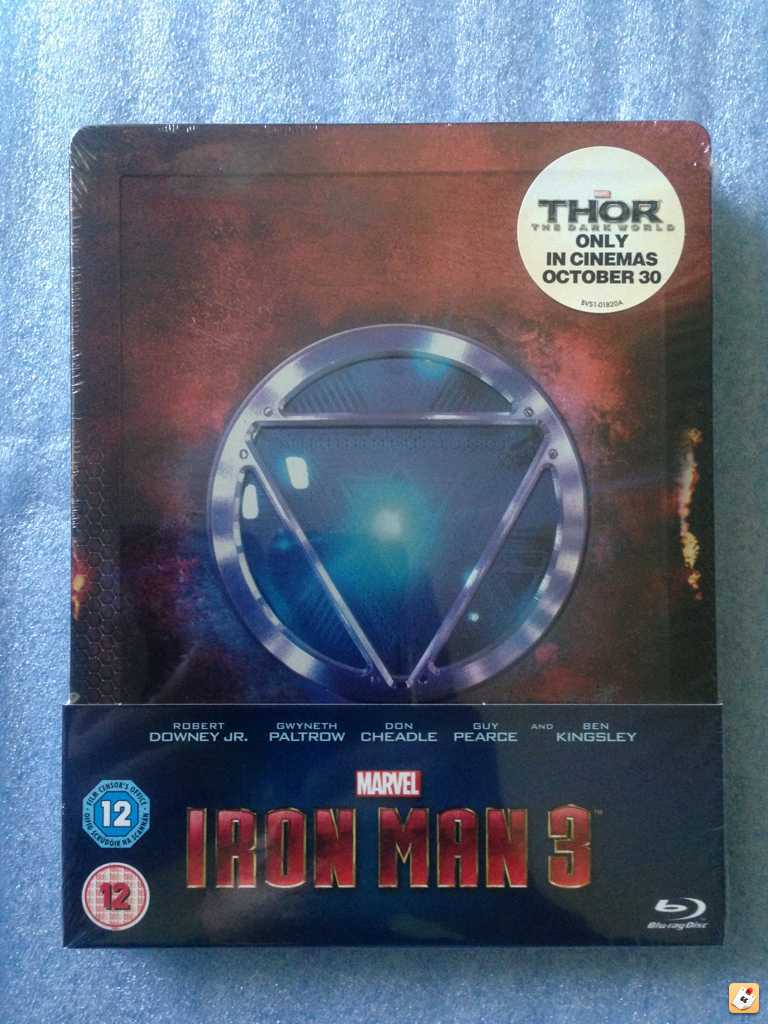

From pyszny
Purchase link: Iron Man 3
Price: £23.99
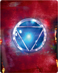
Notes: Embossed arc on chest plate, Print run: 10'000
Actual Pics
From pyszny
Attachments

Last edited by a moderator:

")


 ignore me, i think i am thinking of a different thread
